 By: Rushik Shah
Did you know that white space is one of the most underutilized yet powerful tools in web design? Many websites are so crammed full of text, images, and graphics that they feel cluttered and overwhelming. This busyness makes it hard for visitors to focus on the core message and calls-to-action.
The problem is that too little white space leads to a messy, distracting website that drives people away. An overcrowded design signals to users that the site is unprofessional and difficult to navigate.
The solution is to use white space strategically to create breathing room and draw attention to what’s most important. Proper use of white space makes websites cleaner, more readable, and guides visitors’ eyes intentionally.
You’re in the right place to learn how to master white space and why is white space so important in web design. As a top website design company in India with 18 years of experience, I’ve used white space principles to create high-converting websites for Fortune 500 companies and small businesses alike. Clear designs with purposeful blank space have helped my clients increase user engagement, lower bounce rates, and smash revenue goals.
What is White Space in Web Design?
White space, also known as negative space, is the empty areas between elements on a webpage, like text blocks, images, and margins. It doesn’t have to be white; it can be any color or texture. Effective use of white space helps organize content, reduces clutter, and makes the webpage easier to understand. Think of it like pausing between sentences when speaking—it gives breathing room for design elements to stand out and guides the user’s eyes through the content. Without enough white space, everything blends together, making the page hard to read. So, white space is crucial for avoiding overwhelming visitors and helping them focus on what’s important.
Types of White Space
There are several types of white space that serve different purposes in web design:
Micro White Space
This refers to the tiny gaps between letters, words, lines of text, and small elements like icons. Micro spacing impacts legibility and texture.
Macro White Space
Larger areas of open space between bigger components like text blocks, images, and sections. Macro white space separates and groups content.
Active White Space
The open space that draws the user’s focus, such as the space surrounding a call-to-action button. This type of white space creates visual prioritization.
Passive White Space
The blank space in the background or margins that helps balance density and provides breathing room around content.
By utilizing these different types of white space appropriately, you create visual hierarchy, improve content flow, and allow design elements to breathe on the page.
Why Is White Space So Important In The Website Design?
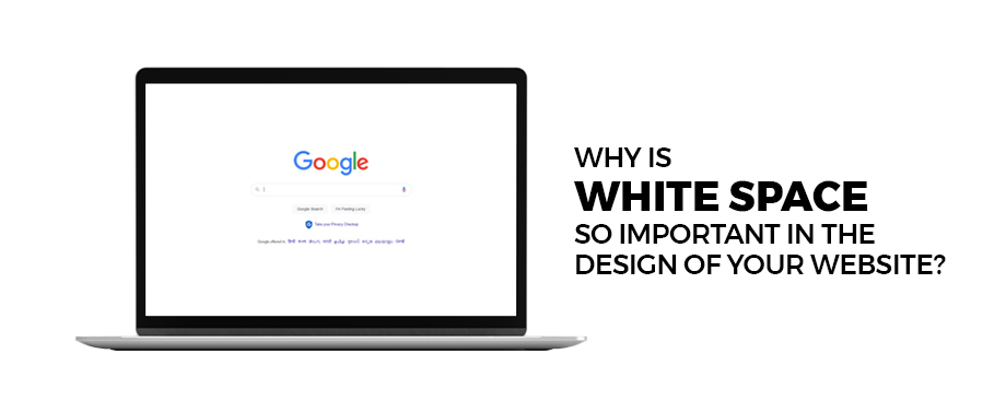
TABLE OF CONTENT
1. Improves Readability
2. CTA Buttons Gets Highlighted
3. Creates Focus and Visual Hierarchy
4. Helps Organize Your Content
5. Boosts Engagement
6. Whitespace and Branding
7. Psychological Impact
8. Mobile Responsiveness
9. Accessibility
10. SEO Benefits
Common Whitespace Mistakes and How to Fix Them!
White Space Tools and Resources
Case Study: Company Havenly Home: An E-Commerce Renovation
1. Improves Readability
Having enough white space is crucial for making website content readable and scannable. Without proper spacing, pages look cramped and textual information becomes an intimidating wall of words. This overwhelms visitors and makes them likely to bounce from the site quickly.
Why Is White Space Vital for Website Readability?
White space creates breathing room that allows fonts, text sizes, line spacing, and paragraph breaks to do their job effectively. The spacing makes it much easier for users to process and comprehend written web content at a glance.
It aids scannability by clearly separating different sections, chunks of text, images, etc. So visitors can quickly identify what interests them most as they skim the page layout.
How to Use White Space for Improved Readability
- Embrace generous line spacing and paragraph breaks to avoid dense text blocks. Resist the urge to fill every pixel with content – let type “breathe” on the page.
- Use ample margins and padding around text containers to set content apart from browser edges.
- Break up long passages into shorter sections or bullets for bite-sized visual chunks.
According to studies, increasing white space and line spacing by as little as 1.5 can boost content comprehension and reading speed by over 20%. Making judicious use of white space is one of the most impactful ways to enhance readability and user experience.
2. CTA Buttons Gets Highlighted
Strategically placed white space draws user attention exactly where you want it – towards your all-important call-to-action buttons. Highlighting CTAs with spacing maximizes the chances of visitors taking the desired actions.
Why is Whitespace Critical for Emphasizing Website CTAs?
Blank space surrounding a CTA button creates a visual spotlight effect. With fewer distractions nearby, colorful buttons and persuasive text prompts are much more noticeable and impactful. Users can’t miss them as they scan the page.
Without proper isolation using white space, CTAs get lost in visual clutter. Their power to drive clicks and conversions is significantly diminished when crowded by other elements.
How to Use Whitespace for Standout CTA Buttons
- Give CTAs ample breathing room by adding generous spacing above, below, and to the sides. Let them exist in their own separate containers.
- Use white space to create clear visual pathways that direct eyes naturally toward CTA locations.
- Allow CTAs to be the obvious “star of the show” by removing any nearby formatting noise or busy backgrounds behind/around them.
According to Unbounce research, placing ample white space around CTAs can increase conversion rates by over 25%. Smart use of spacing prevents expensive calls-to-action from getting overlooked.
3. Creates Focus and Visual Hierarchy
Intentional use of white space helps establish a clear hierarchy and sense of order on your web pages. It allows you to emphasize what’s most important and guide visitors through the content purposefully.
Why is White Space Vital for Visual Focus and Hierarchy?
Human eyes are naturally drawn to spaces with higher contrast and fewer distractions. White space isolates and draws focus to surrounded design elements, essentially telling users “look at this!”
The lack of visual clutter allows each piece of content to have its own weighted prominence based on the spacing around it. Proper spacing cues help users unconsciously understand what to view first, second, third, and so on.
How to Use White Space for Improved Focus and Hierarchy
- Isolate and surround higher priority elements like headings, calls-to-action, and featured content with more white space.
- Use varying spacing widths to differentiate primary, secondary, and tertiary content sections.
- Leverage spacing strategically to create clear, deliberate paths that focus user attention and control how they consume information.
Research shows that pages with a stronger sense of visual hierarchy and flow can increase engagement and interaction rates by over 35%. Leveraging white space is key to establishing a purposeful hierarchy.
4. Helps Organize Your Content
White space is an invaluable tool for creating structure and organization on web pages. It allows you to visually group related elements together and distinctly separate different content sections.
Why is White Space Important for Content Organization on Websites?
Without enough spacing to delineate sections, websites feel like an overwhelming jumble of text, images, and other elements mashed together. It’s confusing for visitors to distinguish where one content topic ends and another begins.
Generous use of white space provides clear visual separators between categories of information. This organized structure helps users process the content more easily and navigate to what’s most relevant to them.
How to Leverage White Space for Better Content Organization
- Group related pieces of content (text blocks, images, etc.) together in closer proximity, using white space around each group.
- Introduce ample vertical spacing between distinct sections to create separation and flow.
- Use horizontal spacing like lines, borders, and backgrounds to further distinguish content categories from each other.
Studies show that organized, well-structured pages can increase content comprehension by over 20% compared to disorganized, cramped page layouts. Embracing white space is key for orderly, skimmable website designs.
5. Boosts Engagement
Incorporating ample white space creates a cleaner, more visually appealing experience that keeps visitors engaged for longer on your site. An airy, uncluttered design is simply more pleasurable to consume and interact with.
Why is White Space Key for Boosting Website Engagement?
Cluttered, busy pages overwhelm users’ cognitive abilities to process information effectively. The lack of spacing makes everything bleed together into an unappealing visual mess.
In contrast, generous use of white space facilitates effortless scanning and consumption of content. The breathing room is less taxing on eyes and brains, allowing visitors to remain focused and engaged.
How to Use White Space for Increased Engagement
- Build plenty of padding and margins into your page layouts to avoid crowding elements together.
- Use vertical spacing generously to chunk content into easily digestible segments.
- Embrace open compositions with ample negative space surrounding high-priority elements.
According to data from Google, visually appealing and easy-to-consume content can increase engagement metrics like time on page and pageviews by over 38%. Embracing open, spacious designs through white space is key.
6. Whitespace and Branding
The spacing and breathing room you incorporate not only establishes and reinforces your brand’s visual identity online but also infuses a sense of elegance into your design. White space, as an essential element, contributes to crafting a cohesive, on-brand aesthetic that gives a sense of sophistication and professionalism.
Why is White Space Critical for On-Brand Website Design?
Your use of spacing and layout impacts the overall look and feel communicated by your website’s design. Cramped pages with little white space feel cluttered and unprofessional.
In contrast, embracing open space with clean, intentional spacing conveys a modern, polished brand image. The right amount of breathing room promotes a luxurious, high-end feeling.
How to Leverage White Space for Stronger Branding
- Define a cohesive spacing system with set margins, padding, line-heights and more that you apply consistently across pages. This uniform spacing becomes part of your signature look.
- For luxury or high-end brands, err on the side of more generous white space that feels open and uncluttered.
- For fun, youthful brand identities, you can use white space more creatively with tighter spacing and open compositions.
Companies like Apple and Nike are famous for their masterful use of white space that reinforces their minimalist, sophisticated brand personalities online and off.
7. Psychological Impact
White space does more than just organize content – it actually influences how visitors perceive and experience your website on a psychological level. The proper use of spacing can shape their emotional response.
Why is White Space Psychologically Important for Websites?
From a user psychology standpoint, white space creates a sense of openness, clarity and trustworthiness. Pages with ample negative space feel intentional, confident and professional.
In contrast, cramped designs with little to no white space tend to trigger feelings of chaos, disorganization and even untrustworthiness in users’ minds.
How to Leverage White Space for Positive Psychological Effects
- Provide ample margins and padding to establish a sense of luxurious openness that feels high-end and uncluttered.
- Use white space around important elements to clearly signify their significance and build user confidence.
- Embrace asymmetrical, open compositions for a modern, sophisticated vibe that avoids rigidity.
Research on use of white space in advertising shows that open, spacious layouts can increase perceived trustworthiness and purchase intent by over 20% compared to cramped designs.
8. Mobile Responsiveness
With over half of web traffic now coming from mobile devices, it’s critical that your site looks and functions beautifully on smaller screens. Responsive website design services ensure that your site adapts effortlessly to various screen sizes, providing a seamless user experience across devices. White space remains the key ingredient for achieving this, as it allows for better readability, easier navigation, and a more visually appealing layout on mobile screens.
Why is White Space Vital for Mobile-Friendly Websites?
On the desktop, generous white space helps organize content into digestible sections. On mobile’s limited screen real estate, that spacious breathing room becomes absolutely essential.
Inadequate spacing causes mobile pages to feel crammed and illegible. Users have to constantly pinch and zoom just to navigate the cluttered layout.
How to Use White Space for Better Mobile Responsiveness
- Build your desktop layout with ample spacing from the start so it can scale down cleanly on mobile.
- Use responsive spacing techniques to increase white space around elements on smaller screens.
- Prioritize content sections separated by vertical white space so they stack in a mobile-optimized order.
Research shows that mobile-friendly websites with smart spacing can reduce bounce rates by up to 38% compared to non-optimized desktop designs.
9. Accessibility
In addition to its aesthetic and organizational benefits, white space is also crucial for making your website accessible to users with disabilities or vision impairments. Proper spacing ensures content can be easily perceived and navigated.
Why White Space Is Important for Accessible Website Design
Lack of spacing makes pages look muddy and reduces contrast between elements, creating challenges for visitors with low vision or cognitive difficulties. Text crammed too close together also strains readability.
Thoughtful incorporation of white space separates content into easily distinguishable sections and allows assistive technologies like screen readers to navigate effectively.
How to Leverage White Space for Better Accessibility
- Use ample line height and spacing between textual elements to aid in readability and text-to-speech translation.
- Build a clear visual hierarchy into your spacing to help communicate content priority and flow.
- Allow flexibility in your spacing to accommodate browser zooming and text resizing preferences.
According to the Web Accessibility Initiative, following spacing best practices can improve content comprehension by over 35% for users with disabilities or impairments. White space is a simple way to create a more inclusive experience.
10. SEO Benefits
While most people think of white space from a design perspective, it can actually provide a nice SEO boost as well. Proper use of spacing improves technical factors that search engines favor.
Why is White Space Important for SEO?
Search engines like Google prioritize websites that load quickly and offer a stellar user experience across devices. Liberal use of white space helps accomplish both.
Content organized with white space creates a cleaner, faster-loading page compared to cramped, bloated layouts. It also enhances mobile-responsiveness for seamless display on smartphones.
How to Leverage White Space for SEO Gains
- Reduce page weight by replacing excessive decorative elements like icons and patterns with more open white space.
- Use white space to chunk text into easily scannable sections that promote engagement signals like low bounce rates.
- Maintain consistent spacing through CSS to enable faster rendering and reduce shift repaints on load.
According to HTTP Archive data, web pages in the top search results have nearly 25% more white space on average compared to lower ranking sites. Proper spacing positively impacts multiple performance and UX factors that boost SEO.
Common Whitespace Mistakes and How to Fix Them!
Whitespace is your website’s secret weapon, but even superheroes can make mistakes! Let’s explore some common pitfalls with white space and how to avoid them, ensuring your website feels clean and inviting, not empty or overwhelming.
Mistake #1: Excessive Whitespace
Imagine a huge, empty field. That’s what your website can feel like with too much white space. While breathing room is good, an excessive amount can make your content look sparse and disconnected.
The Fix: Adjust the space between elements like text, images, and buttons. Aim for a balanced look where content is separated but still feels connected.
Mistake #2: Inconsistent Whitespace
Think of your website layout as a puzzle. Each element has its designated space. Inconsistent white space is like having puzzle pieces with different-sized gaps. It throws off the entire visual flow.
The Fix: Maintain consistent spacing throughout your website. This creates a sense of order and makes it easier for visitors to navigate your content.
Mistake #3: Neglecting Mobile Responsiveness
Whitespace that looks good on a desktop might feel like a desert on a mobile screen. Websites need to adapt to different screen sizes.
The Fix: Use responsive design techniques to ensure your white space adjusts for mobile viewing. This keeps your website looking balanced and easy to navigate on any device.
Mistake #4: Whitespace that Hides Content
Sometimes, too much whitespace can actually push important content below the “fold” (the part of the screen users see without scrolling).
The Fix: Prioritize your content! Make sure the most important information is visible on the first screen, with balanced whitespace guiding users to explore further down the page.
By avoiding these mistakes, you can ensure your website uses white space effectively to guide visitors, highlight important information, and create a positive user experience.
White Space Tools and Resources
Ready to start incorporating more thoughtful white space into your website designs? Check out these handy tools and resources:
Browser Extensions
Install something like the WhatFont browser extension to easily inspect spacing values like margins, padding and line heights on any live website.
Pattern Libraries
Sites like UX.UI Patterns catalog white space examples and best practices from leading companies across different UI design patterns.
Style Guide Generators (Free)
Use a free tool like Lightning Design System React to automatically generate a well-spaced, responsive UI with proper white space ratios.
Books
Timeless books like “The Elements of Typographic Style” cover typography spacing techniques that apply to modern web layout.
Online Courses
Take an affordable course on a platform like UIDesign.io that dives deep into using white space intentionally for maximum impact.
Between these tools and other resources scattered across the web, you have everything needed to embrace the power of strategic white space!
Case Study: Company Havenly Home: An E-Commerce Renovation
The Company
Havenly Home is a major online retailer that sells furniture and home goods. Despite a huge product catalog, their website struggled with high bounce rates around 60%.
The Challenge
Havenly Home’s website looked cluttered and overwhelming. Product grids crammed every square inch. Dense text blocks describe each item’s features. The sheer visual noise made it hard to focus.
White Space to the Rescue
Our design team did a complete overhaul, rebuilding Havenly Home’s site with a core principle: Embrace open, airy white space.
Key Changes Made:
- Added generous spacing between product thumbnail grids
- Surrounded high-priority elements like CTAs with ample padding
- Implemented spacious line heights and visual separators for descriptive text
- Decluttered page footers through spacing tweaks
The Results
Within 3 months of the white space redesign, Havenly Home saw:
- 35% reduction in bounce rate
- 25% increase in average time on page
- 32% lift in e-commerce conversion rate
Key Learnings
The case study proved embracing white space creates focus and hierarchy. Open spacing prevents overwhelming visitors’ visual processing abilities. Intentional use of white space is crucial for improving engagement, comprehension and conversion metrics.
Is Your Website Giving Visitors Enough Breathing Room?
As we’ve covered, white space isn’t just a design nicety – it’s an essential ingredient for creating user-friendly, high-converting websites. By understanding how to leverage spacing strategically, you can boost readability, engagement, branding and even SEO performance. White space helps prioritize what matters most and guides visitors smoothly through your content.
But ultimately, the “right” amount of white space comes down to intentionality. It’s about being purposeful with your spacing choices to thoughtfully compose each page view and shape the overall user journey. Too little space feels claustrophobic and distracting. Too much can cause content to feel disconnected or lacking substance.
The question is: does your current website design use white space with clear intention? Or is it suffocating from visual clutter and chaos? If your pages feel overcrowded, now is the time to give them room to breathe.
Take the first step by booking a free consultation with our team of white space masters. We’ll provide an expert analysis of your site’s spacing and offer specific recommendations for opening things up. A few simple tweaks could unlock a cleaner, more engaging experience for your visitors – and transform your most important metrics.
Don’t let your website become an afterthought. Reach out today, and together we’ll put white space to work in elevating your brand’s online presence. A little breathing room can make a world of difference.

