 By: Rushik Shah
Did you know that over 60% of online shopping carts are abandoned before completion? That’s a staggering number of lost sales that could have been avoided with a well-designed eCommerce website. As an eCommerce web designer with over 18 years of experience, we’ve seen firsthand how the right website design can make or break an online business.
In this blog post, we’ll be sharing the top common mistakes we often see in eCommerce website design, and providing practical tips on how to fix them. By addressing these key problem areas, you’ll be able to create a high-performing website that keeps customers engaged and coming back to convert.
Whether you’re launching a new eCommerce site or looking to optimize an existing one, you’ll walk away with a clear action plan for avoiding the most costly design pitfalls. My goal is to arm you with the knowledge and insights to design an eCommerce experience that drives sales and creates loyal, lifelong customers.
Let’s dive in and discuss the top common eCommerce website design mistakes, so you can start optimizing your site for maximum success.
Common eCommerce Website Design Mistakes

TABLE OF CONTENT
1. Low-Quality Images
2. Ineffective CTA
3. Unclear contact information
4. Overusing Pop-Ups
5. Difficult Shopping Cart Design
6. Having No Social Proof
7. Confusing Navigation
8. Not Doing any A/B Testing
Tools and Resources
Tools and Software
Educational Resources
Free & Low-Cost Resources
Case Study: Revamping the Online Store for a Luxury Fashion Brand
Don’t Let Your eCommerce Website Be a Conversion Killer
1. Low-Quality Images
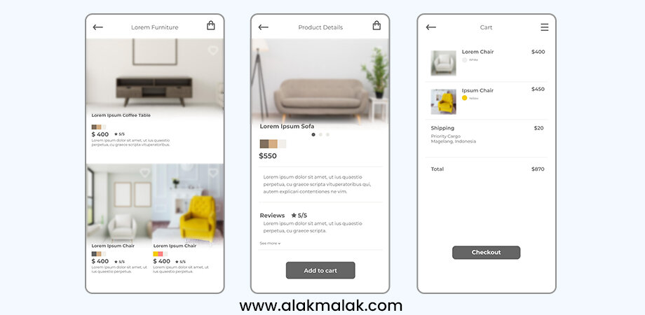
One of the most common mistakes we see in eCommerce website design is the use of low-quality, pixelated, or blurry product images. In an online shopping experience where customers can’t physically interact with the products, high-quality visuals are essential for building trust, showcasing details, and driving conversions.
Why is it important?
Studies show that 75% of online shoppers consider product images to be very important in their purchasing decisions. Low-quality images can make products appear cheap or unreliable, leading to high bounce rates and shopping cart abandonment. Customers need to be able to zoom in, rotate, and closely examine products to get a true sense of quality, materials, and fit.
How to implement?
To avoid this common mistake, make sure all your product images meet the following criteria:
- High Resolution: Ensure images are at least 1200 pixels wide, with a resolution of 72 dpi or higher. This provides the level of detail and clarity customers expect.
- Consistent Formatting: Use the same background, lighting, and framing for all product shots to create a cohesive visual experience.
- Multiple Angles: Provide 3-4 images of each product, showcasing different views, details, and angles.
- Zoom Functionality: Allow customers to click and zoom in on images for a closer look at the product.
- Optimization for Speed: Compress image files without sacrificing quality to ensure fast page load times.
2. Ineffective CTA
Another common mistake we see in eCommerce website design is the use of ineffective or unclear calls-to-action (CTAs). Your CTAs are the prime real estate on your site – they’re what guide customers towards completing a purchase or taking a desired action. As a reputable website design agency, we understand the importance of optimizing CTAs for maximum impact on conversion rates and sales.
Why is it important?
Studies show that a well-placed, compelling CTA can increase conversion rates by up to 21%. On the flip side, vague or uninspiring CTAs can lead to a 287% decrease in clicks. Customers need clear direction on what you want them to do next, whether that’s adding an item to their cart, signing up for your newsletter, or completing their purchase.
How to implement?
To create effective CTA buttons that drive action, follow these best practices:
- Use Clear, Actionable Language: Avoid generic CTAs like “Click Here” or “Submit”. Instead, use specific, benefit-driven language like “Add to Cart”, “Buy Now”, or “Get 10% Off”.
- Optimize CTA Placement: Place your CTAs in high-visibility areas like above the fold, at the end of product descriptions, and throughout the checkout process.
- Make Them Stand Out Visually: Use contrasting colors, eye-catching designs, and relevant icons to make your CTAs impossible to miss.
- Test, Test, Test: Continuously A/B test your CTA copy, placement, and design to see what resonates best with your audience.
3. Unclear contact information

One of the most frustrating mistakes we see in eCommerce website design is the lack of clear, accessible contact information. Customers expect to be able to easily get in touch with a business, whether it’s to ask a question, report an issue, or provide feedback. Burying your contact details or making them difficult to find can severely damage customer trust and satisfaction.
Why is it important?
Research shows that 44% of online shoppers will abandon a purchase if they can’t easily find contact information for the business. In an increasingly competitive eCommerce landscape, providing responsive, reliable customer support is essential for building long-term relationships and driving repeat business. Customers want to know there’s a real person they can reach out to if needed.
How to implement?
To ensure your contact information is clear and accessible on your eCommerce site, follow these steps:
- Prominently Display Contact Details: Include your business name, phone number, email address, and physical address (if applicable) in the website header, footer, and contact page.
- Offer Multiple Contact Options: Give customers the ability to reach you via phone, email, live chat, and/or contact form to cater to their preferred method of communication.
- Respond Promptly: Commit to answering customer inquiries within 24 hours, and set clear expectations around your response times.
- Provide an FAQ Section: Anticipate common customer questions and proactively address them in an easily-navigable FAQ page.
- Monitor and Improve: Regularly review your contact channels to identify areas for improvement, such as common questions or pain points.
4. Overusing Pop-Ups

One of the most common and detrimental mistakes we see in eCommerce website design is the overuse of intrusive pop-ups. While pop-ups can be an effective tool for capturing leads and special offers, they can quickly become an annoyance if used excessively or at the wrong times. Bombarding visitors with multiple pop-ups can severely damage the user experience and drive potential customers away.
Why is it important?
Studies have shown that excessive pop-ups can lead to a 50% increase in bounce rates. Customers value a smooth, uninterrupted browsing experience, and too many disruptive pop-ups can quickly sour their perception of your brand. Poorly timed or overly aggressive pop-ups can also trigger ad-blockers, further reducing your ability to connect with and convert potential customers.
How to implement?
To strike the right balance with pop-ups on your eCommerce site, follow these best practices:
- Be Selective: Only use pop-ups for specific, high-value offers like newsletter signups, exclusive discounts, or cart abandonment.
- Time Them Carefully: Trigger pop-ups based on user behavior and interaction, such as after a certain scroll depth or time on page.
- Keep Them Concise: Limit pop-ups to a single, focused call-to-action without excessive copy or clutter.
- Provide Easy Dismissal: Make it simple for users to close or “X out” of pop-ups without disrupting their browsing experience.
- Leverage Retargeting: Use pop-ups sparingly, and follow up with retargeting ads to nurture leads and abandoned carts.
5. Difficult Shopping Cart Design
Another common pitfall in eCommerce website design is a confusing or overly complicated shopping cart experience. The checkout process is one of the most critical parts of the customer journey, and any friction or frustration during this stage can lead to high abandonment rates and lost sales.
Why is it important?
Studies show that over 69% of online shopping carts are abandoned before completion. Difficult or unclear checkout steps, unexpected fees, and a lack of payment options are among the top reasons cited for abandoned purchases. Providing a seamless, intuitive shopping cart experience is essential for converting browsers into buyers and maximizing your revenue.
How to implement?
To create a user-friendly, high-converting shopping cart design, follow these steps:
- Simplify the Checkout Process: Minimize the number of steps required to complete a purchase, and only ask for the essential information needed.
- Provide Payment Flexibility: Offer a variety of secure payment options, including credit/debit cards, digital wallets, and buy-now-pay-later services.
- Clearly Communicate Costs: Display the total order value, including taxes and shipping, upfront to avoid any surprises.
- Implement Persistent Carts: Allow customers to save their cart contents and return to complete their purchase later.
- Optimize for Mobile: Ensure the shopping cart is responsive and optimized for a smooth experience on any device.
- Offer Guest Checkout: Give customers the option to checkout as a guest without creating an account.
6. Having No Social Proof
One of the most overlooked mistakes in eCommerce website design is the lack of social proof. In an online shopping environment where customers can’t physically interact with or test products, displaying credible reviews, testimonials, and endorsements is crucial for building trust and driving conversions.
Why is it important?
Studies show that 93% of customers read online reviews before making a purchase. Positive social proof can increase conversion rates by as much as 270%. Conversely, the absence of third-party validation can make your products and brand appear untrustworthy, leading to high bounce rates and abandoned shopping carts.
How to implement?
To effectively incorporate social proof into your eCommerce website design, follow these steps:
- Display Customer Reviews: Prominently feature star ratings, product reviews, and customer testimonials on your product pages and homepage.
- Showcase Influencer or Expert Endorsements: If you’ve partnered with industry leaders or influencers, highlight their recommendations and seals of approval.
- Highlight Social Media Engagement: Display your social media follower counts, shares, and user-generated content to demonstrate your brand’s popularity and credibility.
- Leverage Trust Badges: Showcase security badges, payment processor logos, and third-party certifications to reassure customers about the safety and legitimacy of your site.
- Encourage User-Generated Content: Incentivize customers to share photos, videos, and comments about their experiences with your products.
7. Confusing Navigation
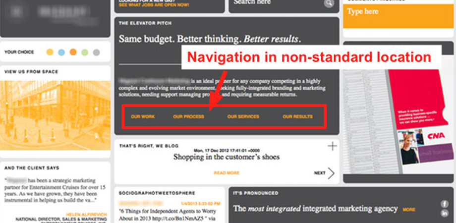
One of the most common and detrimental mistakes we see in eCommerce website design is confusing or overly complicated navigation. Your website’s navigation is the roadmap that guides customers through your product catalog and helps them find what they’re looking for. If it’s unclear, disorganized, or difficult to use, it can severely hinder the user experience and lead to high bounce rates.
Why is it important?
Studies show that 60% of shoppers will abandon a purchase if they can’t easily find what they’re looking for. Confusing navigation is one of the top reasons cited for cart abandonment. Customers expect an intuitive, streamlined path to the products they want to buy, and any friction along the way can quickly turn them off from completing a purchase. As a leading website development company, we prioritize creating seamless user experiences to minimize cart abandonment and maximize conversions.
How to implement?
To create a clear, user-friendly navigation system for your eCommerce site, follow these best practices:
- Organize Categories Logically: Group your products into well-defined categories and subcategories that make sense to your target audience.
- Use Descriptive Labels: Ensure your navigation menu options are clear, concise, and accurately describe what customers will find in each section.
- Implement Search Functionality: Provide a prominent, easy-to-use site search tool to help customers quickly find specific products or information.
- Optimize for Mobile: Ensure your navigation is responsive and optimized for seamless use on any device, with features like hamburger menus and dropdown categories.
- A/B Test and Iterate: Continuously monitor user behavior and feedback to identify areas for improvement, and test different navigation structures to find what works best.
8. Not Doing any A/B Testing
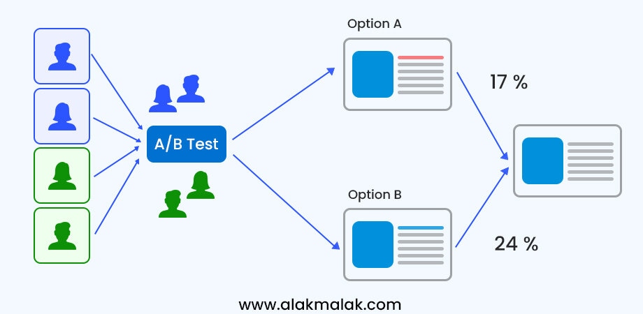
One of the most critical yet commonly overlooked mistakes in eCommerce website design is the failure to implement A/B testing. While it may be tempting to launch your site and stick with the initial design, continuous testing and optimization is essential for ensuring your website is performing at its full potential and delivering the best possible user experience.
Why is it important?
Studies show that A/B testing can lead to a 49% increase in sales revenue. However, a staggering 60% of businesses don’t perform any A/B testing on their websites. Without the data-driven insights that come from testing different design elements, you’re essentially operating in the dark and missing out on opportunities to drive more traffic, engagement, and conversions.
How to implement?
To start incorporating A/B testing into your eCommerce website design process, follow these steps:
- Identify Key Performance Metrics: Determine the specific goals you want to track, such as conversion rate, average order value, or cart abandonment.
- Prioritize Testing Areas: Focus your efforts on high-impact areas like product pages, CTAs, checkout flows, and homepage layouts.
- Hypothesize Potential Improvements: Brainstorm design variations, copy changes, and feature tweaks that you believe could positively impact your key metrics.
- Set Up Your A/B Tests: Use a tool like Google Optimize, Optimizely, or VWO to create and run your A/B tests, ensuring a statistically significant sample size.
- Analyze the Results: Review the data to determine which variation performed better, and use those insights to inform future design and optimization decisions.
- Iterate and Repeat: Continuously test new ideas and refine your eCommerce website based on the learnings from each A/B test.
Tools and Resources
Here are some tools, resources, and additional information that can help readers address the top common mistakes in eCommerce website design:
Tools and Software
- Google Optimize: A free A/B testing and website optimization tool that integrates seamlessly with Google Analytics.
- Hotjar: Provides heatmaps, session recordings, and user feedback tools to help you understand how customers interact with your site.
- Canva: A user-friendly graphic design platform that makes it easy to create high-quality, professional-looking visuals and images for your eCommerce site.
- Shopify: A leading eCommerce platform that offers built-in features and templates to help you build a visually appealing, mobile-responsive online store.
- Drupal Commerce: An open-source eCommerce solution that integrates with the Drupal content management system for a robust, customizable online store.
Educational Resources
- Baymard Institute: An independent web usability research company that provides in-depth studies, guidelines, and benchmarks for eCommerce design best practices.
- Econsultancy Blog: Offers a wealth of articles, case studies, and expert insights on all aspects of eCommerce and digital marketing.
- Conversion Rate Experts: Publishes detailed guides, podcasts, and case studies on conversion rate optimization strategies.
- Ecommerce Bootcamp by Shopify: A free, comprehensive online course that covers the fundamentals of building and growing a successful eCommerce business.
- Web Design Library by Wix: A curated collection of design inspiration, tutorials, and industry trends for eCommerce websites.
Free & Low-Cost Resources
- Unsplash: A vast library of high-quality, free-to-use stock photos and images.
- Canva Free Plan: Provides access to thousands of templates, design elements, and tools at no cost.
- Google Optimize: Offers a free version of its A/B testing and website optimization platform.
- Drupal Commerce Community: An active, open-source community that provides extensive documentation, tutorials, and support.
- Shopify Ecommerce Guides: A comprehensive library of free educational resources on building and growing an online store.
By taking advantage of these tools, resources, and educational materials, you’ll be well on your way to avoiding the top common mistakes in eCommerce website design and creating a high-performing, customer-centric online store.
Case Study: Revamping the Online Store for a Luxury Fashion Brand
The Challenge:
Muse Atelier, a high-end fashion retailer, had an eCommerce website that was failing to drive sales and generate a satisfactory return on investment. The site suffered from low conversion rates, high bounce rates, and poor customer engagement. The team recognized that a complete redesign and optimization of the website was crucial to the company’s ongoing success.
The Approach:
After conducting a thorough audit of the existing site, the Muse Atelier team partnered with a specialized eCommerce web design agency to overhaul the website from the ground up. The key areas of focus included:
- Visually Stunning Product Photography: Investing in professional, high-quality product photography to showcase the brand’s luxury offerings in the best possible light.
- Intuitive Navigation and Site Structure: Reorganizing the site’s information architecture and navigation to make it easy for customers to quickly find and explore relevant products.
- Strategically Placed Calls-to-Action: Deploying eye-catching, benefit-driven CTAs throughout the shopping experience to guide customers towards conversion.
- Seamless Checkout Process: Streamlining the checkout flow and offering a variety of secure payment options to minimize friction and abandoned carts.
- Prominent Social Proof: Integrating customer reviews, testimonials, and influencer collaborations to build trust and credibility.
- Continuous A/B Testing: Implementing an ongoing program of A/B testing to identify optimization opportunities and drive continuous site improvements.
The Results:
Within 6 months of launching the redesigned eCommerce website, Muse Atelier saw the following impressive results:
- Conversion Rate Increased by 42%: The new site design and optimization strategies led to a significant boost in the percentage of visitors who completed a purchase.
- Average Order Value Grew by 28%: Customers were spending more per transaction, thanks to the enhanced product presentation and seamless buying experience.
- Bounce Rate Decreased by 35%: Visitors were staying engaged and navigating deeper into the site, indicating a vastly improved user experience.
- Revenue Grew by 58%: The combined effect of higher conversions, order value, and customer engagement resulted in a substantial increase in overall eCommerce revenue.
Key Learnings:
The success of Muse Atelier’s eCommerce website overhaul underscores the importance of taking a data-driven, user-centric approach to website design. By identifying and addressing the common pitfalls that plague many online stores, the team was able to create an exceptional shopping experience that resonated with their target audience and drove substantial business results.
The lessons learned from this case study can be applied to eCommerce businesses of all sizes and industries:
- Invest in high-quality visuals and product presentation
- Prioritize intuitive navigation and a frictionless checkout
- Leverage social proof to build trust and credibility
- Continuously test and optimize based on customer behavior
- Maintain a relentless focus on improving the overall user experience
Don’t Let Your eCommerce Website Be a Conversion Killer
As we’ve explored in this blog post, there are a number of common mistakes that can severely hamper the performance and customer experience of an eCommerce website. From low-quality product images to confusing navigation and a difficult checkout process, these design flaws can lead to high bounce rates, abandoned shopping carts, and lost sales.
However, by addressing these key problem areas and implementing best practices, you can create an eCommerce site that engages customers, drives conversions, and maximizes your online revenue. The steps we’ve outlined – investing in visual assets, streamlining the user experience, incorporating social proof, and continuously testing and optimizing – provide a clear roadmap for taking your eCommerce presence to the next level.
If you’re ready to elevate your online store and start seeing dramatically better results, I encourage you to reach out to our team of eCommerce design experts. We’d be happy to assess your current website, identify areas for improvement, and develop a custom optimization strategy tailored to your unique business goals and customer needs.
Don’t let another day go by with a sub-par eCommerce experience that’s costing you valuable sales and growth opportunities. Schedule a consultation today, and let’s work together to transform your website into a high-performing, customer-centric online destination.

