 Web Design
 Web Development
 Apps Development
 Digital Marketing
 CMS
CMS Ecommerce
 Emerging Tech
 By: Rushik Shah
Have you ever landed on a website and felt completely lost, unsure of where to go or what to do next? It’s a frustrating experience that too many websites inflict on their visitors. The truth is, poor website navigation is one of the leading causes of high bounce rates and abandoned shopping carts online.
The navigation menu is the backbone of your website. It’s how users find what they’re looking for and explore your content. If it’s confusing, cluttered, or illogical, your visitors will quickly give up and go elsewhere.
This blog post will guide you through best practices for creating an intuitive, user-friendly navigation system that keeps people engaged and moving through your site with ease.
With over 18 years of experience as a leading website development company in India, we’ve built high-performing sites for businesses across diverse industries. We know what works and what doesn’t when it comes to navigation menus that convert.
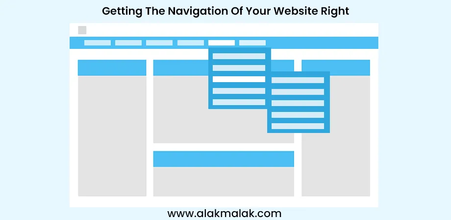
Ways For Getting The Navigation of Website Right
1. Understanding User Psychology
2. Mental Models
3. Microinteractions
4. Navigation Structures
5. Responsive Design
6. Accessibility
7. Mobile Apps
8. Information Architecture
9. Data-Driven Navigation
10. Clarity is King
11. Search Integration
12. Visual Hierarchy
13. Maintain Consistency
Tools & Resources
How Bellroy Streamlined Their Navigation for Higher Conversions
Optimizing Your Website’s Navigation: A Next Steps Guide
1. Understanding User Psychology
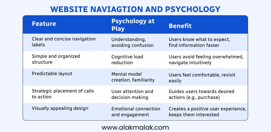
When it comes to website navigation, understanding how users think and behave is crucial. Your navigation menu needs to align with their expectations and mental models. People scan, not read, so leverage F-shaped patterns and attention spans to prioritize key elements.
Why It’s Important
Research shows that users spend just 2-4 seconds scanning a webpage before deciding whether to stay or leave. A confusing or counterintuitive navigation system is a surefire way to drive people away. By designing with user psychology in mind, you can create an intuitive experience that keeps visitors engaged.
How to Implement It
- Use clear, descriptive labels that match users’ vocabulary and understanding.
- Follow established conventions and patterns that users are already familiar with.
- Organize your navigation based on how users categorize information, not how your business sees it internally.
- Keep your navigation menu visible and consistent across all pages.
- Minimize clutter and distractions so users can focus on finding what they need.
- Leverage the F-shaped pattern of how users scan content by prioritizing important navigation at the top and left side.
- Design for short attention spans by using concise labels and grouping related items.
2. Mental Models
Mental models refer to the deeply ingrained thought patterns that guide how users expect to find and interact with information online. Your navigation needs to match these intuitive models.
How do users expect to find information? Organize navigation based on common mental models, not your internal site structure.
Why It’s Important
When site navigation aligns with users’ mental models, it reduces cognitive load and friction. If the paths to information are illogical or counterintuitive, users get frustrated and are more likely to abandon the site. According to a study, 88% of online visitors are less likely to return to a site after a poor user experience.
How to Implement It
- Research how your target users categorize and describe the information you offer.
- Use labels that match the language and terminology users already understand.
- Follow established navigation conventions like having global navigation at the top.
- Group navigation links based on common real-world associations, not your org structure.
- Test navigation prototypes with users to validate mental model fit.
3. Microinteractions

Microinteractions are small, delightful animations or effects that provide feedback and reinforce user actions. Subtle animations and hover effects can provide delightful user feedback and reinforce navigation cues.
Why It’s Important
In today’s digital world, users expect smooth, responsive interfaces. Microinteractions like hover effects and subtle animations add a spark to your navigation that enhances the overall experience.
More importantly, they provide crucial feedback that prevents user confusion. When an element animates or changes state, it immediately signals to the user that their action was recognized. This strengthens the intuitive connection between them and your interface.
How to Implement It
- Use hover effects like scaling or drop shadows on navigation links to indicate interactivity.
- Animate menu expansions with smooth transitions instead of abrupt changes.
- Provide state changes like highlights or underlines on the active navigation link.
- Keep animations small and focused – don’t let them distract from the core content.
- Ensure animations run at 60fps for a natural, delightful feel.
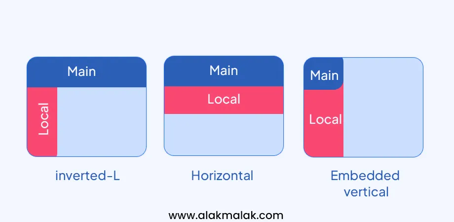
The classic horizontal navigation bar is just one approach. For larger, more complex sites, you need to explore different navigation structures. Go beyond the horizontal navbar. Explore mega menus, breadcrumbs, and progressive disclosure for complex sites.
Why It’s Important
As your website grows with more content and features, a simple horizontal menu can quickly become overwhelming or ineffective. The wrong navigation structure leads to a confusing user experience.
Studies show that websites with highly intuitive navigation have much higher success rates for desired user actions like purchases or lead conversions. The right navigation structure is critical.
How to Implement It
- Use mega menus to neatly organize links under main categories on content-heavy sites.
- Implement breadcrumb trails to reinforce the user’s current location within the site hierarchy.
- Apply progressive disclosure by revealing additional navigation options contextually as needed.
- For mobile, use a toggle menu and prioritize only the most important links.
- Test navigation options through user research like card sorting to align with mental models.
5. Responsive Design
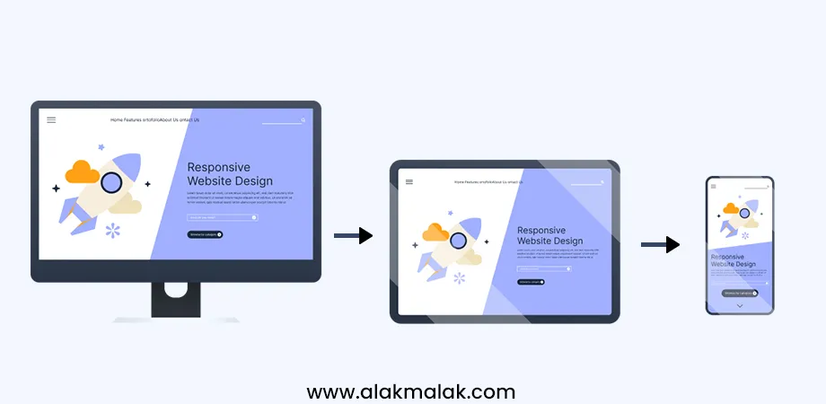
In today’s multi-device world, having a navigation system that adapts seamlessly to various screen sizes is no longer a bonus, it’s essential. Navigation that adapts seamlessly to various screen sizes is no longer a bonus, it’s essential. Utilize responsive frameworks and media queries for optimal user experience across devices.
Why It’s Important
With over half of web traffic now coming from mobile devices, providing a great experience on smaller screens is crucial. A navigation system that fails to adapt will lead to a frustrating, overcrowded interface that drives mobile users away.
Studies show that 57% of users won’t recommend a business with a poorly designed mobile site. Getting responsive navigation right directly impacts your bottom line.
How to Implement It
- Use a mobile-first responsive design approach when building your site’s navigation.
- Utilize a CSS framework like Bootstrap that has responsive navigation components built-in.
- On smaller screens, switch to a compact menu icon that reveals navigation options.
- Prioritize the most important links in mobile menus while allowing access to full navigation.
- Test your navigation extensively on real mobile devices during development.
6. Accessibility:
Creating an accessible website navigation is about enabling users of all abilities to access and navigate your content easily. WCAG compliance isn’t just a checkbox. Ensure keyboard navigation, screen reader compatibility, and clear language in your navigation for an inclusive web.
Why It’s Important
Over a billion people worldwide live with some form of disability that impacts how they use the web. An inaccessible navigation system excludes this sizable audience from your site.
Beyond being the right thing to do ethically, accessibility is also increasingly required by law in many regions. Non-compliance can lead to penalties and lawsuits.
Inclusive design benefits everyone – accessible navigation improves usability and reduces confusion across all user groups.
How to Implement It
- Ensure all navigation functions are keyboard operable without a mouse.
- Add ARIA roles and labels for screen reader compatibility.
- Provide text alternatives for icons/graphics used in navigation.
- Allow navigation via skip links for keyboard/assistive tech users.
- Use clear, descriptive link text instead of ambiguous labels.
- Allow adjustable text sizing and high contrast viewing modes.
7. Mobile Apps:
In the mobile era, apps have conditioned users to new navigation patterns like swipe gestures and hidden menus. How do users navigate their favorite apps? A mobile app development company understands these trends well. Borrow intuitive swipe gestures, hidden menus, and contextual navigation for a mobile-inspired website experience.
Why It’s Important
With over half of web traffic now coming from mobile devices, providing an app-like experience can increase engagement and ease of use. Users are already accustomed to the navigation paradigms pioneered by mobile apps.
Research shows that mobile users have higher expectations for fast, seamless browsing that feels native. Translating app navigation patterns to the web can make your site feel more responsive and intuitive.
How to Implement It
- Allow horizontal swiping to browse through categories, images or content sections.
- Use a hidden slide-out navigation panel revealed by tapping a menu icon.
- Implement context menus that surface relevant actions/navigation dynamically.
- Design “fat” buttons and navigation optimized for touch targets on smaller screens.
- Enable smooth scrolling between navigation transitions and content areas.
8. Information Architecture
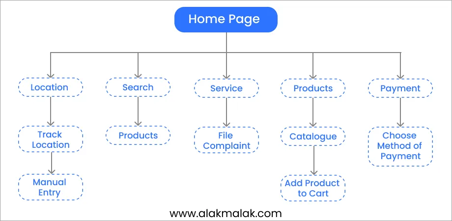
Your website’s navigation system is the map that guides users through your content. Draw inspiration from libraries and physical space organization. Group related content logically and create clear pathways for exploration.
Why It’s Important
Humans rely on familiar mental models to make sense of information. An illogical or haphazard navigation architecture will disorient users and lead to high bounce rates.
Research shows that sites with well-planned information architecture have up to 42% higher success rates for desired user goals like purchases or engagement. Getting this foundational structure right is critical.
How to Implement It
- Conduct open card sorting exercises to understand how users categorize your content.
- Group navigation links based on common real-world associations.
- Use clear labels that connect to your audience’s vocabulary.
- Implement nested navigation hierarchies to progressively disclose more options.
- Test navigation prototypes through treejack studies to validate findability.
Don’t just rely on assumptions when designing your website’s navigation. Use analytics to understand user behavior. A/B test different navigation layouts and menus to see what resonates best with your audience.
Why It’s Important
Designing navigation based solely on personal preferences or internal stakeholder opinions leads to suboptimal user experiences. What seems intuitive to you may utterly confuse your target users.
Research shows that data-driven design decisions produce navigation that achieves up to 57% better task success rates compared to conventional approaches. By letting real user data guide you, you eliminate guesswork.
How to Implement It
- Analyze engagement metrics like clicks, scrolls, and conversions on existing navigation.
- Use heatmaps and session recordings to identify confusing navigation pain points.
- Conduct A/B tests pitting different navigation variants against each other.
- Let quantitative data determine winning navigation that delivers the best results.
- Regularly audit analytics to spot areas for iterating and optimizing navigation further.
10. Clarity is King:
No matter how creative or innovative your website navigation is, clarity should always be the top priority. Use analytics to understand user behavior. A/B test different navigation layouts and menus to see what resonates best with your audience.
Why It’s Important
Website users have limited time and patience. If your navigation system isn’t immediately clear and intuitive, they’ll simply abandon your site.
Research indicates that the average user spends just 10-20 seconds on a webpage before deciding to stay or leave. Confusing navigation menus make that decision much easier – they leave.
How to Implement It
- Use clear, descriptive link labels that instantly convey meaning to users.
- Group related navigation links in a logical, predictable manner.
- Prioritize the most important pages/sections in top-level navigation.
- Eliminate redundant, unnecessary links that cause bloat and confusion.
- Conduct usability testing to identify areas of clarity that need improving.
11. Search Integration
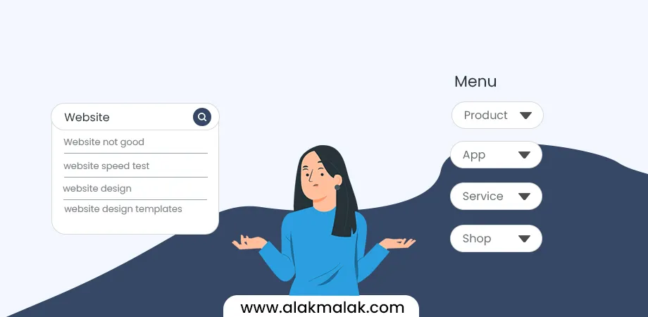
For large, content-heavy websites, navigation menus alone may not suffice. A powerful search bar can be a lifesaver for users with specific needs. Make it prominent and easy to find.
Why It’s Important
No matter how well you structure your site’s navigation, some users will still have trouble finding exactly what they want through browsing menus. This gets exponentially harder as your site’s scope grows.
Research shows that over 50% of website visitors immediately look for a search box when landing on a new site. Failing to provide an effective search experience leads to frustration and abandoned visits.
How to Implement It
- Place the search input box in a highly visible location in the header or top navigation.
- Use a descriptive yet concise label like “Search” or an icon plus placeholder text.
- Support partial word/phrase matching and autocomplete for faster query input.
- Make search results pages easy to scan with clear section headers.
- If possible, incorporate search filters and faceted navigation to narrow results.
12. Visual Hierarchy
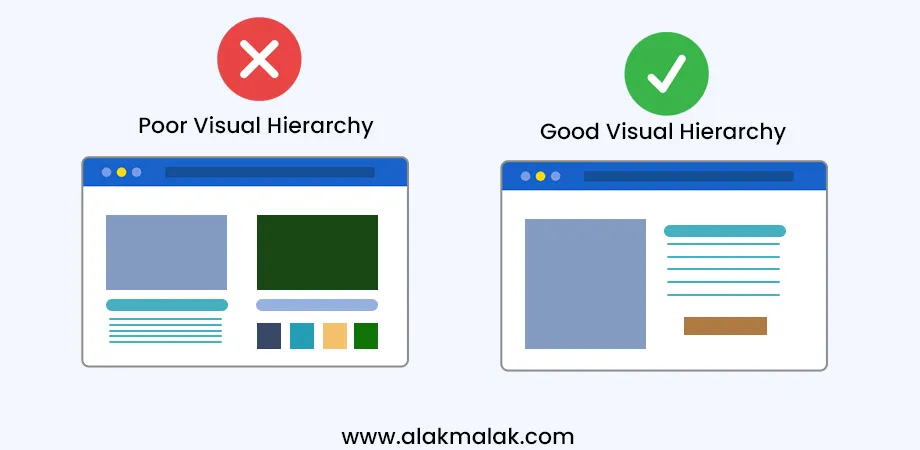
Navigation menus aren’t just lists of text links. A top website design company knows how to use design elements like size, color, and spacing to guide users towards the most important navigation elements.
Why It’s Important
With limited time and attention, users need clear visual cues that allow them to quickly scan and prioritize the navigation options most relevant to their goals.
Studies show that when navigational elements lack a defined hierarchy, users take 82% longer to accomplish tasks on a website. A cluttered, flat navigation taxes cognitive load and impedes efficient wayfinding.
How to Implement It
- Use contrasting colors, larger font sizes, and ample spacing to make top-level navigation stand out.
- Take advantage of the reader’s pattern for scanning content in an F-shaped pattern on pages.
- Rely on proximity, similarity and visual weight to group related navigation under logical parent headers.
- Use icons consistently alongside text labels for extra scannability.
- Avoid visual noise – simple styling allows the navigation architecture to shine.
13. Maintain Consistency:
Navigation should be consistent across all pages of your website. Don’t let users get lost in a maze.
Why It’s Important
Users rely on predictable patterns and wayfinding cues as they browse a website. Inconsistent navigation that varies wildly from page to page will disorient them and disrupt their flow.
Research shows that sites with inconsistent user interfaces have up to 32% higher abandonment rates. When users feel lost, they get frustrated and simply leave.
How to Implement It
- Define a consistent navigation architecture and stick to it across your entire site.
- Keep navigation menus in a persistent location that doesn’t change.
- Use the same link labels, icons, and styling for global navigation elements.
- Apply universal standards for interactive states like hover, active, etc.
- If sections require special navigation, supplement rather than replace the global system.
Tools & Resources
Website Navigation Testing Tools:
- OptimalSort (card sorting tool, $9/month)
- ChalkMark (heat mapping and user testing, free trial)
- Hotjar (heatmaps, session recordings, polls – free up to 1,000 pageviews/day)
WordPress Plugins for Navigation:
- UberMenu (mega menu builder, $25+)
- Nav Menu Roles (free, menu access by user role)
Further Reading:
- Navigation Design Pattern Examples (FREE ebook from UXPin)
- The UX of Navigation Elements (FREE from NN/Group)
By utilizing best practices, user testing tools, and helpful plugins/resources, you can craft an intuitive, user-friendly navigation that guides visitors through your website easily. Don’t overlook this critical UX element!
Bellroy is a popular maker of slim wallets, purses, and other leather goods. While their products were beloved, their website suffered from a confusing and overcrowded navigation structure.
As their product lineup expanded over the years, the main navigation bar became a mess of vague category labels like “Wallets & Folios” and “Bags & Backpacks.” It was never clear exactly what types of items would be found under each category.
Customers struggled to find what they wanted, often resorting to the search bar out of frustration. Analysis showed high exit rates from categories like “Cases” where people expected to find phone cases but instead landed on laptop sleeves and travel cases.
Bellroy knew their navigation woes were hindering sales, so they decided an overhaul was needed. Here’s what they did:
The Navigation Reboot
- Conducted user testing to see how people categorize and search for their products
- Based on insights, reorganized products into clear categories like “Wallets,” “Bags,” “Phone Cases” etc.
- Streamlined the main nav to only list out these specific product categories
- Implemented filtered navigation for attributes like material, size, gender
- A/B tested the new nav and saw a 12% increase in clickthrough rate
The Results
Within a month of launching the revamped navigation, Bellroy saw:
- 25% increase in new user conversion rates
- 35% reduction in unwanted exit rates from top categories
- 10% increase in average order value as cross-sells improved
As Bellroy’s VP of ecommerceput it: “The new nav allowed our awesome products to finally shine through and be discovered easily by customers.”
Key Takeaways
- Your nav should map to how customers think about and search for your offerings
- Don’t over-generalize or hide products in ambiguous categories
- Leverage filtered navigation for narrowing choices when needed
- Let data and user testing guide your navigation restructuring
With a streamlined, intuitive navigation system in place, Bellroy was able to remove huge usability barriers on their site. This led to more engaged shoppers, higher conversions, and ultimately more revenue.
In this blog post, we covered the importance of having an intuitive, user-friendly navigation system for your website. We looked at navigation best practices, useful tools and resources, and real-world case studies that highlight the impact of good navigation design.
The main takeaways are:
- Keep your main navigation menu simple and limited to around 5-7 categories
- Use clear labels that match how your users think about your offerings
- Implement mega menus, filters, and other tools to improve findability
- Let data from user testing, analytics, and customer research inform your nav structure
- Continuously optimize and test your navigation over time
If your website’s current navigation is confusing, cluttered, or under-performing, now is the time to take action.
Your Next Move: Audit and Improve Your Site’s Navigation
First, analyze your existing navigation using tools like heat maps, analytics, user testing, etc. Identify any areas of confusion or drop-off.
Then, devise an improved navigation architecture based on best practices, testing insights, and solid information architecture principles.
Once you’ve mapped out a better nav structure, build it out through your CMS or with a plugin/tool like WordPress’ UberMenu. Don’t forget to optimize for mobile too!
Finally, A/B test or measure the impact of your new navigation through metrics like engagement, conversions, bounce rates and more.
Need Help Revamping Your Website’s Navigation?
If optimizing your site’s navigation seems daunting, our team of UX designers and web developers can help. We’ll work with you to thoroughly understand your users, products/services, and goals in order to craft an intuitive, high-converting website experience.
Reach out today to learn more about our web design process and request a free consultation!
- e-commerce website
- Navigation Nightmare
- navigation of your website

