Summary – How To Make A Website ADA Compliant
Why it matters – Non-compliance risks lawsuits, lost leads, poor SEO, and bad reputation. Common mistakes – Issues like poor navigation, missing captions, bad contrast, and inaccessible forms. Quick fixes don’t work – Plugins alone can’t fully make a website ADA compliant. Proven approach – Run a full ADA audit, fix issues, and monitor continuously. Big benefits – Better user experience, higher search rankings, more reach, and lawsuit protection. Practical steps – Improve navigation, design with contrast, add alt text & captions, and use simple content.
You know that sinking feeling when you realize your website isn’t ADA-compliant? It’s not just a tiny blip on the radar; it’s a full-blown storm cloud looming over your business. Imagine the frustration of finding out you’ve missed out on potential leads because they couldn’t access your site. Imagine the panic setting in when a lawsuit lands on your desk because you didn’t make a website ADA compliant. Imagine how your reputation might take a hit, especially when customers gripe on social media. Let’s not forget those search engine rankings plummeting like a rock. It’s a nightmare, folks.
The Top 10 Surprising Reasons Why You’re Struggling
It’s not what you think. No, it’s not just about fonts and colors. The real culprit? A lack of awareness about the depth of ADA compliance. Most business owners think installing a plugin or adding alternative text to images is as simple as installing a plugin. They don’t realize that the true complexity lies in the intricate layers:
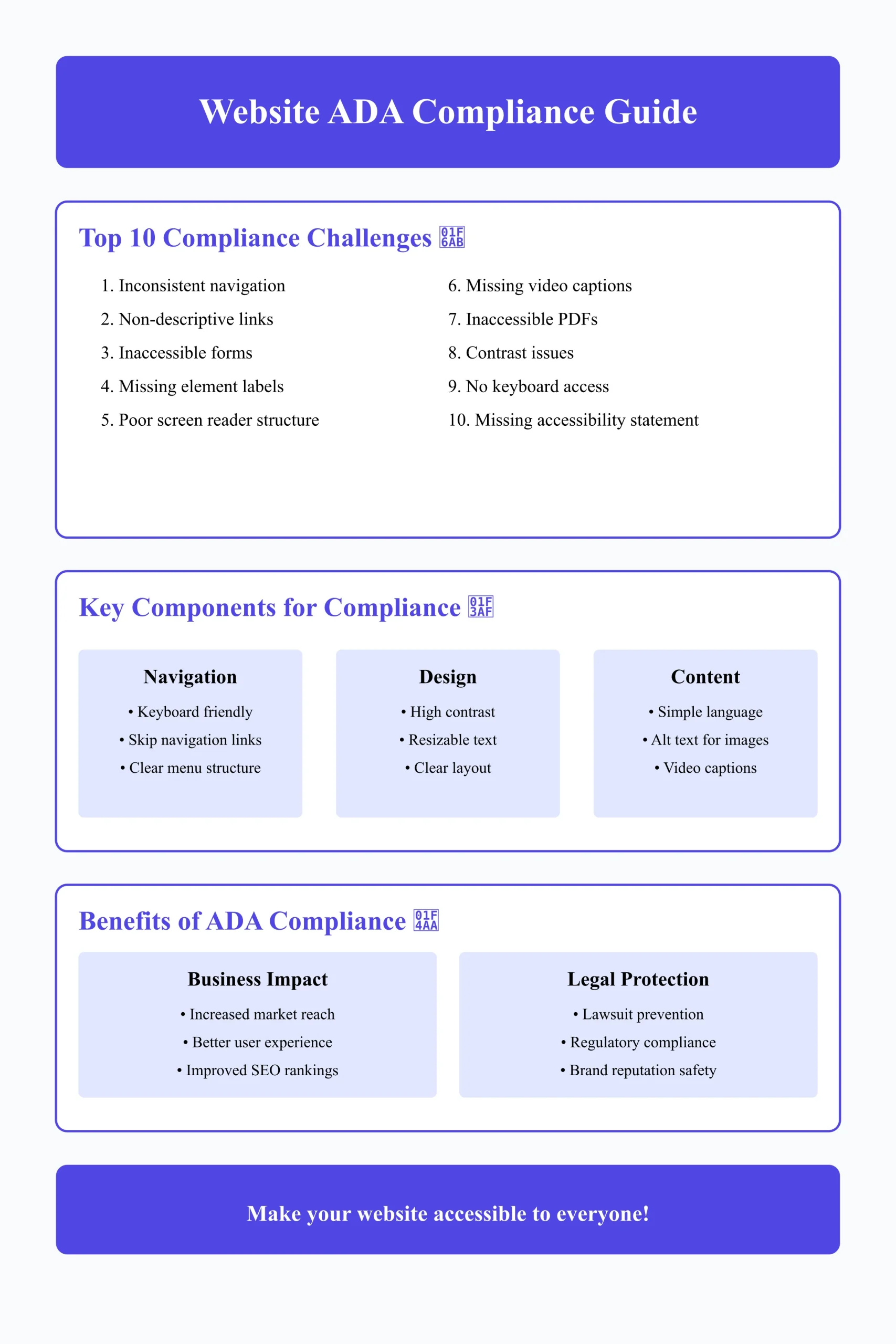
1. Inconsistent website navigation
2. Non-descriptive link texts
3. Inaccessible forms
4. Missing or inappropriate labels on elements
5. Content not structured for screen readers
6. Videos lacking proper captions
7. Inaccessible PDFs
8. Colors and contrast issues
9. Lack of keyboard accessibility
10. Absence of a clear accessibility statement
The Pitfall of Quick Fixes
Your go-to solutions? Plugins, templates, and quick checklists. But guess what? They don’t tackle the root issue. They may only offer a surface-level fix that could backfire, landing you in even deeper trouble.
The New, Superior Way
But here’s the kicker: There is a way out. Take a cue from businesses like Apple and Microsoft, leading the charge with stellar accessibility features. They went the extra mile and engaged in comprehensive ADA audits. This approach focuses on eliminating every barrier to create an all-inclusive user experience.
What’s the Path Forward?
1. Conduct an ADA website audit.
2. Implement the changes based on the audit.
3. Monitor continuously.
The End Game
Imagine the sense of relief, knowing your website is a fortress against lawsuits. Think of the credibility boost as you announce your ADA compliance. Picture yourself skyrocketing the search rankings and enjoying a flood of leads without barriers to engaging with your brand.
What Is ADA Compliance?
ADA compliance is a framework that aligns your website with the Americans with Disabilities Act (ADA), a law designed to prevent discrimination based on disabilities. This isn’t just a requirement for physical spaces; it also extends to the digital realm, covering sectors from education and public transportation to banking and tech services.
Ensuring that your website is ADA-compliant involves integrating a variety of accessibility features, making sure every visitor can navigate and interact with your site effectively. This aligns with the ADA Standards for Accessible Design, which aim to level the playing field and offer equal opportunities to everyone.
ADA Compliance vs. Section 508 & Web Content Accessibility Guidelines (WCAG)
You might get lost in a sea of acronyms like ADA, WCAG, and Section 508 regarding website compliance. Confusing, right? Don’t sweat it; we’ll break it all down for you.
1. ADA (Americans with Disabilities Act)
The ADA is a groundbreaking civil rights legislation to eliminate discrimination against individuals with disabilities. While the original law didn’t directly mention custom websites, recent court rulings have interpreted it to extend to digital spaces. If your website isn’t accessible to everyone, you could find yourself in legal hot water. So, ADA isn’t just about ramps and elevators anymore; it’s also about making your website usable by everyone, disabled or not.
2. Section 508
Unlike ADA, Section 508 is laser-focused on digital accessibility, but there’s a catch: it’s specifically tailored for federal agencies. If you’re doing business with the U.S. government as a contractor or a vendor, your digital assets, including your website, must be accessible to all. This means your site has to be as easy to navigate for someone with visual elements or auditory impairments as it is for someone without.
3. WCAG (Web Content Accessibility Guidelines)
Think of WCAG as the rulebook for making an inclusive website. Created by experts in the field, these guidelines lay down the law on everything from color contrast and font sizes to interactive elements and multimedia. While WCAG guidelines are not legally binding, they’re globally accepted as the gold standard for website accessibility. Adhering to them can also help you dodge ADA-related lawsuits and fines.
Do You Want Your Own Business Website?
Elevate your online business with Alakmalak Technologies’ exceptional website developers! Experience top-tier website development tailored to your budget.
Is ADA Compliance Mandatory For Websites?
While ADA compliance is non-negotiable for local and state government sites, its mandate for business websites is a bit more nuanced. The ADA doesn’t explicitly mention business websites, but don’t be fooled; lawsuits have targeted companies with inaccessible websites. So, not being ADA-compliant isn’t just an ethical miss; it’s a legal gamble.
Besides dodging legal bullets, there’s another upside to making your website ADA-compliant: expanding your audience. Without ADA compliance, you’re essentially locking out a portion of potential customers, limiting your reach and, by extension, your profits. So ADA compliance issues aren’t just about dodging fines; it’s about casting a wider net and being inclusive to all.
Why Is ADA Compliance Important For Your Website?
Apart from dodging legal headaches, there are many game-changing reasons to get your website ADA-compliant. Trust me, it’s more than just following the rulebook.
1. Increases Your Reach & Lead Generation
Having an ADA-compliant website isn’t just the right thing to do; it’s good for business. We’re talking about unlocking a market of millions of people who, because of accessibility issues, might not otherwise be able to engage with your content. By making your website accessible, you’re opening up a new avenue for potential customers, and that’s like striking gold in digital marketing.
2. Improves Your User Experience
You might think ADA compliance is about helping those with disabilities, but the ripple effect is much broader. Making your site more accessible enhances the UX design for everyone. As a UI/UX design company in India, we understand that easy navigation, readable fonts, and intuitive design aren’t just “nice-to-haves”; they’re essentials that benefit all users, period.
3. Improves Your SEO Strategy
Here’s a juicy tidbit: Search engines are smitten with accessible websites. Google’s algorithm, for example, rewards sites that are easy to navigate and understand—traits common to ADA-compliant sites. This translates to better rankings, more visibility, and, in turn, more leads. So, ADA compliance isn’t just a legal safeguard; it’s an SEO(search engine optimization) booster, too.
Helps Prevent ADA-Related Lawsuits
Last, let’s talk about the elephant in the room—lawsuits. Non-compliance isn’t just an oversight; it’s a direct ticket to legal troubles. ADA-related lawsuits can be financially crippling and can tarnish your brand’s reputation. Being ADA-compliant is your safety net, your “get-out-of-jail-free card,” if you will.
How To Make A Website ADA Compliant
Whether you’re jazzing up an existing website or partnering with the best website development company for a brand-new venture, now is the perfect time to ensure it’s ADA-compliant. This isn’t just legalese; it’s about ensuring that everyone can engage with your brand, regardless of their physical or cognitive abilities. We’ve prepared a comprehensive guide to assist you in transforming your website into a welcoming space for individuals facing motor, visual, cognitive, or hearing challenges.
Kick things off by ensuring your website navigation can be fully explored with just a keyboard. Yep, you heard that right—every click, every scroll, every feature. Add ‘skip navigation’ links and tweak your menu so it’s ADA-compliant. It’s not just the polite thing to do; it’s what’s expected.
2. Design
Next up, let’s talk color schemes. You want high contrast between text and background. Think black text on a white backdrop. No more squinting! Also, opt for resizable text so everyone can read your content without busting out a magnifying glass.
3. Content
Last but not least, keep your language simple and to the point. Nobody’s got time for jargon. Make every video, image, and piece of media accessible. Add alt text for your images and captions for your videos. It’s the digital equivalent of rolling out a welcome mat for everyone.
Conclusion:
Making your website, ADA-compliant might feel like scaling Everest at first, but trust me, it’s not just about avoiding legal quagmires or ticking boxes. It’s about opening your digital doors to everyone and, in the process, becoming a brand that stands for inclusivity and equal access. From keyboard-only navigation to high-contrast design and jargon-free content, these aren’t just ‘nice-to-haves,’ they’re must-haves. And the best part? It’s not just your brand that benefits; your users do, too, no matter their physical or cognitive abilities.
Ready to make your website fully ADA-compliant but unsure where to start? We’re experts in web accessibility, and we’re here to help. Contact us today, and let’s make the Internet a more inclusive place, one website at a time.

 By: Rushik Shah


