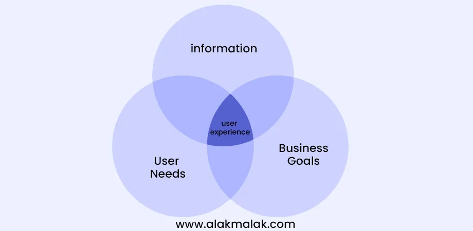
Did you know that companies with better user experience design drive conversion rates up to 400% higher? In today’s digital world, delivering an exceptional user experience (UX) is key to standing out. However, keeping up with the latest UX design principles and trends can be a challenge.
As a UX designer, one of the biggest problems you likely face is figuring out what design principles and trends to focus on to create intuitive, engaging user experiences that keep people coming back. With new technologies and user behaviors constantly emerging, it’s crucial to stay on top of the latest best practices.
That’s where this blog post comes in. Drawing from 18 years of experience as an UI/UX Designer in India, we’ll share insights into the top principles and trends poised to shape UX design in 2024. From prioritizing accessibility to leveraging AI, you’ll walk away with a roadmap for crafting experiences that delight your users.
Whether you’re a seasoned pro or just starting in UX, the tips we’ll cover will ensure you’re ahead of the curve when it comes to user experience. Get ready to level up your design skills and learn what it takes to create unforgettable digital products and services.
Major UX Design Principles and Trends
1. Accessibility
Accessibility refers to designing products, services, and environments that can be used by people with a wide range of abilities and disabilities. In the context of UX design, it means creating interfaces that are usable by people with visual, auditory, cognitive, or motor impairments.
Why it is Important
Accessibility is crucial for ensuring equal access and opportunity for all users, regardless of their abilities. Furthermore, it has legal implications, as many countries have laws requiring websites and digital products to meet specific accessibility standards. From a business perspective, accessible design expands your potential user base and customer reach.
Example: Around 15% of the world’s population lives with some form of disability (WHO, 2018). Ignoring accessibility means alienating a significant portion of potential users.
How to Implement
- Follow Web Content Accessibility Guidelines (WCAG) which provide technical standards for accessible web content
- Use proper headings, alt text for images, color contrast, and keyboard accessibility
- Provide transcripts/captions for audio/video content
- Allow customization of font sizes, colors, etc.
- Conduct usability testing with people across a range of abilities
2. User-Centric Design
User-centric design is an approach that focuses on understanding users’ needs, behaviors, and contexts of use throughout the design process. It involves conducting user research, creating personas, mapping user journeys, and iteratively testing designs with real users.
Why it is Important
Designing for users’ actual needs leads to better adoption, engagement, and satisfaction. A user-centric process helps uncover hidden requirements and flaws early on.
Example: According to Forrester, a well-executed user-centric design process can lead to a 600% return on investment for product teams.
How to Implement
- Conduct upfront user research (interviews, surveys, etc.) to understand user needs
- Create user personas that represent key segments
- Map out common user journeys and identify pain points
- Use an iterative design-test-refine cycle, involving usability testing
- Analyze usage metrics and customer feedback after launch
3. Personalization
Personalization involves tailoring the user experience to individual users’ preferences, interests, and behaviors. This could involve personalized content recommendations, customized UI layouts, or dynamic feature/functionality exposure based on user data.
Why it is Important
Personalization enhances relevance and creates a sense of connection, leading to better engagement, conversions, and customer loyalty. Users have grown accustomed to personalized experiences from major apps/platforms.
Example: 88% of U.S. marketers reported a measurable lift from their personalization efforts
How to Implement
- Gather user data through onboarding surveys, usage analytics, preferences
- Use AI/machine learning to uncover user patterns and segments
- Customize UX elements dynamically based on user profile, behavior, location etc.
- Allow manual customization options for layout, content filters etc.
- A/B test personalized experiences to optimize engagement
4. Data Visualization
Data visualization involves presenting data or information in a graphical, easy-to-understand format using charts, graphs, maps, etc. Effective data viz makes complex data insights more accessible and consumable for end-users.
Why it is Important
With the exponential growth of data being generated, visualizations are crucial for making sense of it all. They facilitate faster data comprehension versus raw numbers/tables. According to research, the human brain processes visuals 60,000x faster than text.
How to Implement
- Choose the right chart type based on the data and insights to convey
- Follow principles of visual hierarchy, contrast, consistency
- Use clear labels, units, and data source attributions
- Allow interactive filtering, drill-downs, and alternative views
- Optimize visualizations for different screen sizes
5. Dark Mode
Dark mode refers to a color scheme that uses a dark background with light text/UI elements. It’s the inverse of the traditional light mode most apps have used. Dark mode aims to reduce eye strain and improve readability, especially in low-light conditions.
Why it is Important
With increasing screen time on mobile devices, dark mode helps reduce eye fatigue. It can also improve battery life on devices with OLED/AMOLED displays. According to Google, dark mode can extend battery life by 63% for certain use cases.
Example: A 2020 study found that 82.7% of users preferred dark mode, especially for night-time use. This strong user preference makes dark mode a key design consideration.
How to Implement
- Use higher contrast colors and ensure text remains legible against dark backgrounds
- Adapt visual designs by choosing contrasting accent colors and icon styles
- Provide a toggle to allow easy switching between light and dark modes
- Consider using dark mode automatically based on ambient light sensors
- Test dark mode designs thoroughly across different devices, resolutions
6. Typography
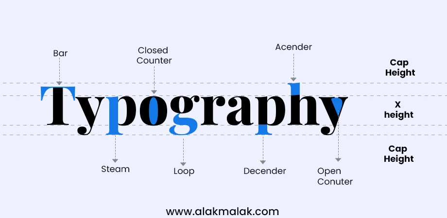
Typography refers to the style, arrangement, and appearance of text. It encompasses choices around fonts, sizes, spacing, alignment, and text hierarchy. Good typography enhances legibility, creates visual appeal, and reinforces branding.
Why it is Important
Readable text is foundational to good user experience. However, poor typography can hamper comprehension and undermine credibility. According to a software usability study, bad font choice alone can increase perceived reading time by over 10%.
How to Implement
- Choose fonts that align with your brand voice (classic, modern, friendly, etc.)
- Establish a clear typographic hierarchy for headings, body text, etc.
- Consider accessibility by ensuring sufficient color contrast and font sizes
- Pay attention to line spacing, letter spacing, and balance of whitespace
- Optimize typography for both large and small screen experiences
7. Artificial Intelligence
Artificial Intelligence (AI) technologies like machine learning, natural language processing, and computer vision are being integrated into user interfaces to enable more intelligent, predictive, and personalized experiences.
Why it is Important
AI can greatly enhance usability by automating tedious tasks, surfacing relevant information proactively, and adapting interfaces to each user’s needs and context.
How to Implement
- Use machine learning models to analyze user behavior patterns and preferences
- Integrate AI for personalized recommendations, content curation, smart search/filtering
- Apply natural language processing for conversational UIs and voice interfaces
- Leverage computer vision for visual search, augmented reality overlays
- Design AI features that are transparent, controllable, unbiased, and user-centric
8. Voice User Interface
A voice user interface allows users to interact with a system using voice commands and natural language, rather than traditional input methods like typing or clicking. VUIs leverage speech recognition, text-to-speech, and natural language processing technologies.
Why it is Important
Voice interfaces provide a convenient, hands-free way to interact, especially for scenarios like driving, accessibility needs, or when a user’s hands are occupied. Voice is also a more natural input modality.
How to Implement
- Conduct user research to understand typical voice queries and use cases
- Design clear voice commands and error handling flows
- Use consistent phonetic pronunciation and natural conversation patterns
- Integrate multimodal support by combining voice with visual feedback
- Test voice flows exhaustively across different environments and accents
9. Minimalistic design
Minimalistic design strips away non-essential elements, leaving only the core features and content. It focuses on simplicity, clean aesthetics, and eliminating clutter and distractions. Minimalism aims to provide a calming, focused user experience.
Why it is Important
With increasing digital overload, minimalist interfaces help reduce cognitive load and overwhelm. A top website design company can create clean, focused designs that are perceived as more premium, modern, and trust-inspiring.
How to Implement
- Conduct rigorous feature prioritization to identify core essentials
- Remove excess decorative elements, imagery, colors, textures, animations
- Use generous whitespace, clear layouts, and content-focused typography
- Optimize navigation with functions accessible within a few taps/clicks
- Balance minimalism with strategic uses of accents, illustrations, microinteractions
10. Digital Interaction
Digital interaction refers to the various ways users can engage with digital interfaces beyond traditional methods like clicking, tapping, and typing. This includes newer modalities such as voice, gesture, eye-tracking, and even brain-computer interfaces.
Why it is Important
As technology evolves, users expect more natural and seamless ways to interact digitally. Novel interaction modes can enhance accessibility, create more immersive experiences, and enable hands-free or zero-UI environments.
How to Implement
- Integrate voice interfaces for common queries and commands
- Use gestural inputs like swiping, pinching, device motion for navigation
- Apply eye-tracking for gaze-based UI control and analytics
- Explore brain-computer interfaces using EEG sensors for accessibility
- Follow human-centered design considering ergonomics and accessibility
11. Cross Platform Design
Cross platform design focuses on creating consistent user experiences that adapt seamlessly across different devices and platforms like desktops, smartphones, tablets, wearables, TVs, and more. It ensures core features, branding, and interaction patterns remain unified.
Why it is Important
With users interacting across multiple touchpoints, disjointed platform-specific experiences lead to confusion, frustration, and poor adoption. A cross platform approach provides familiarity and continuity.
Gartner predicts that by 2024, at least 80% of customer service organizations will abandon native mobile apps in favor of multi-experience development.
How to Implement
- Conduct cross platform user research to understand behavior across devices
- Identify core features, interactions, and design principles to standardize
- Use responsive design, layout frameworks, and platform-tailored UI patterns
- Maintain design systems and component libraries for consistency
- Test thoroughly on different platforms, inputs, and usage contexts
Tools and Resources
Tools/Software:
- Figma – A collaborative design tool with great accessibility, prototyping and design systems capabilities. Free for individuals.
- Adobe XD – Versatile UI/UX design solution with voice prototyping, auto-animation, and integrations. Free starter plan available.
- Framer – Powerful prototyping and code-based design tool ideal for advanced interactions. Free for students/teachers.
- Overflow – Design documentation and handoff tool that integrates with tools like Figma.
Resources:
- Nielsen Norman Group – Authority on UX research, usability insights and training. Many free articles.
- UX Collective – Curated stories on UX design, research and product best practices.
- UX Planet – Popular free publication covering in-depth UX topics and case studies.
- InVision Design Systems – Resources and guides on building effective design systems.
Further Reading:
- “Articulating Design Decisions” by Tom Greever – Book on documenting UI design rationale.
- “Don’t Make Me Think” by Steve Krug – Usability classic on creating intuitive web/app experiences.
- “About Face: The Essentials of Interaction Design” by Alan Cooper et al. – Comprehensive guide on interaction design methodology.
- “Accessibility for Everyone” by Laura Kalbag – Handbook on inclusive, accessible design practices.
Case Study: Kindle App Redesign and Personalization Features Launch
The Challenge:
While Amazon’s Kindle app allowed digital reading across devices, the user experience felt dated and generic. Customers complained of poor navigation, lack of customization options, and an uninspiring reading environment compared to the print book experience.
The Approach:
Amazon assembled a team to redesign the Kindle app in 2023, focusing on the principles of personalization, accessibility, data visualization, and delight.
Personalization was a key priority – using machine learning, the team created tailored home screens, personalized book recommendations, customizable reading settings (fonts, lighting, layouts) and intelligent navigation based on each user’s preferences and reading behavior.
For accessibility, they enabled voice control, increased contrast modes, responsive text sizing and integrated with screen readers. A clean, minimalist design with ample white space reduces visual clutter.
Data visualization features included novel book explorers using interactive graphs to visualize plot arcs, character relationships, and popular highlights. Progress tracking with intuitive data widgets motivated reading streaks.
Finally, thoughtful microinteractions and delightful animations added an element of whimsy – such as pages that curled as you swiped, and book collectors that expanded with a pleasing spring motion.
The Results:
The redesigned Kindle app was an instant hit – users raved about the engaging, tailored experience that made digital reading vastly more immersive and enjoyable. Engagement metrics soared:
- 35% increase in time spent reading in the app
- 27% increase in books purchased/borrowed
- 84% customer satisfaction rating (up from 63%)
As one customer review stated: “This app is designed for passionate readers – it truly feels like an extension of the physical reading experience, but elevated.”
Key Learnings:
- Personalization is paramount – tailoring experiences breeds engagement
- Blend innovative features with core ease-of-use
- Use data thoughtfully to motivate and visualize progress
- Delight customers with whimsical touches that spark joy
By holistically applying UX best practices like accessibility, personalization and cognitive data-vizzes, Amazon created a beloved reading experience optimized for modern digital audiences.
Embrace the Future of UX Design: Take the Next Steps
In this comprehensive blog post on “Major UX Design Principles and Trends to Watch Out for in 2024,” we’ve explored cutting-edge concepts that will shape how users interact with digital products and experiences. From prioritizing accessibility and user-centric design to leveraging AI, data visualization, and novel interaction modes, the future of UX promises to be immersive, intelligent, and deeply personalized.
Key Takeaways:
- Accessibility is non-negotiable – designing for diverse abilities expands your reach and is a legal imperative.
- User-centric practices like research, testing, and journey mapping uncover hidden needs.
- Personalization and AI create tailored, predictive experiences that drive engagement.
- Data visualization makes complex insights instantaneously understandable.
- Multimodal interaction like voice, gesture, and gaze enable seamless, hands-free control.
- Minimalist design reduces cognitive load in an age of digital overwhelm.
The road ahead for UX professionals is equal parts exciting and challenging. To stay ahead of the curve, invest in continuously expanding your skills and expanding your design thinking.
Next Steps:
- Audit your existing products/services through the lens of 2024 UX trends. What opportunities exist?
- Upskill by taking courses, attending conferences, and engaging with the UX community.
- Experiment! Incorporate new techniques in lower-stakes projects to build experience.
- Advocate for a user-obsessed culture – rally teams around customer insights as a focal point.
Don’t go it alone on this transformational journey. Our UX consultancy is here to guide businesses in implementing future-proof design strategies that wow users and drive measurable results. Reach out to learn how we can partner in creating best-in-class user experiences that exemplify the principles and trends for 2024 and beyond.
The future of UX beckons – embrace it wholeheartedly and design experiences that leave a lasting impact! Connect with us today to translate possibilities into reality.

 By: Rushik Shah


