 By: Rushik Shah
Did you know that 88% of online consumers are less likely to return to a website after a bad user experience? In today’s digital age, having a website is no longer just a luxury; it’s a necessity for businesses of all sizes. However, simply having a website isn’t enough – it needs to be well-designed, user-friendly, and optimized for success.
If you’re struggling to create a website that resonates with your target audience and drives conversions, you’re not alone. Many business owners and marketers find themselves lost in the sea of website design and development, unsure of what elements to prioritize.
That’s where this blog post comes in. We’ll unveil a comprehensive checklist of 12 critical things a website must have as a minimum, empowering you to create a website that not only looks great but also delivers an exceptional user experience.
As a leading web development company in India, with 18 years of web development experience and a portfolio of over 3,000 high-performing websites, we’ve mastered the art of creating websites that captivate audiences and drive tangible results. Our expertise and proven track record ensure that the solutions we offer are tried, tested, and tailored to your specific needs.
So, whether you’re building a website from scratch or revamping an existing one, this blog post is your go-to resource for ensuring your website has all the essential elements to succeed in today’s competitive online landscape.
12 Critical Things a Website Should Have

Check out these 12 things a website should have as a minimum:
1. Clear, easy-to-understand homepage elements
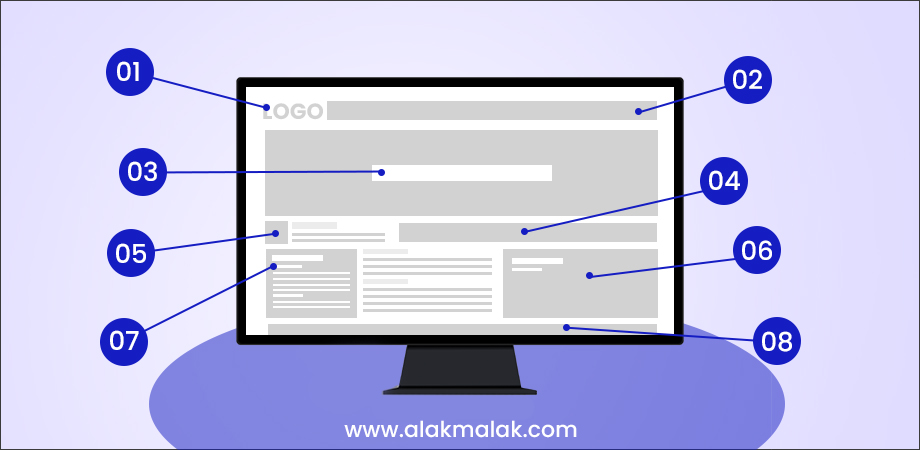
First impressions matter. In the digital world, your website’s homepage is often the first touchpoint for potential customers. A recent Stanford University study**[Insert Link to Stanford Study]** found that users form an opinion about a website in just 50 milliseconds, emphasizing the importance of a clear, well-designed homepage that effectively communicates your value proposition.
So, what exactly makes a homepage successful? Let’s break down some key elements that will grab attention, keep visitors engaged, and ultimately, achieve your website’s goals.
1. Value Proposition: What Makes You Unique?
In a crowded online landscape, it’s crucial to quickly convey what sets your business apart. Your homepage should answer the visitor’s question: “Why should I care?”. A strong value proposition is a concise statement that highlights the benefits you offer and the problems you solve for your target audience.
Example: An e-commerce store selling handcrafted furniture might showcase a value proposition like “Unique, sustainably sourced furniture pieces to elevate your home decor.”
2. Compelling Visuals: Show, Don’t Tell
High-quality visuals are powerful tools for grabbing attention and leaving a lasting impression. Use captivating images, videos, or graphics that are relevant to your brand and resonate with your target audience.
Example: A restaurant’s homepage might feature mouth-watering food photography alongside inviting images of their dining space.
3. Clear and Concise Messaging: Speak Your Audience’s Language
Avoid technical jargon and overly complex sentences. Use clear, concise language that your target audience can easily understand. Focus on the benefits you offer and how your product or service can improve their lives.
Example: A financial planning service might use straightforward messaging like “Simplify your financial future. Get started with a free consultation today!”
4. Call to Action: Tell Visitors What to Do Next
Don’t leave visitors guessing about what you want them to do next. Include a clear call to action (CTA) that encourages them to take the desired action, whether it’s subscribing to your newsletter, making a purchase, or contacting you for more information.
Example: A prominent “Shop Now” button on an e-commerce homepage or a clear “Contact Us” form with a CTA like “Get Your Free Quote” are effective ways to guide visitors.
Examples of Homepage Success:
Apple: Apple’s homepage is known for its minimalist design, stunning product photography, and simple navigation. They focus on showcasing their latest products with clear CTAs to “Learn More” or “Buy Now.”
2. Easy-to-remember domain name
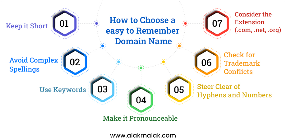
Your website’s domain name is like its online address or identity. It’s one of the first things people see and remember about your website. A catchy, easy-to-remember domain name can make a big difference in how memorable and recognizable your online presence is. It’s like having a simple, catchy business name that sticks in people’s minds.
Studies have shown that a good domain name can greatly impact how trustworthy and credible people perceive your website to be. For example, a Verisign study found that 68% of online consumers trust a website more when it has a meaningful, relevant domain name that matches the company’s name or industry.
Tips for choosing a suitable domain name:
- Keep it short and simple: Shorter domain names are easier to remember and type correctly.
- Make it relevant: Choose a domain that relates to your business name, products, or services.
- Use simple words: Avoid complex words or abbreviations that are hard to spell or pronounce.
- Consider keywords: If possible, include relevant keywords that describe your business or industry.
- Check availability: Make sure the domain name is available and not already claimed by someone else.
- Stick to .com: While there are many domain extensions, .com is still the most widely recognized and trusted.
Having an easy-to-remember, relevant domain name can make it much simpler for people to find and recall your website. It’s an important first step in creating a strong, recognizable online presence for your business.
3. Add Business Reviews and Testimonials
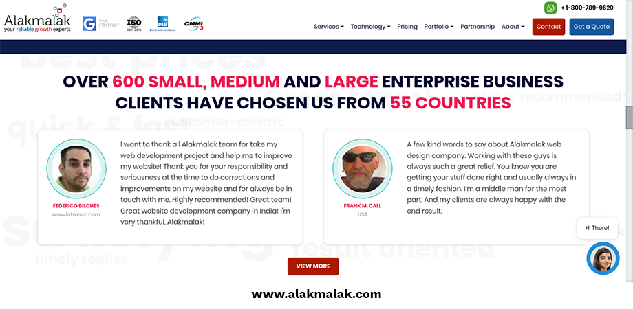
In today’s digital age, potential customers heavily rely on online reviews and testimonials to help them make informed decisions about which businesses to choose. Adding genuine reviews and testimonials to your website is a powerful way to build trust and credibility with your audience.
Importance of social proof and customer reviews in building trust
Reviews and testimonials act as “social proof” – they show that real people have had positive experiences with your products or services. This third-party validation can greatly influence a visitor’s perception of your business’s trustworthiness and quality.
Research shows just how much impact reviews can have. A BrightLocal survey found that 88% of consumers trust online reviews as much as personal recommendations from friends or family. Meanwhile, a Podium study revealed that 93% of consumers say online reviews impact their purchasing decisions.
Best practices for displaying reviews and testimonials effectively:
- Showcase reviews on prominent pages like your homepage or service pages.
- Use authentic reviews from verified customers, including names/photos.
- If using excerpts, provide links to read the full reviews.
- Highlight impressive statistics or quotes that speak to your strengths.
- Mix video testimonials along with written reviews for more impact.
- Regularly update your reviews section with fresh customer feedback.
Adding customer reviews and positive testimonials provides that critical “social proof” that can make or break a visitor’s decision to use your services. Displayed properly, they build trust and credibility.
4. Calls to action – Visible

Call-to-action (CTA) buttons are a vital element on your website that encourage visitors to take specific actions you want, like making a purchase, signing up for a newsletter, or contacting your business. Well-designed CTAs act as a catalyst, guiding users through your website and driving conversions.
How to Make Your CTAs Shine
- Be Clear and Concise: People shouldn’t have to guess what you want them to do. Use short, action-oriented verbs like “Download Now,” “Learn More,” or “Shop Now.”
- Stand Out Visually: Make your CTAs visually distinct from the rest of your website. Use contrasting colors, clear buttons, or unique shapes to grab attention.
- Place Them Strategically: Put your CTAs where visitors are most likely to take action. For example, a “Sign Up for Free Trial” button at the end of a blog post or a “Buy Now” button next to a product description are prime placements.
- Highlight the Benefits: Don’t just tell users what to do, tell them why they should do it. Use CTAs that emphasize the benefits of taking action, such as “Get Started Today and Save 10%!”
Studies show that clear and compelling CTAs can significantly increase conversions on your website. For instance, a Hubspot study found that adding a CTA button to a landing page can boost conversions by up to 47%.
Examples in Action:
- E-commerce website: A prominent “Add to Cart” button next to each product and a clear “Checkout Now” button on the shopping cart page.
- Service-based website: A bold “Get a Free Quote” button on the homepage and a “Contact Us Today” CTA at the end of each service description page.
By incorporating clear, well-designed CTAs throughout your website, you can effectively guide visitors towards the actions you want them to take and achieve your website’s goals. Remember, your CTAs are like friendly salespeople on your website, politely guiding visitors towards a positive outcome – a conversion for you and a great experience for them!
5. Enhance Usability with Visual Hierarchy
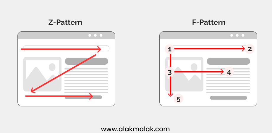
Research by the Nielsen Norman Group found that proper use of visual hierarchy can increase comprehension and usability by up to 47%.
Visual hierarchy refers to the arrangement and prioritization of elements on a webpage to guide users’ attention and make it easier for them to navigate and understand the content. By structuring information effectively, visual hierarchy improves usability and enhances the overall user experience of a website.
Visual hierarchy is crucial for ensuring that users can quickly and intuitively find what they’re looking for on a website. When implemented correctly, it helps users navigate through the content, understand the information hierarchy, and focus on the most important elements. This not only improves usability but also increases engagement and encourages users to spend more time on the site.
Creating Visual Hierarchy on Your Website
1. Use Size and Position:
Larger and centrally positioned elements tend to attract more attention. Use size and position to prioritize important content such as headlines, key messages, and calls to action.
2. Employ Contrast:
Create contrast between different elements using color, font style, or whitespace. Contrast helps highlight important information and differentiate between content categories.
3. Utilize Visual Cues:
Use arrows, icons, or imagery to direct users’ attention towards specific actions or information. Visual cues can guide users through the website and indicate interactive elements.
4. Organize Content:
Organize content in a logical and hierarchical manner, with important information placed prominently at the top and less critical details presented further down the page. This helps users understand the structure of the content and find relevant information quickly.
A Real-World Example
Think about a newspaper. Headlines are typically the largest and boldest text, grabbing your attention first. Shorter summaries and smaller fonts follow, guiding you through the details. This is a perfect example of visual hierarchy in action!
By partnering with a top Ui/Ux Design Agency and incorporating these simple visual hierarchy techniques, you can create a user-friendly website. It’ll be easy to navigate, engaging, and help visitors achieve their goals. Remember, a well-organized website, guided by experts, leads to happy visitors!
6. Mobile-First Design with Simple Navigation

Did you know that over 53% of all website traffic comes from mobile devices (Statista, 2023)?
Mobile-first design is an approach where websites are designed and developed primarily for mobile devices, with desktop versions adapting from there. Simple navigation refers to organizing website menus and links in a clear and straightforward manner, making it easy for users to find what they’re looking for, especially on smaller screens.
With the majority of internet users accessing websites from mobile devices, it’s essential for websites to prioritize mobile-friendly design and navigation. Mobile-first web design ensures that websites are optimized for the growing number of mobile users, providing a seamless and enjoyable experience regardless of the device being used. Simple navigation further enhances usability, reducing frustration and increasing user engagement.
How to Implement Mobile-First Design with Simple Navigation:
1. Prioritize Mobile Optimization:
Start by designing the website layout and user interface with mobile devices in mind. Focus on responsive design techniques that adapt seamlessly to different screen sizes and resolutions.
2. Simplify Menu Structures:
Keep the navigation menu simple and intuitive, with clear labels and concise categories. Limit the number of menu items to essential sections to avoid overwhelming users, especially on smaller screens.
3. Implement Touch-Friendly Elements:
Use larger touch targets for buttons and links to accommodate mobile users’ interactions. Ensure that clickable elements are easily distinguishable and spaced appropriately to prevent accidental taps.
4. Optimize for Speed:
Mobile users expect fast-loading websites. Optimize images, minimize code, and leverage caching techniques to improve page load times, enhancing the overall mobile experience.
Partnering with a responsive website design company, prioritize mobile-first design and intuitive navigation. This ensures a seamless experience, keeping mobile users engaged and satisfied, minimizing frustration and bounce rates.
7. Easy-to-Find Contact Information

A Forrester study found that 61% of online consumers are unlikely to return to a website that lacks an easy way to find contact information.
Ensuring that your website’s contact information is easy to find is essential for enabling visitors to get in touch with you quickly and effortlessly. Whether they have questions, feedback, or inquiries, having readily accessible contact details can enhance user experience and foster better communication between you and your audience.
Prominently displaying contact information on your website serves multiple purposes. Firstly, it builds trust with visitors by demonstrating transparency and accessibility. When users see that you’re easily reachable, they feel more confident engaging with your business. Additionally, easy access to contact details facilitates communication, allowing users to reach out with questions, concerns, or inquiries, which can lead to valuable interactions and potential business opportunities.
Tips for Prominently Showcasing Contact Details:
Include Contact Information in Header or Footer:
Place essential contact details, such as a phone number or email address, in the header or footer of your website. This ensures that it remains visible on every page, making it convenient for users to find regardless of where they are on your site.
Create a Dedicated Contact Page:
Designate a separate contact page where users can find comprehensive contact information, including addresses, phone numbers, email addresses, and social media links. Keep this page easily accessible from the main navigation menu.
Use Clear and Legible Fonts
Ensure that contact information is displayed in a legible font size and style that contrasts well with the background. Avoid overly stylized fonts that may be difficult to read, particularly on smaller screens.
Utilize Contact Forms
In addition to displaying contact information, consider incorporating contact forms on relevant pages of your website. Contact forms provide a convenient way for users to reach out while also allowing you to gather specific information from them.
Multiple Channels
Offer different communication options – phone, email, and a contact form are all great choices.
Consider a Live Chat Option
For businesses that require more immediate communication, adding a live chat feature can be a great way to connect with visitors in real-time.
By making multiple contact channels readily visible throughout your site, you provide a seamless way for visitors to reach out, address concerns, and kick off their customer journey – building crucial trust and credibility.
8. Security
A recent study by Accenture found that a data breach can cost a business an average of $4.24 million (2023)!
Website security is implemented through measures like SSL/TLS encryption, website security tools and security badges. SSL (Secure Sockets Layer) and TLS (Transport Layer Security) encrypt data transmitted between the website and visitor’s browser, protecting sensitive information like passwords and payment details. Security badges are trustmarks displayed on sites to show they have implemented security protocols.
In today’s digital age, website security is paramount for protecting your business and customers from cyber threats like hacking or data breaches. Visitors need to feel safe providing personal or financial information on your site. Robust security is also essential for complying with data privacy regulations.
Best Practices for Implementing and Communicating Website Security Measures:
Install SSL/TLS Certificates
Ensure that your website has an SSL/TLS certificate installed to encrypt data transmitted between users and your server, thereby securing sensitive information.
Display Security Badges
Prominently display security badges or seals on your website to indicate that it is safe and secure. This can help reassure visitors about the trustworthiness of your site.
Regularly Update Software
Keep your website’s software, including content management systems (CMS) and plugins, up to date to patch vulnerabilities and protect against potential security threats.
Use a Strong Password
Choose a complex password for your website’s control panel and avoid using the same password for everything.
By implementing and effectively communicating robust website security protocols, you instill trust in visitors and create a safe environment for transactions. This protects your business reputation and revenues.
9. Compelling Content

According to a HubSpot study, companies that consistently blog generate 67% more leads than those that don’t.
Compelling content is the backbone of any successful website. It not only attracts visitors but also keeps them engaged, encourages repeat visits, and drives conversions. In this section, we’ll explore the importance of having a clear content strategy and how to create and implement one effectively.
A clear content strategy is essential for ensuring that your website’s content aligns with your target audience and business goals. Fresh, relevant, and engaging content helps attract visitors to your site and keeps them coming back for more. By understanding your audience’s needs and preferences, you can tailor your content to address their interests and provide value, ultimately fostering stronger connections and driving desired outcomes, such as increased sales or brand loyalty.
How to Create and Implement Content Strategy:
Define Your Objectives
Start by identifying your website’s goals and objectives. What do you want to achieve with your content? Whether it’s to educate, entertain, or inspire your audience, having clear objectives will guide your content creation efforts.
Know Your Audience
Understand who your target audience is, what their interests and pain points are, and how they prefer to consume content. Conduct market research, analyze audience demographics, and gather feedback to inform your content strategy.
Create Valuable Content
Develop content that resonates with your audience and provides value. This could include blog posts, articles, videos, infographics, or podcasts. Focus on delivering fresh, relevant, and engaging content that addresses your audience’s needs and interests.
Plan Content Calendar
Establish a content calendar to organize your content creation and publication schedule. This helps ensure consistency and keeps your audience engaged with regular updates. Consider factors such as seasonality, industry trends, and promotional campaigns when planning your content calendar.
By delivering compelling, high-quality content that resonates with your target audience, you can establish a strong online presence, build trust and authority, and ultimately drive business growth through increased engagement, leads, and conversions.
10. Social media integration

According to a Sprout Social survey, businesses that leverage social media effectively have a 63% higher marketing ROI than those that don’t.
In today’s digital world, social media has become an integral part of how people discover, engage with, and share content online. By integrating social media elements into your website, you can amplify your online presence, increase brand awareness, drive more traffic to your site, and foster a stronger connection with your audience.
Social media integration allows visitors to easily share your content across various platforms, increasing its reach and visibility. It also enables you to showcase your social media presence and community directly on your website, which can help build trust and credibility. Additionally, social media can be a powerful source of referral traffic and lead generation.
Connecting Your Website and Social Media
There are several ways to integrate social media into your website:
- Social Sharing Buttons: Make it easy for visitors to share your content on their own social media channels with prominent “Share” buttons.
- Social Media Feeds: Embed a live feed from your social media accounts, showcasing your latest posts and keeping your website content fresh.
- Social Logins: Allow visitors to sign up or log in to your website using their existing social media accounts, streamlining the registration process.
- Encourage Social Proof: Display positive customer reviews and testimonials from social media to build trust and credibility.
By seamlessly integrating social media into your website, you not only enhance the user experience but also create opportunities for increased brand exposure, community engagement, and potential lead generation – driving tangible business results.
11. Readability

According to a study by Nielsen Norman Group, users typically read only 20-28% of the text on a webpage.
Readability refers to how easily and comfortably visitors can read and understand the content on your website. It’s not just about having the right words, but also about presenting them in a way that is clear, accessible, and engaging. Readability directly impacts user experience and engagement, as visitors are more likely to stay on your site and consume your content if it’s easy to read and comprehend.
Best Practices for Improving Website Content Readability:
Choose Clear Fonts
Use easy-to-read fonts, such as Arial, Helvetica, or Open Sans, for body text. Avoid overly decorative or stylized fonts that may be difficult to read, especially in smaller sizes.
Optimize Font Size
Ensure that text is sized appropriately for readability, with a minimum font size of 16px for body text. Larger font sizes improve legibility, particularly on smaller screens and mobile devices.
Utilize White Space
Incorporate ample white space around text blocks and between paragraphs to enhance readability and reduce visual clutter. White space provides breathing room for the eyes and improves content comprehension.
Format Content Effectively
Use headings, subheadings, and bullet points to break up text and make it easier to scan. This helps users quickly find the information they’re looking for and improves overall readability.
Include Visual Aids
Supplement text with relevant visual aids, such as images, infographics, or videos, to reinforce key points and enhance comprehension. Visuals can also make content more engaging and memorable for visitors.
By implementing best practices for improving website content readability, such as choosing clear fonts, formatting content effectively, and incorporating visual aids, you can enhance the overall user experience, increase engagement, and ensure that your message resonates with your audience effectively.
Additional Points To Consider
Technical SEO:

Technical SEO involves optimizing your website’s technical aspects to improve its search engine visibility and ranking. Key elements include:
- Mobile Optimization: Ensure your website is optimized for mobile devices to provide a seamless user experience across different screen sizes.
- Website Speed: Improve loading times to enhance user experience and satisfy search engine requirements for fast websites.
Accessibility:

Accessibility ensures that your website is usable by everyone, including people with disabilities. Prioritizing website accessibility is not only the right thing to do but also improves SEO. Consider implementing features such as alt text for images and keyboard navigation for better accessibility.
Search Functionality:

Incorporating a search function on your website allows users to easily find specific content, improving user experience and navigation. A search bar helps users quickly locate information, especially on larger websites with extensive content.
Analytics Tracking:
![]()
Utilize tools like Google Analytics to track and analyze user behavior on your website. Website Analytics tracking provides valuable insights into how users interact with your site, allowing you to make data-driven decisions and continuously improve the user experience. Monitor metrics such as page views, bounce rates, and conversion rates to identify areas for optimization and enhancement.
Are You Ready to Create a High-Impact Website?
In today’s digital age, having a website that checks all the essential boxes is crucial for success. Throughout this blog post, we’ve explored the 12 critical things a website should have as a minimum, from clear and compelling homepage elements to robust security measures and seamless social media integration.
The main takeaways are clear: a well-designed website should be easy to navigate, visually appealing, and optimized for both desktop and mobile devices. It should showcase your brand’s value proposition, engage visitors with high-quality content, and provide a seamless user experience that inspires trust and confidence.
By implementing these 12 essential elements, you can create a website that not only looks great but also delivers tangible results, whether that’s driving more traffic, generating leads, or increasing conversions.
Remember, your website is often the first impression potential customers will have of your business, so it’s crucial to get it right. Don’t settle for a mediocre online presence – invest in a website that truly represents your brand and meets the needs of your target audience.
If you’re ready to take your website to the next level or need guidance on incorporating these essential elements, we’re here to help. Our team of experienced web designers and developers specializes in creating high-impact websites that not only look great but also deliver results.
Contact us today to schedule a consultation, and let’s discuss how we can help you create a website that stands out from the crowd and drives your business forward.

