Did you know that 94% of a website’s first impressions are design-related? If your website is outdated, clunky, or difficult to navigate, you’re likely losing potential customers and leads every single day. A website redesign is crucial for staying competitive in today’s digital landscape, but getting it right can be a major challenge.
In this blog post, we’ll share the top best practices for a website redesign. As an expert with 18 years of experience in providing website redesign services, we’ve helped numerous businesses transform their online presence and achieve dramatic increases in traffic, leads, and sales.
Whether your current website is in desperate need of an overhaul or you’re simply looking to optimize its performance, you’ll walk away with a clear roadmap for creating a website that wows your visitors and drives real business results. Let’s dive in!
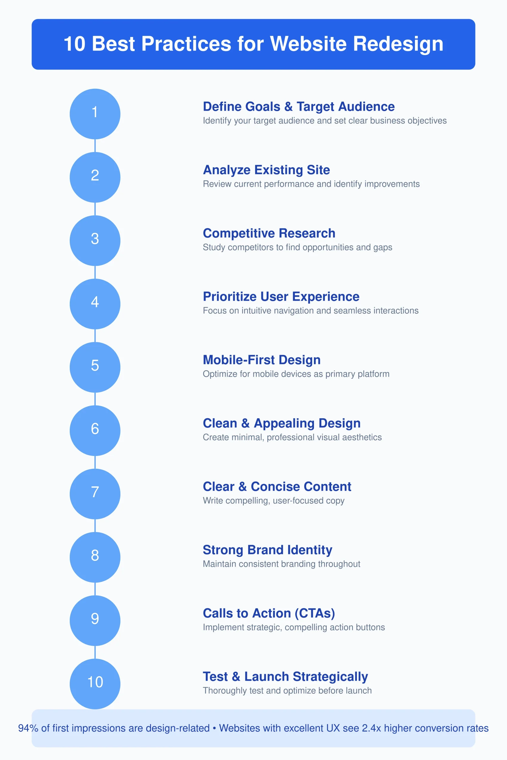
Best Practices For a Website Redesign
Here are the best practices for why your website needs to be redesigned:-
TABLE OF CONTENT
1. Define Goals & Target Audience
2. Analyze Existing Site
3. Competitive Research
4. Prioritize User Experience (UX)
5. Mobile-First Design
6. Clean & Appealing Design
7. Clear & Concise Content
8. Strong Brand Identity
9. Calls to Action (CTAs)
10. Test & Launch Strategically
1. Define Goals & Target Audience
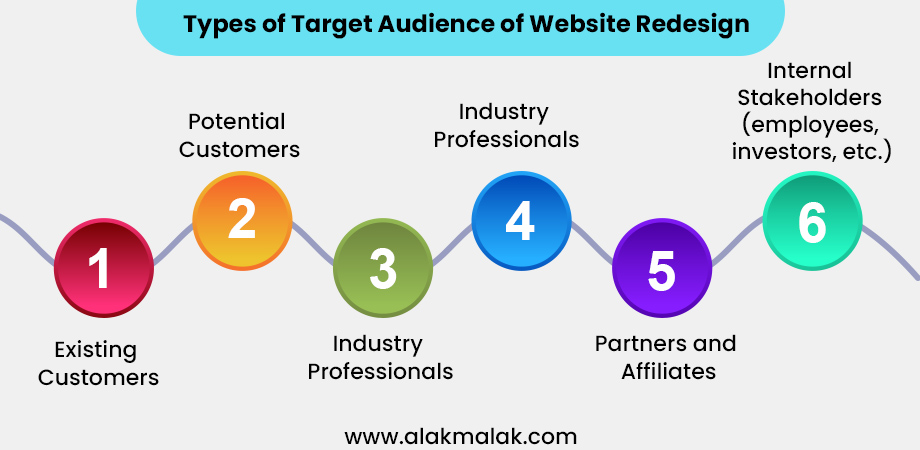
Before you can start the website redesign process, it’s crucial to define your goals and identify your target audience. After all, a successful website redesign isn’t just about making your site look pretty – it’s about creating a digital experience that resonates with the people who matter most to your business.
Why is this important?
Research shows that websites with a clear purpose and target audience convert 2.5x more visitors into leads compared to generic, one-size-fits-all sites. When you know exactly who you’re designing for and what you want them to do, you can create a website that guides them seamlessly towards your desired actions, whether that’s making a purchase, scheduling a consultation, or signing up for your email list.
How to get started?
- Who is your target audience? Clearly define the demographics, pain points, and goals of the people you’re trying to attract and convert.
- What are your primary business objectives? Are you looking to increase brand awareness, generate more qualified leads, boost online sales, or something else?
- What specific actions do you want visitors to take on your website? Map out the ideal customer journey and identify the key conversion points.
- How will you measure success? Determine the KPIs you’ll use to track the performance of your redesigned website, such as bounce rate, time on site, form submissions, and online revenue.
Once you have a firm grasp on these elements, you can start planning a website redesign that is laser-focused on delivering an exceptional user experience and achieving your business goals.
2. Analyze Existing Site
Before you start planning your new website, it’s crucial to take a deep dive into your current online presence. Analyzing your existing site will help you identify what’s working well, what needs improvement, and where the biggest opportunities for growth lie.
Why is this step so important?
Research shows that businesses that thoroughly review their current website performance see 24% higher conversion rates after a redesign compared to those that don’t. When you have a clear understanding of your site’s strengths, weaknesses, and pain points, you can create a redesign roadmap that’s laser-focused on addressing your most pressing needs.
Here are the key steps to effectively analyze your existing website:
- Audit your current site structure and content. Review each page and section to understand what information you’re currently providing, how it’s organized, and whether it aligns with your target audience’s needs.
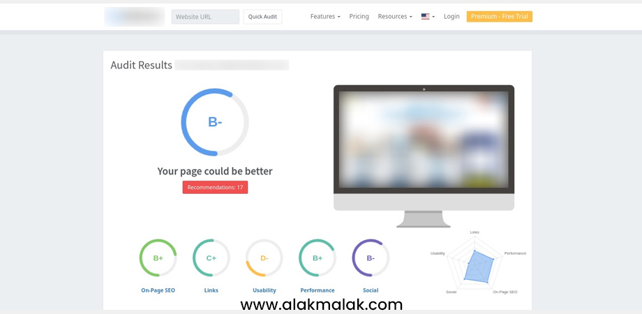
- Assess your site’s technical performance. Run your website through tools like Google PageSpeed Insights and Lighthouse to identify any speed, mobile-friendliness, or SEO issues that need to be addressed.
- Examine your website analytics. Dig into your traffic sources, bounce rates, conversion rates, and other key metrics to pinpoint areas of strength and weakness.
- Gather user feedback. Conduct user testing, surveys, and interviews to understand how your audience is experiencing your current website and where they’re facing challenges.
- Conduct a competitive analysis. Research your top competitors to see how your website stacks up in terms of design, functionality, and overall user experience.
By taking the time to thoroughly audit your existing site, you’ll uncover valuable insights that will inform every decision in your upcoming website redesign.
3. Competitive Research
As part of your website redesign process, it’s crucial to conduct a thorough competitive analysis. By researching what your top competitors are doing online, you can uncover valuable insights to inform your own redesign strategy.
Why is this step so important?
Studies show that businesses that closely monitor their competitors’ websites are 2.4 times more likely to have a website that outperforms the industry average. When you understand how your online presence stacks up against the competition, you can make strategic design and content decisions that help you stand out in a crowded marketplace.
Here are the key steps to conducting effective competitive research:
- Identify your top 3-5 competitors. These should be businesses that are similar in size, target audience, and industry to your own.
- Analyze their website design, layout, and user experience. Examine elements like navigation, calls-to-action, imagery, and overall visual appeal.
- Evaluate their content strategy. Review the types of content they’re creating (e.g., blog posts, videos, guides), how it’s structured, and how it aligns with their audience’s needs.
- Assess their search engine optimization (SEO). Use tools like SEMrush and Ahrefs to see how your competitors are performing in organic search and identify keyword opportunities.
- Examine their overall digital marketing approach. Look at how they’re promoting their website and driving traffic through channels like social media, email, and paid advertising.
4. Prioritize User Experience (UX)
At the heart of any successful website redesign is a laser-focused commitment to user experience (UX) and UI/UX design and development services. After all, your website is the digital face of your business – it needs to not only look great, but also provide a frictionless, intuitive experience that keeps visitors engaged and moving through your sales funnel.
Why is UX so crucial?
Studies show that websites with excellent user experience, crafted using the principles of UX Design, see 2.4 times higher conversion rates compared to those with poor UX. When you design your site with your target audience’s needs, goals, and pain points at the forefront, you create a digital experience that resonates and compels them to take action.
How can you prioritize UX in your website redesign?
Here are some key steps to consider:
- Conduct detailed user research to deeply understand your audience. Use surveys, interviews, and usability testing to uncover their preferences, frustrations, and behaviors.
- Map out the ideal customer journey and identify key conversion points. Ensure your website design and content seamlessly guide visitors towards your desired actions.
- Optimize your site architecture and navigation. Make it easy for users to find the information they need with intuitive menus, search functionality, and internal linking.
- Prioritize mobile-friendliness and responsive design. Over 60% of web traffic now comes from mobile devices, so your site needs to deliver a top-notch experience on any screen size.
- Leverage clear, compelling copywriting that speaks directly to your users’ needs. Ditch the jargon and focus on creating content that educates, inspires, and drives conversions.
5. Mobile-First Design
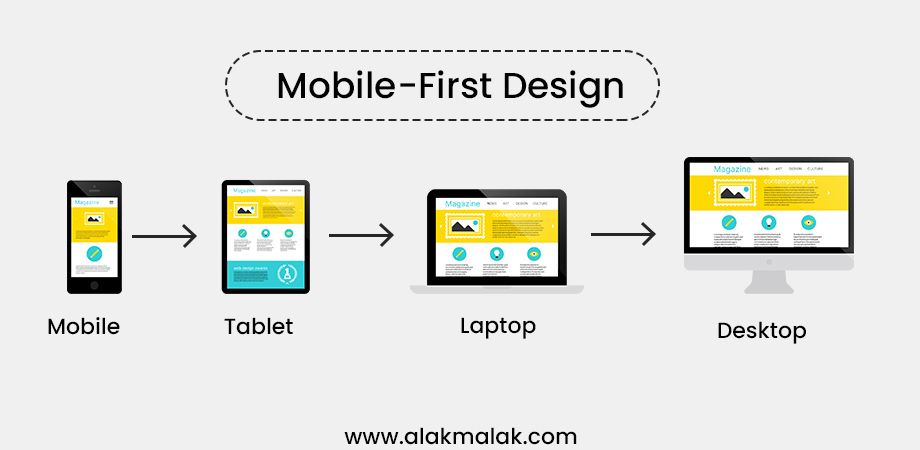
In today’s digital landscape, responsive website designing has become an integral part of ensuring mobile optimization, making it no longer just a “nice-to-have” – it’s an absolute necessity. As more and more people access the web primarily through their smartphones and tablets, a mobile-first approach to website design has become the new standard.
Why is this so important?
Data shows that websites with a strong mobile experience see 1.5 times higher conversion rates compared to those with poor mobile optimization. When your site is designed from the ground up to deliver a seamless, frictionless experience on smaller screens, you create a digital presence that resonates with the majority of your audience.
How can you ensure a mobile-first approach in your website redesign?
Here are some key steps to consider:
- Start with a mobile wireframe. Before you even begin designing the desktop version of your site, map out the user experience and content hierarchy for mobile devices.
- Prioritize mobile-friendly design elements. Optimize your layout, navigation, and calls-to-action for easy tapping and scrolling on smartphones and tablets.
- Ensure fast load times. Use techniques like image optimization, lazy loading, and content delivery networks to keep your mobile pages lightning-fast.
- Leverage responsive web design. Use CSS media queries and flexible grids to automatically adjust your site’s layout and content based on the user’s device.
- Test thoroughly across multiple devices and browsers. Quality assurance is crucial to identify and address any mobile usability issues before launch.
6. Clean & Appealing Design
While user experience should be the top priority in any website redesign, visual design also plays a crucial role in shaping your online presence. A clean, visually appealing website not only makes a strong first impression on visitors, but also directly impacts their engagement, trust, and likelihood to convert.
Why is design so important?
Studies show that websites with an attractive, professional-looking design see 25% higher user engagement rates compared to those with outdated or cluttered aesthetics. When your site has a cohesive, on-brand visual identity, it establishes credibility, showcases your expertise, and compels users to stick around and explore further.
So how can you create a clean, appealing website design?
Here are some key elements to focus on:
- Leverage a minimalist, streamlined layout. Opt for plenty of white space, clear content hierarchy, and strategic use of images and graphics.
- Choose a modern, on-brand color palette. Select a limited number of primary and secondary colors that align with your brand identity.
- Utilize high-quality, visually compelling imagery. Use professional photos, illustrations, and iconography to enhance your content and reinforce your messaging.
- Ensure typography is legible and consistent. Select easy-to-read font pairings and sizes, and apply them systematically throughout your website.
- Maintain a cohesive, visually unified aesthetic. Ensure all design elements, from the layout to the graphics, work together to create a polished, professional look and feel.
7. Clear & Concise Content
While design elements play a crucial role in shaping your website’s overall user experience, the content you provide is what truly drives engagement, conversions, and long-term success. Crafting clear, concise, and value-packed messaging is essential for grabbing your audience’s attention and guiding them towards your desired actions.
Why is content so important?
Research shows that websites with well-written, user-focused content see 2 times higher conversion rates compared to those with subpar or hard-to-digest messaging. When your content is laser-focused on addressing your target audience’s needs and pain points, you create a digital experience that resonates and compels them to take action.
So how can you ensure your website redesign features clear, effective content?
Here are some key steps to consider:
- Conduct in-depth audience research to deeply understand your users’ goals, challenges, and preferred communication styles.
- Develop a content strategy that aligns with your business objectives and maps directly to your target audience’s journey.
- Use plain, conversational language that speaks directly to your users. Avoid industry jargon and focus on communicating value in a clear, concise way.
- Structure your content with scannable formatting, such as short paragraphs, bullet points, and strategic use of headings and subheadings.
- Leverage persuasive copywriting techniques, like benefit-driven messaging, social proof, and compelling calls-to-action, to drive conversions.
8. Strong Brand Identity
Your website is the digital face of your business – it’s where your brand comes to life and makes its first impression on potential customers. That’s why establishing a strong, cohesive brand identity is essential in any successful website redesign.
Why is this so important?
Studies show that businesses with a well-defined brand identity see 3.5 times higher brand visibility online compared to those with an inconsistent or unclear brand presence. When your website design, messaging, and overall user experience are closely aligned with your brand, you create a memorable, trustworthy digital presence that helps you stand out in a crowded marketplace.
How can you ensure your website redesign reinforces a strong brand identity?
Here are some key steps to consider:
- Clearly define your brand positioning, values, and unique value proposition. Ensure these core elements are the foundation for every design and content decision.
- Maintain visual brand consistency by leveraging your established color palette, typography, imagery, and other brand assets.
- Craft messaging that authentically reflects your brand’s tone of voice and speaks directly to your target audience’s needs and pain points.
- Ensure your website design seamlessly aligns with your brand’s aesthetic, whether that’s modern and minimalist or vibrant and playful.
- Integrate your brand’s unique personality, story, and culture throughout the user experience to build an emotional connection with visitors.
9. Calls to Action (CTAs)
Effective calls-to-action (CTAs) are the linchpin of any high-performing website. These strategic prompts are what compel your visitors to take the next step, whether that’s making a purchase, scheduling a consultation, or signing up for your email list. Crafting clear, compelling CTAs is essential for driving tangible business results from your website redesign.
Why are CTAs so crucial?
Research shows that websites that use multiple, well-placed CTAs see 83% more conversions on average compared to those with minimal or generic calls-to-action. When you provide visitors with a frictionless path to take your desired actions, you create a seamless user experience that translates directly to your bottom line.
How can you optimize your CTAs as part of your website redesign?
Here are some key tips to consider:
- Use action-oriented language that clearly communicates the value of clicking. Words like “Shop Now,” “Get a Free Quote,” and “Download the Guide” are far more effective than vague CTAs like “Click Here.”
- Make your CTAs visually prominent by using contrasting colors, eye-catching designs, and strategic placement throughout the user journey.
- Tailor your CTAs to each stage of the sales funnel, offering different actions for awareness, consideration, and decision-making stages.
- Test different CTA variations to see which messaging, design, and positioning resonate best with your target audience.
- Leverage social proof, urgency, and other psychological triggers to increase the persuasiveness of your CTAs.
By strategically placing eye-catching “Add to Cart” and “Buy Now” buttons, we were able to guide shoppers seamlessly through the checkout process and drive a significant boost in revenue.
10. Test & Launch Strategically
Once you’ve completed the planning and design phases of your website redesign, the real work begins – testing, optimizing, and launching your new digital presence. This final stage is absolutely critical, as it ensures your redesigned site is delivering the best possible user experience and achieving your business goals.
Why is strategic testing and launch so important?
Research shows that websites that undergo a thorough pre-launch evaluation and implementation plan see 1.7 times higher conversion rates in the first 3 months compared to those that skip this step. When you take the time to identify and address any issues before going live, you create a seamless, high-performing website that’s primed for long-term success.
How can you ensure a smooth, strategic launch for your website redesign?
Here are some key steps to follow:
- Conduct comprehensive quality assurance (QA) testing across all devices, browsers, and user scenarios to identify and fix any bugs or usability problems.
- Gather feedback from a diverse group of beta testers representing your target audience to uncover any additional areas for improvement.
- Develop a detailed launch plan that outlines your timeline, content migration strategy, SEO optimization, and marketing rollout.
- Implement robust performance monitoring and analytics tracking to gain real-time insights into your website’s traffic, engagement, and conversion metrics.
- Create a post-launch optimization roadmap to continually refine and improve your site’s user experience based on ongoing data and feedback.
Conclusion:
Redesigning your website requires a strategic, user-centric approach. By following best practices like defining clear goals, prioritizing mobile optimization, and creating a cohesive brand identity, you can transform your online presence and drive measurable business results.
Remember, your website is the digital face of your brand. It must not only look great, but also provide a seamless, engaging user experience that resonates with your target audience. Aligning your redesign efforts with proven tactics like conversion-focused content and strategic testing will help you build a high-performing website that elevates your brand and drives real business outcomes.
Ready to get started on your website redesign? Reach out to our web design experts today. We’ll help you create a digital experience that wows your visitors and delivers the results you need to succeed online.

 By: Rushik Shah

