You’ve probably spent countless hours exploring best consulting website designs, brainstorming how to attract more clients and close deals for your consulting firm. But no matter what you do, things aren’t just clicking. So, what’s keeping you up at night?
- Invisible in a Crowded Market: With thousands of consulting firms, your brand is getting lost in the sea of sameness.
- Client Confusion: Prospective clients visit your website but leave without taking any action, like requesting a quote or setting up a call.
- Stale Business Image: Your website doesn’t convey the dynamism and innovation you bring to your work.
- Low Engagement: High bounce rates, low session times, and anemic lead generation.
- Missed Revenue: Every visitor who clicks away is a potential contract lost, money that’s flying out the door.
The Real Culprits: It’s Not What You Think
You may believe that your problems stem from stiff competition or the cyclical nature of the consulting business. But, surprise, surprise, the root cause is none of these. It’s your outdated, unengaging, and uninspiring website design. To improve your situation, it’s crucial to address bad website design & mistakes to avoid. This will help attract more clients and stay ahead of the competition.
- Clichéd Content: Using stock photos and buzzwords that every other consulting website uses.
- Poor User Experience: Confusing navigation and slow page loading times.
- No Social Proof: Lack of testimonials, case studies, or data to prove your expertise.
- Missing Personality: Your brand’s voice is lost, making you indistinguishable from competitors.
- Outdated Design Principles: Failing to adapt to newer, more effective design techniques, thus diminishing client trust.
The Failed Solutions
Most consulting firms think the answer is pouring money into SEO or paid ads. Or they get trapped in hiring the wrong kind of experts who don’t understand their unique needs. They don’t realize that without fixing the real problem – the website design itself – these solutions only dig a deeper hole. Partnering with a trusted website design company in India can be the game-changer these firms need to address their unique challenges effectively.
40 Best Consulting Website Designs
Looking for top-notch and best consulting website designs that will truly make you stand out? We’ve curated a list of 40 exceptional examples that serve as free inspiration for your own site. Covering a wide spectrum from startups and small businesses to large corporations, our selections offer a variety of styles, from ultra-professional to whimsically creative.
1. Edgy Inc.
Why it works: The subtle animation on the hero section adds a dynamic touch to the overall layout, making it a standout feature of one of the best consulting website designs. Buttons are easily identifiable, and the contact form at the bottom ensures easy accessibility.
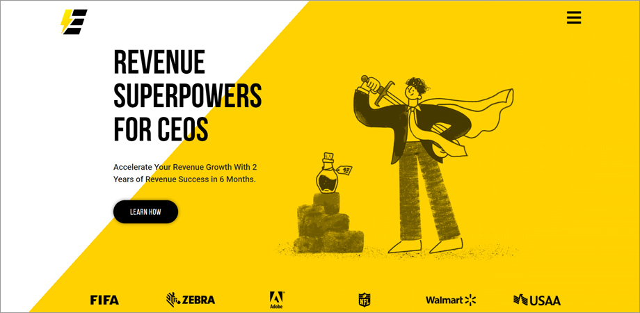
Edgy Inc
2. Laurie Ruettimann
Why it works: Laurie’s personal branding shines through, with a blog that offers actionable insights. The navigation is user-friendly and intuitive.
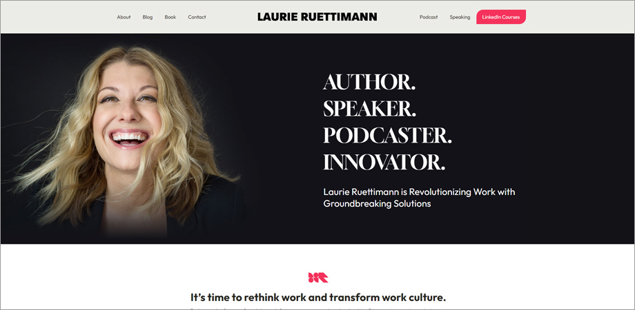
Laurie Ruettimann
3. Accura Consulting
Why it works: Sleek and professional, Accura’s website uses a monochrome palette to keep the focus on content. Case studies are highlighted prominently.
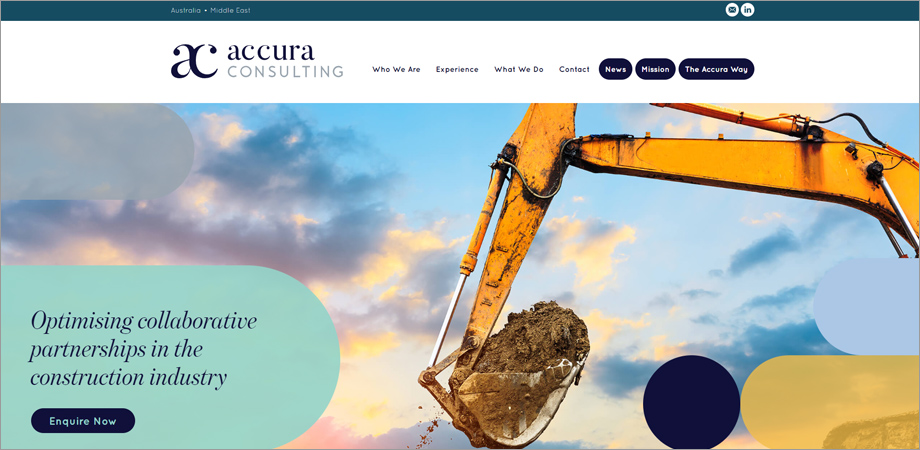
Accura Consulting
Are You Looking For Top Website Design Company in India?
Skyrocket your online business with Alakmalak Technologies’ amazing website designers! Get top-notch website development that fits your budget perfectly.
4. Fahrenheit 212
Why it works: Innovative use of multimedia grabs attention, while the content is broken down into digestible segments for easy comprehension.
5. Prophet
Why it works: Minimalist design elements paired with impactful case studies create a compelling narrative about the firm’s expertise.
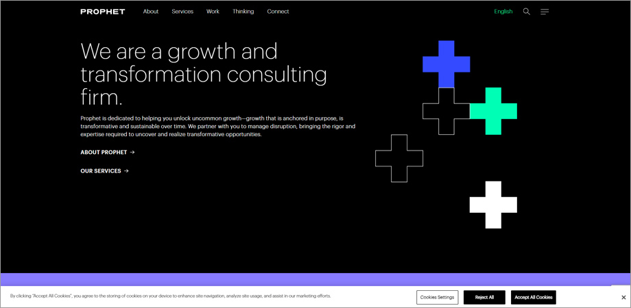
Prophet
6. Landor
Why it works: Their portfolio is a visual feast, making it easy for potential clients to gauge the quality and scope of their work.
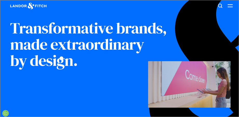
Landor
7. UI Breakfast
Why it works: A clean interface combined with a wealth of free resources creates an inviting atmosphere.
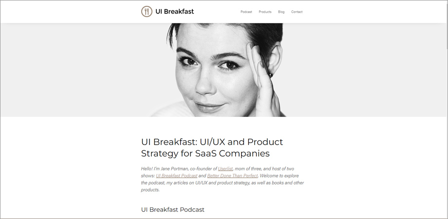
UI Breakfast
8. Lucidity Design
Why it works: The seamless blend of imagery and text creates an engaging storytelling mechanism.
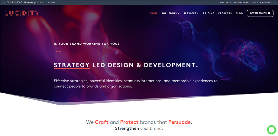
Lucidity Design
9. Code and Theory
Why it works: Strong emphasis on innovation and design thinking, reflected both in the content and the interactive UI elements.
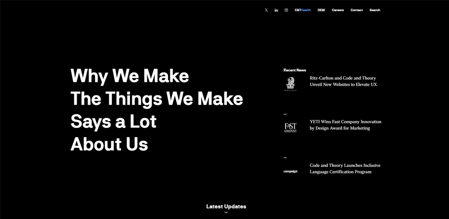
Code and Theory
10. Accenture
Why it works: The blend of corporate professionalism with cutting-edge technology insights provides a balanced appeal to varied audiences.
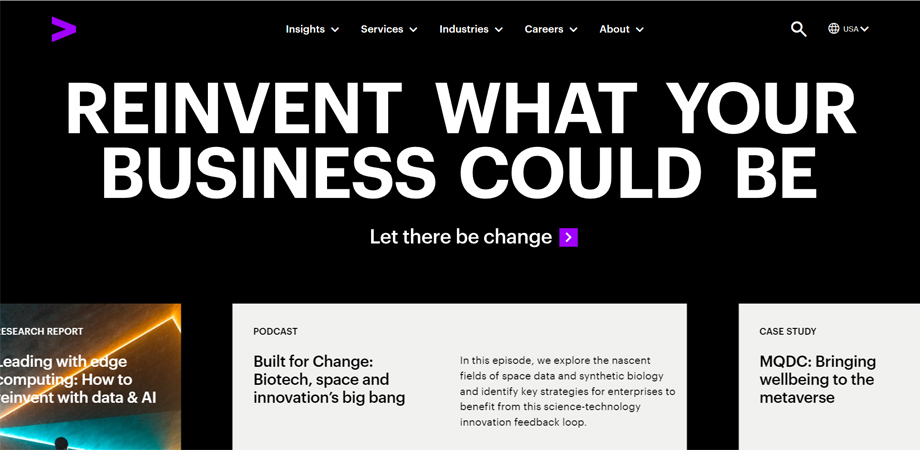
Accenture
11. Leonard Kim
Why it works: Personable and authentic, Leonard’s site establishes an immediate connection with visitors through storytelling.
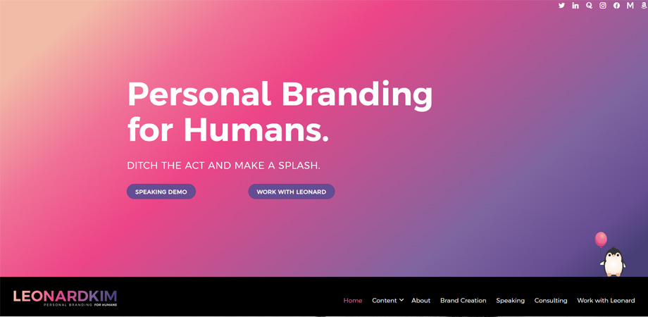
Leonard Kim
12. One North
Why it works: Effective calls-to-action and a well-placed newsletter subscription box make for a conversion-friendly design.
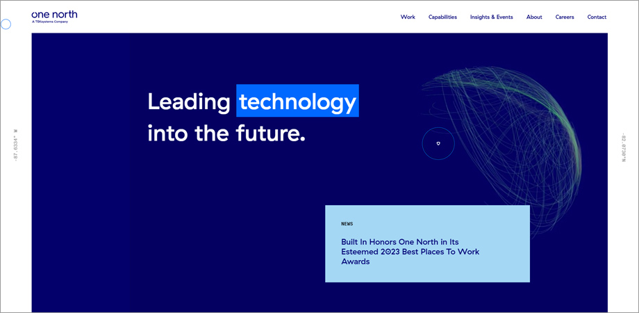
One North
13. Epic Teams
Why it works: The emphasis on team-building is highlighted through relatable imagery and testimonials.
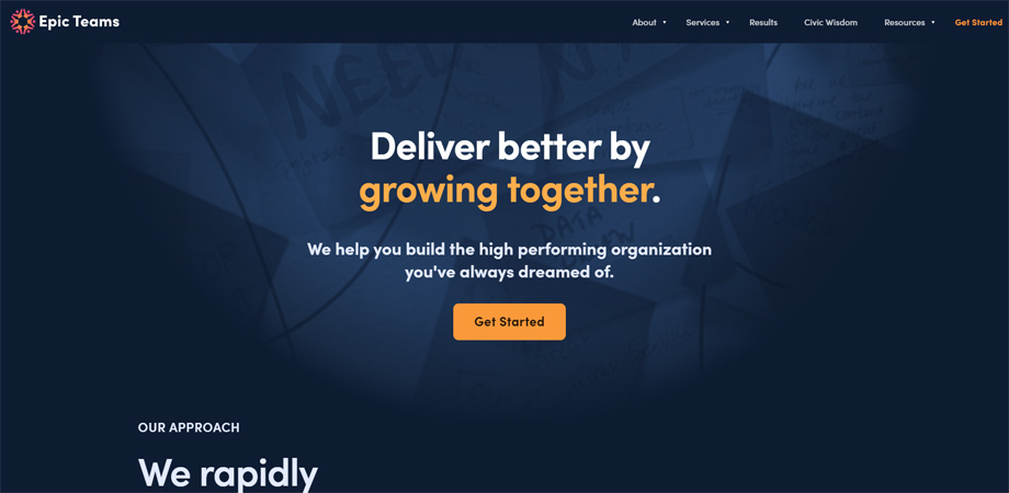
Epic Teams
Why it works: Simplified navigation and a resource-rich blog provide added value to visitors.
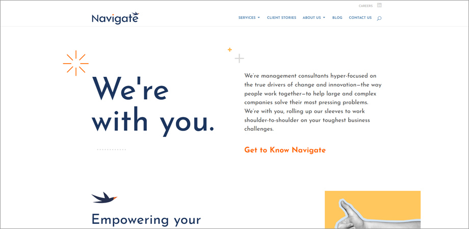
Navigate
15. Live Lite
Why it works: A UI/UX Design Company in India knows that a mobile-responsive design and quick load times are paramount for prioritizing user experience.
16. Aim Consulting
Why it works: Extensive service listings with dedicated landing pages make it easy to find relevant information.
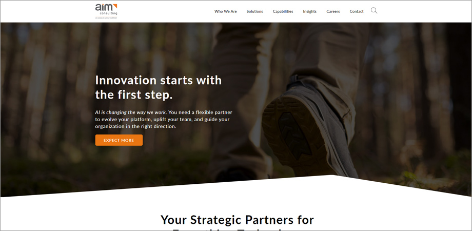
Aim Consulting
17. Kurt Elster
Why it works: The inclusion of podcasts and other multimedia elements offers diverse forms of content consumption.
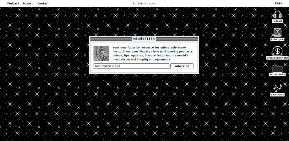
Kurt Elster
18. SBTI
Why it works: An emphasis on data-driven results is seamlessly integrated into this example of one of the best consulting website designs. The website showcases its commitment to delivering tangible outcomes through an array of insightful whitepapers and compelling case studies, creating a persuasive narrative that underscores the consulting firm’s expertise and success stories.
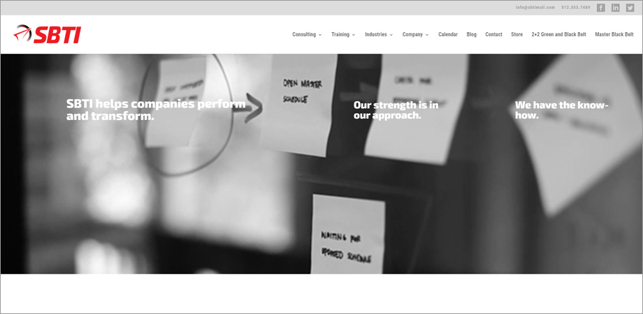
SBTI
19. Mindset Online Course
Why it works: User-centric design with a focus on easy enrollment to their flagship course.
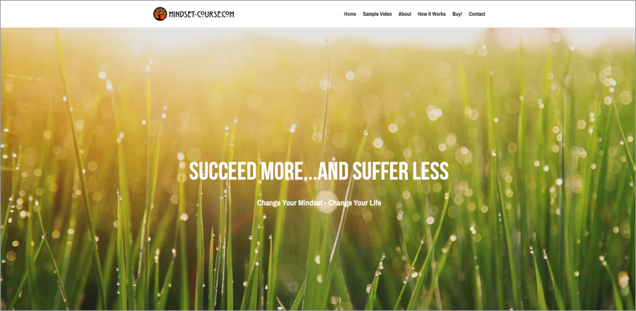
Mindset Online Course
20.Pontoon
Why it works: The bright color scheme and youthful design elements reflect the company’s focus on innovative solutions.
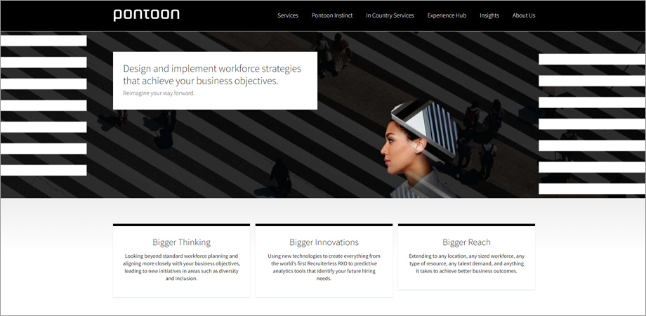
Pontoon
21. Boagworks & Boagworld
Why it works: An eclectic mix of articles, podcasts, and videos keeps the audience engaged while offering a deep dive into UX design.
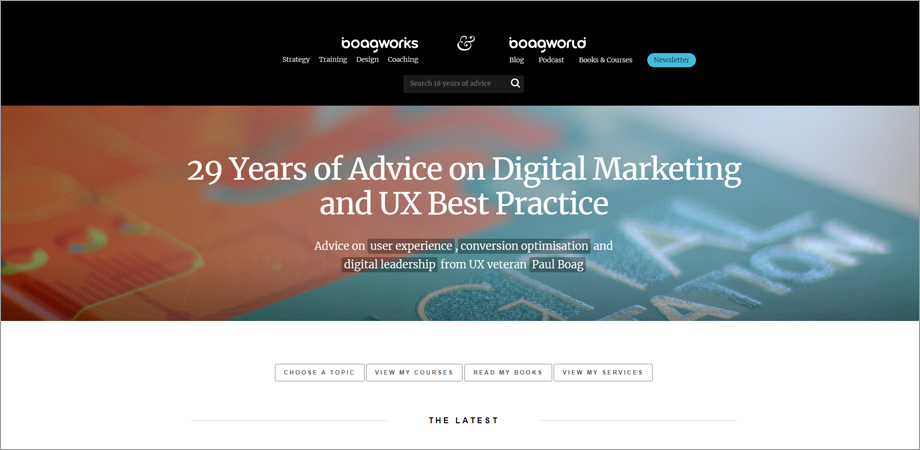
Boagworks & Boagworld
22. Fabian Roschig
Why it works: A minimalist approach emphasizes the consultancy’s focus on simplicity and efficiency.
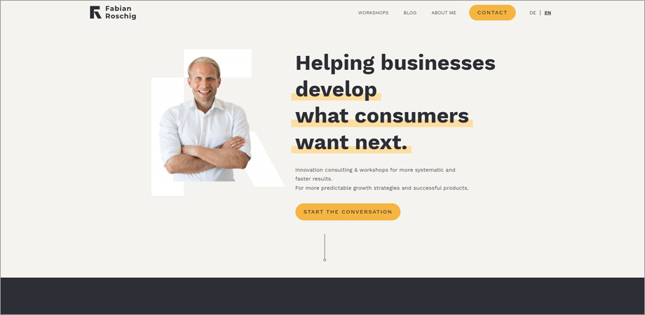
Fabian Roschig
23. Betancourt & Associates
Why it works: A traditional layout with modern touches instills trust while also showcasing adaptability.
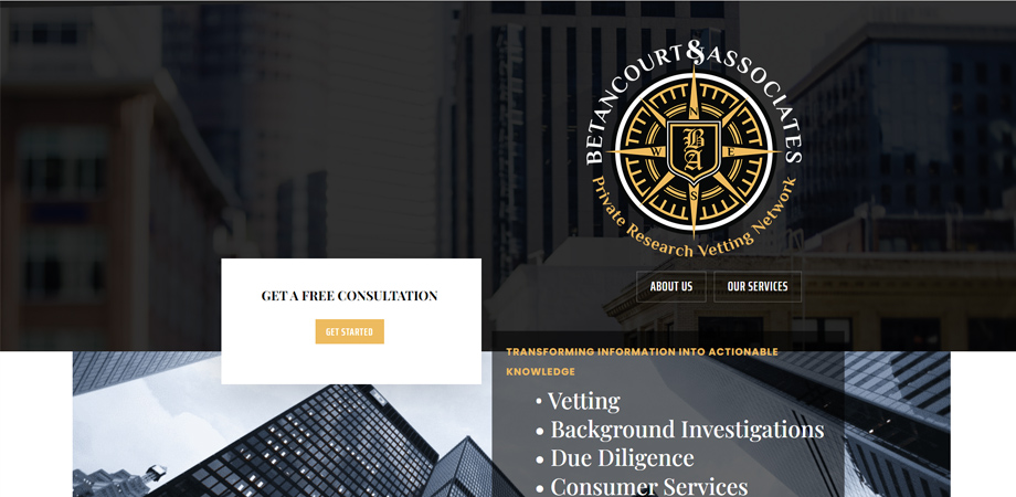
Betancourt & Associates
24. Implement Consulting Group
Why it works: A focus on real-world implementation is underscored by their library of case studies and downloadable resources.
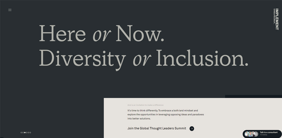
Implement Consulting Group
25. Graytitude
Why it works: A monochromatic color scheme allows for visual consistency while their blog offers color through insightful articles.
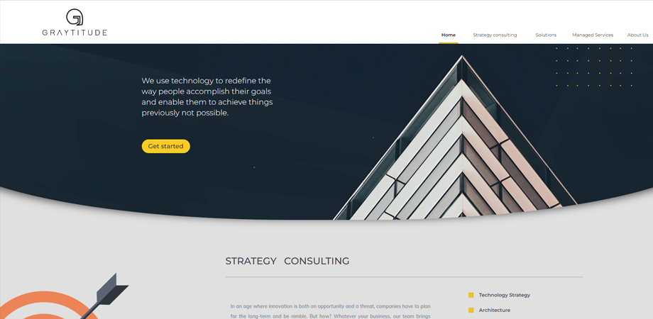
Graytitude
26. Bell Lap Advisors
Why it works: High-quality images and concise text synergize to create an easy-to-read experience, exemplifying the principles often found in some of the best consulting website designs. The strategic use of visuals and streamlined content not only enhances user engagement but also contributes to a visually appealing and informative digital presence for the consulting firm.
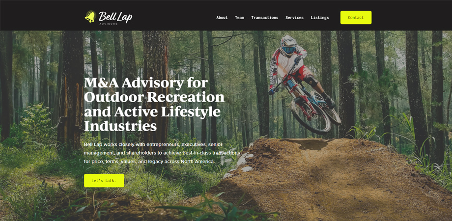
Bell Lap Advisors
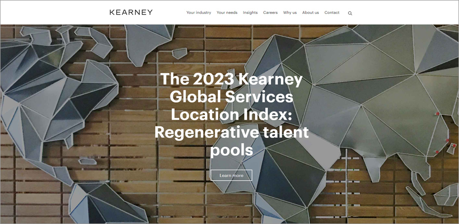
27. Kearney
Why it works: Infographics and statistical evidence lend credibility to their consulting services.
Kearney
28. Motivated Mornings
Why it works: A focus on lifestyle improvement is evident through motivational blog posts and case studies.
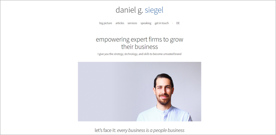
29. Daniel G. Siegel
Why it works: A strong academic background is showcased through a plethora of articles and research papers.
Daniel G. Siegel
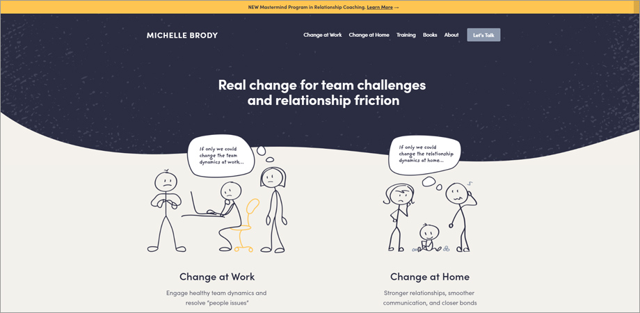
30. Michelle Brody
Why it works: The site offers immediate booking options for consultations, streamlining the client acquisition process.
Michelle Brody
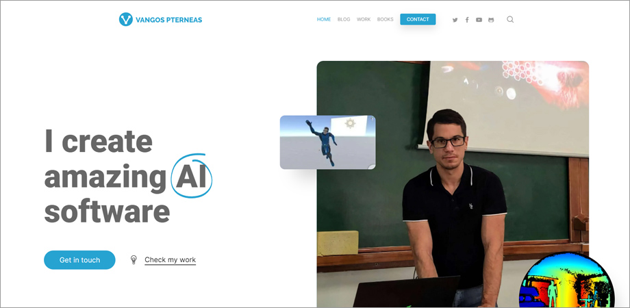
31. Vangos Pterneas
Why it works: A tech-focused layout showcases tutorials and software, making it a haven for tech-savvy clients.
Vangos Pterneas
32. Bain & Company
Why it works: An authoritative voice in consulting, their site offers industry reports that enhance their credibility.
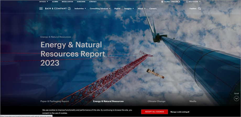
Bain & Company
33. TinySeed
Why it works: An intimate focus on startups is reflected in a community-centric design and layout.
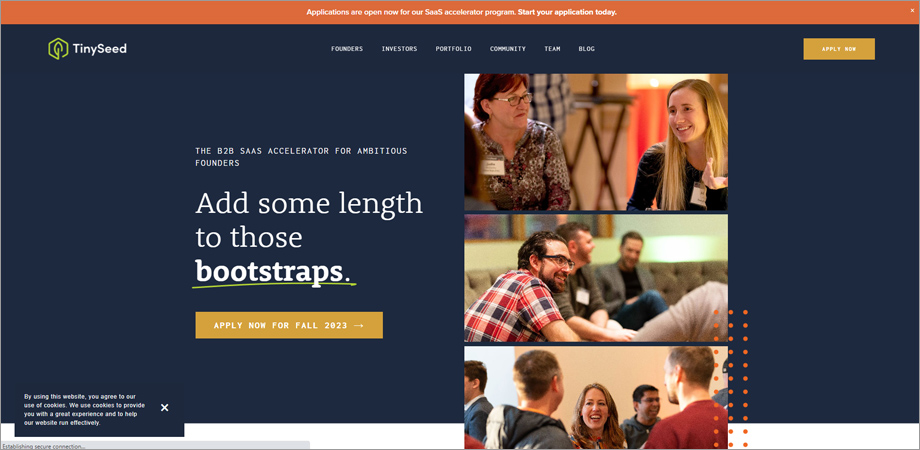
TinySeed
34. Fresh Consulting
Why it works: Interactive graphics and vibrant colors create an energized, forward-thinking vibe.
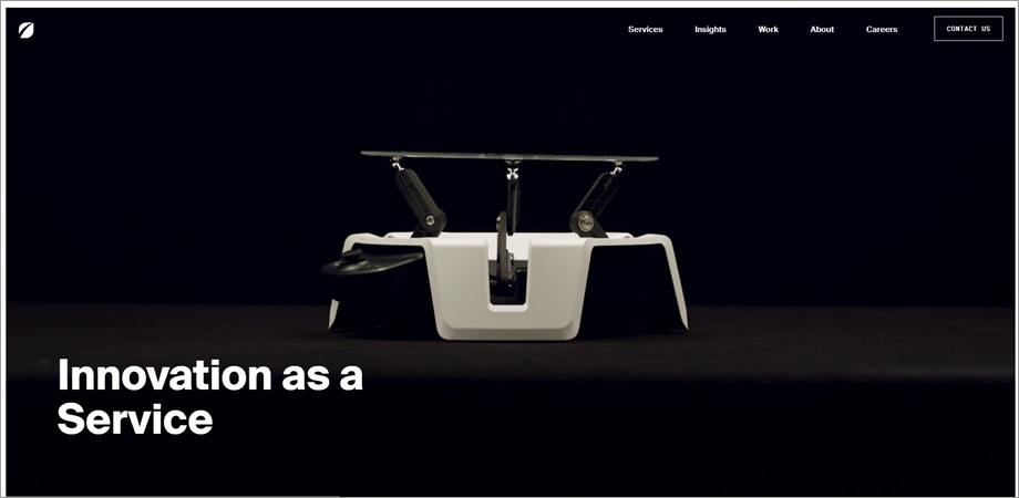
Fresh Consulting
35. The Process Consultant
Why it works: Simplified process maps and how-to guides not only provide tangible value to visitors but also exemplify elements found in some of the best consulting website designs. By offering clear and actionable resources, this website design enhances user engagement and establishes the consulting firm as a reliable source of expertise and guidance in its field.
36. Cities Reimagined
Why it works: A focus on urban planning is visually represented through maps and project galleries.
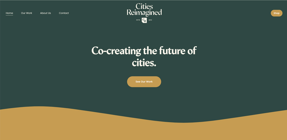
Cities Reimagined
37. Pontefract Group
Why it works: Social proof elements like testimonials and featured logos add to the credibility.

Pontefract Group
38. Matt Olpinski
Why it works: The freelancer vibe is strong, with a focus on direct communication and project highlights.
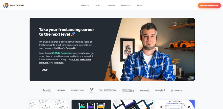
Matt Olpinski
39. Sharif Walker
Why it works: An elegant design with an emphasis on storytelling and personal connection.
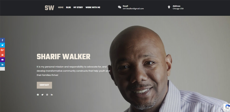
Sharif Walker
40. H&H Works
Why it works: Strong use of corporate aesthetics, balanced with a human touch, is a defining feature of this example of one of the best consulting website designs. The website effectively presents a professional image while infusing authenticity through employee stories and compelling case studies, creating a well-rounded and engaging online experience for visitors.
The 40 consulting websites examined showcase a variety of design philosophies, but they all excel in both form and function. Each one offers an optimal user experience, intuitive navigation, and valuable content, setting a high standard for what a consultancy’s online presence should achieve. In today’s digital age, having a well-designed website is not just an asset—it’s a necessity for building client trust and showcasing expertise.
Interested in making your consulting website stand out? If you’d like to know more about how our expertise can help you join the ranks of the 40 Best Consulting Website Designs, reach out to us today.

 By: Rushik Shah

