 Web Design
 Web Development
 Apps Development
 Digital Marketing
 CMS
CMS Ecommerce
 Emerging Tech
 By: Rushik Shah
In an age where mobile devices have become an extension of our daily lives, crafting an exceptional user experience (UX) on these small screens has never been more crucial. With over 6 billion smartphone users worldwide and counting, the competition for capturing and retaining user attention has never been fiercer.
As a UX designer in India with 18 years of experience, we’ve seen firsthand how the right mobile design practices can make all the difference in delighting users and driving business success. Too often, companies fall into the trap of simply scaling down their desktop experiences for mobile, resulting in frustration and abandoned sessions.
In this blog post, we’ll share proven mobile UX design practices that will help you captivate your users, boost engagement, and deliver an experience that keeps them coming back. From optimizing navigation and microcopy to leveraging the latest mobile-first features, you’ll walk away with a toolkit of strategies to elevate your mobile presence and leave your competitors in the dust.
So if you’re ready to create a mobile experience that delights your users at every turn, read on. Your path to mobile UX mastery starts here.
What is Mobile UX Design? Why Is It Important?
What is Mobile UX Design?
Mobile UX (user experience) design refers to the process of designing digital experiences specifically for mobile devices like smartphones and tablets. It involves understanding mobile user behavior, constraints, and the unique capabilities of mobile platforms, then crafting intuitive, responsive, and engaging experiences tailored to these small-screen devices.
Mobile UX design encompasses everything from information architecture and navigation to visual design, microcopy, and interactive elements. The goal is to create mobile experiences that are seamless, efficient, and delightful for users on the go.
Why is Mobile UX Design Important?
In today’s digital landscape, having a strong mobile presence is essential. Here’s why mobile UX design is so important:
- Mobile-First Dominance: Mobile devices have surpassed desktops as the primary way people access the internet. Over 60% of all web traffic now comes from mobile. Optimizing for mobile is no longer optional.
- Increased User Expectations: Mobile users have high expectations for speed, responsiveness, and ease of use. Poor mobile UX can quickly drive users away to competitors.
- Competitive Advantage: Companies that invest in crafting best-in-class mobile experiences gain a significant competitive edge. Superior mobile UX can boost engagement, conversions, and customer loyalty.
- Accessibility and Inclusivity: Mobile-friendly design principles like clear navigation, legible typography, and accessible interactive elements make digital content available to a wider range of users.
- Business Impact: Mobile optimization has a direct impact on key business metrics like sales, lead generation, and user retention. Seamless mobile UX is essential for driving conversions and overall success.
In summary, mobile UX design is critical for meeting the expectations of today’s mobile-first users, staying competitive, and driving meaningful business results. In the following sections, we’ll dive into specific mobile UX best practices to help you delight your users.
Mobile UX Design Practices

As mobile devices continue to dominate our digital experiences, crafting intuitive and delightful user experiences on the small screen has never been more vital. With limited real estate and the unique constraints of on-the-go usage, mobile UX design requires a specialized approach to captivate users and drive engagement.
In this section, we’ll explore a range of proven best practices that will help you master mobile UX design. From streamlining navigation and optimizing content layout to leveraging mobile-specific features and ensuring accessibility, these strategies will equip you to create mobile experiences that truly wow your users.
Whether you’re refreshing an existing mobile app or building a new mobile-first website, following these mobile UX design practices will set you up for success. Let’s dive in!
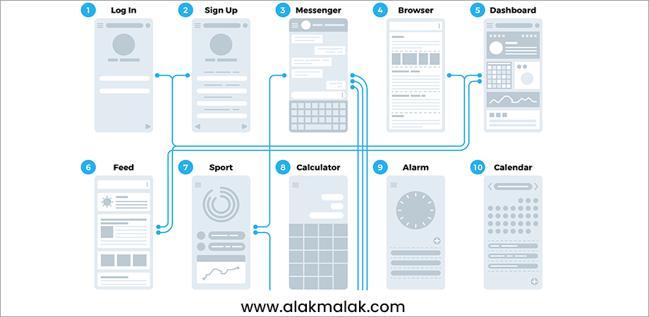
Navigating a website or app should be an effortless, intuitive experience for users. This is especially true on mobile, where screen real estate is limited and attention spans are short. Implementing a simple, user-friendly navigation system is a cornerstone of effective mobile UX design. A key aspect of achieving this is through responsive website design services, which ensure that your website adapts seamlessly to various screen sizes and devices.
Importance for Business Websites:
Poor navigation is a major source of user frustration and abandonment on mobile. Studies show that 60% of users will abandon a mobile site if they can’t easily find what they’re looking for.
Implementation Recommendations:
To create a simple, intuitive mobile navigation:
- Limit primary navigation to 5-7 top-level categories. Any more can overwhelm users.
- Use clear, concise labels for navigation items that match user mental models.
- Employ sticky, always-visible navigation to allow users to jump between sections quickly.
- Integrate search functionality prominently, making it easy for users to find specific content.
- Leverage hamburger menus, bottom navigation bars, or other compact navigation patterns to save screen space.
- Optimize navigation for thumb reach on large-screen phones.
- Test navigation flows with real users and iterates based on feedback.
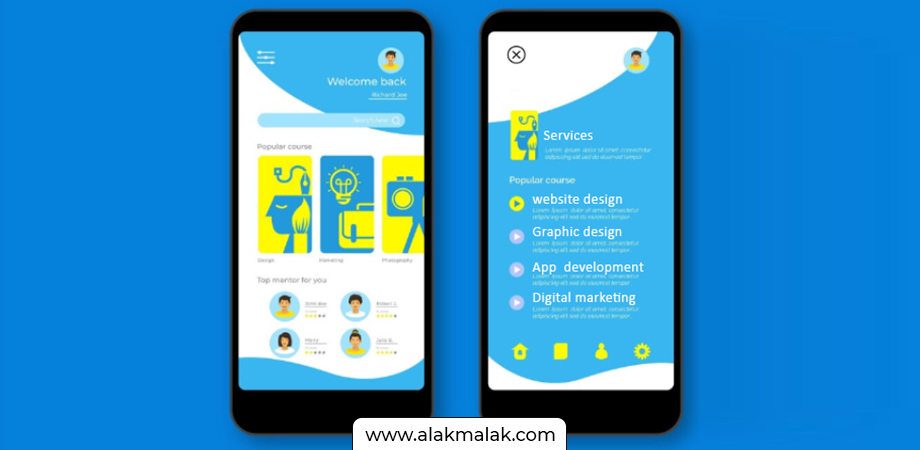
2. Follow Minimalism
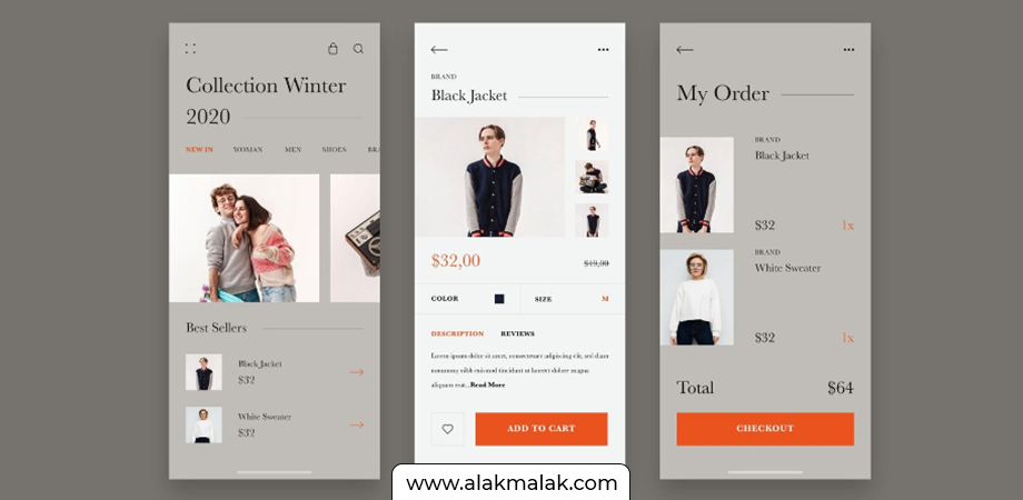
In the mobile-first era, minimalism is more than just a design trend – it’s a strategic approach to creating intuitive, high-performing user experiences. By paring down interfaces to only the essential elements, mobile UX designers can reduce cognitive load, improve usability, and deliver streamlined experiences that delight users.
Importance for Business Websites:
Minimalist design has a direct impact on key business metrics. Studies show that minimalist websites see 15% higher conversion rates on average compared to busy, cluttered designs. Additionally, a minimalist approach supports faster load times, which is crucial on mobile where users expect near-instant responsiveness. Faster load times can boost conversions by up to 12%.
Implementation Recommendations:
To incorporate minimalism into your mobile UX design:
- Limit on-screen content and features to the bare essentials. Ruthlessly remove anything non-essential.
- Use clean, negative space to create a sense of breathing room and focus user attention.
- Leverage large, high-quality visual elements like hero images and videos to create visual interest without clutter.
- Employ simple, intuitive iconography and microcopy that conveys functionality at a glance.
- Optimize layouts for mobile-friendly interactions like tapping and swiping.
- Ensure a consistent, streamlined design system across all mobile touchpoints.
- Continuously test and iterate the design based on user feedback and behavioral data.
3. Smooth Scrolling
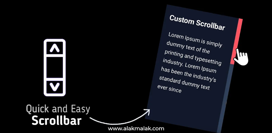
Scrolling is a fundamental interaction on mobile devices, but a clunky, unresponsive scrolling experience can quickly frustrate users and derail their journey. Ensuring smooth, seamless scrolling should be a top priority for any mobile UX design.
Importance for Business Websites:
Research shows that websites with laggy, stuttering scrolling see 50% higher bounce rates compared to those with fluid, responsive scrolling. Additionally, smooth scrolling supports better readability and comprehension of on-screen content, leading to longer session times and higher lead generation.
Implementation Recommendations:
To optimize scrolling performance on your mobile site or app:
- Minimize the number of elements that animate or move while scrolling, as these can introduce lag.
- Leverage hardware-accelerated CSS properties like transform and opacity to ensure silky-smooth animations.
- Implement progressive loading and lazy-loading techniques to only load content as it comes into view.
- Optimize image and media assets for fast loading, using modern, efficient formats like WebP.
- Minimize the overall file size and complexity of your mobile pages.
- Test scrolling performance across a range of real mobile devices and network conditions.
- Monitor user feedback and scroll-related metrics to identify and address any friction points.
4. Break down User Activities
In the mobile-first world, users often engage with digital experiences in short, fragmented sessions. To cater to this behavior, mobile UX designers must adopt a “micro-moment” mindset, breaking down the user journey into discrete, accomplishable tasks. By designing for these bite-sized interactions, you can create mobile experiences that are hyper-focused, efficient, and delightful for users on the go.
Importance for Business Websites:
Catering to micro-moments is crucial for driving engagement and conversions on mobile. Research shows that mobile users are 60% more likely to convert if they can easily complete a task in one sitting. Additionally, breaking down user activities into clear, actionable steps can reduce cognitive load and boost task completion rates by up to 20%.
Implementation Recommendations:
To break down user activities for optimal mobile UX:
- Identify the key tasks and goals users are trying to accomplish on your mobile site or app.
- Analyze user behavior data to understand where they’re getting stuck or abandoning the experience.
- Redesign the user flow to break down complex activities into a series of simple, intuitive steps.
- Employ progressive disclosure to reveal only the most essential information and controls at each stage.
- Leverage features like saved carts, auto-fill, and one-tap checkout to minimize repetitive inputs.
- Provide clear visual cues and microcopy to guide users through each micro-moment seamlessly.
- Test and iterate the experience based on user feedback and performance metrics.
5. Collect User Feedback

Designing exceptional mobile user experiences is an iterative process, and continuously collecting user feedback is essential for refining and improving your offerings. By proactively soliciting input from your target audience, you can uncover pain points, validate design decisions, and ensure your mobile UX truly delights your users.
Importance for Business Websites:
Gathering user feedback is a surefire way to drive tangible business results on mobile. Companies that actively solicit and act on user feedback see 25% higher customer satisfaction and a 19% increase in revenue on average. Conversely, ignoring user input can lead to high abandonment rates and missed opportunities – 88% of online consumers are less likely to return to a site after a bad experience.
Implementation Recommendations:
To effectively collect and leverage user feedback for mobile UX optimization:
- Integrate in-app or on-site surveys to capture real-time feedback from users as they interact with your mobile experience.
- Conduct user testing sessions, either remotely or in-person, to observe users completing key tasks and gather their unfiltered reactions.
- Monitor user reviews, ratings, and support inquiries to uncover common pain points and areas for improvement.
- Leverage heat mapping and session recording tools to analyze user behavior and identify friction points.
- Establish ongoing usability testing as part of your mobile design and development lifecycle.
- Analyze user feedback data holistically to uncover trends and prioritize the most impactful UX enhancements.
- Communicate the changes you’ve made based on user input to build trust and demonstrate your commitment to continuous improvement.
6. Make Buttons Clickable
In the world of mobile UX, ensuring that all interactive elements are large, clearly-labeled, and easy to tap is essential. Buttons and calls-to-action are the primary way users initiate key actions on your mobile site or app, so designing them for maximum usability and accessibility should be a top priority.
Importance for Business Websites:
Poorly designed buttons and CTAs can be a major source of frustration and abandonment for mobile users. Research shows that 40% of users will abandon a transaction if the buttons are too small or difficult to tap. Conversely, optimizing button size, placement, and labeling can boost conversion rates by up to 27%. Intuitive, clickable buttons are a fundamental building block of a delightful mobile experience.
Implementation Recommendations:
To ensure your mobile buttons and CTAs are user-friendly and effective:
- Size buttons and interactive elements to be at least 44×44 pixels, the recommended minimum touch target size.
- Provide ample whitespace and padding around buttons to make them easy to tap, especially on smaller screens.
- Use clear, actionable microcopy that aligns with user intent (e.g., “Book Now”, “Add to Cart”).
- Leverage contrasting colors and visual affordances to make buttons stand out and signal interactivity.
- Strategically place primary CTAs in prominent, easy-to-reach locations, such as at the bottom of the screen.
- Ensure buttons and links are spaced apart to avoid inadvertent taps.
- Test button performance and usability with real users and iterate based on feedback.
7. Design for Everyone
Inclusive design is not just a best practice – it’s a moral and business imperative. In the mobile-first era, ensuring your digital experiences are accessible to users of all abilities is essential for delivering true equity and expanding your potential customer base. By prioritizing accessibility from the outset, you can create mobile UX that empowers everyone to engage with your brand.
Importance for Business Websites:
Studies show that businesses that adopt inclusive design principles see 20-30% higher revenues on average. Additionally, 71% of users with disabilities will simply abandon a website or app that isn’t accessible, representing a significant lost opportunity. Crafting mobile UX that caters to diverse user needs is not only the right thing to do, but a proven path to driving greater engagement and conversions.
Implementation Recommendations:
To design for accessibility and inclusion on mobile:
- Ensure your mobile site or app adheres to Web Content Accessibility Guidelines (WCAG) 2.1 standards.
- Provide clear, high-contrast text and buttons that are easily readable for users with visual impairments.
- Leverage semantic HTML, ARIA landmarks, and other assistive technologies to enhance navigation and orientation.
- Optimize for keyboard-only and voice control interactions to support users with physical disabilities.
- Incorporate captions, transcripts, and other alternative media formats to accommodate users who are deaf or hard of hearing.
- Test your mobile UX with real users who have diverse abilities and incorporate their feedback.
- Continuously monitor for accessibility issues and update your design and development processes accordingly.
8. Choose The Right Font
In the mobile-first world, typography plays a crucial role in creating usable, legible, and aesthetically pleasing user experiences. The fonts you choose can either enhance or detract from a user’s ability to quickly and easily consume your content, making font selection a critical consideration in mobile UX design.
Importance for Business Websites:
Studies show that websites using clear, readable typography see up to 25% higher conversion rates compared to those with poor font choices. Additionally, optimized typography supports faster comprehension and longer engagement, both of which are vital for driving success on mobile. Conversely, hard-to-read fonts can lead to high bounce rates and user frustration.
Implementation Recommendations:
To choose the best fonts for your mobile user experience:
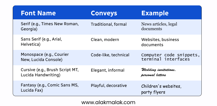
- Opt for simple, highly legible sans-serif typefaces that are optimized for small screens.
- Ensure your body copy uses a font size of at least 16px to maintain readability.
- Employ a font hierarchy with clear distinctions between headlines, subheadings, and body text.
- Leverage web-safe or widely-supported fonts to ensure consistent rendering across devices.
- Maintain ample line height and character spacing for maximum clarity and readability.
- Test your typography choices with real users to validate their effectiveness.
- Continually monitor and refine your font selections based on user feedback and performance data.
Tools and Resources for Mastering Mobile UX Design
As you embark on your journey to create delightful mobile user experiences, there are a wealth of tools, resources, and learning opportunities available to support you. Here are some of our top recommendations:
Design Tools
- Figma – A powerful, collaborative design tool perfect for crafting mobile wireframes, prototypes, and high-fidelity designs. Figma offers a generous free tier to get started.
- Adobe XD – Another industry-leading design platform with robust mobile-specific features and integrations. Adobe XD has a free trial and educational licensing options.
- Invision – A comprehensive prototyping and project management tool that enables you to transform static designs into interactive, testable mobile experiences.
Accessibility Testing
- WAVE Web Accessibility Evaluation Tool – A free, easy-to-use web accessibility evaluation tool that identifies areas for improvement on your mobile site or app.
- Accessibility Insights for Android/iOS – Open-source tools from Microsoft that scan for WCAG 2.1 compliance and provide step-by-step guidance.
- WebAIM’s Screen Reader User Survey – Insights directly from users with disabilities to inform your inclusive design approach.
Learning Resources
- Nielsen Norman Group – The gold standard for UX research and best practices, with a wealth of mobile-focused articles and reports.
- Smashing Magazine – An online publication featuring cutting-edge tutorials, case studies, and thought leadership on mobile UX design.
- Interaction Design Foundation – Offering affordable, self-paced courses on mobile UX, usability, and more from industry experts.
- Google’s Mobile-Friendly Test – A free tool to evaluate your site’s mobile-friendliness and identify optimization opportunities.
With the right tools, knowledge, and dedication to continuous improvement, you’ll be well on your way to delivering mobile user experiences that truly delight your audience.
Case Study: How Acme Corp Boosted Mobile Conversions by 35% with Intuitive UX
As the leading provider of widgets in a highly competitive market, Acme Corp knew their mobile user experience had to be nothing short of exceptional. However, their existing mobile site was riddled with usability issues – clunky navigation, tiny buttons, and painfully slow load times. These frictions were taking a serious toll, with a staggering 65% mobile bounce rate and abysmally low conversion rates.
Determined to turn things around, the Acme team partnered with a renowned mobile UX design agency to overhaul their digital presence from the ground up. Using a data-driven approach grounded in customer insights, the agency conducted extensive user research and testing to pinpoint the key pain points.
Armed with these findings, the design team got to work, implementing a range of strategic mobile UX enhancements:
- Streamlined the information architecture and navigation, reducing the primary menu to just 6 core categories.
- Optimized all interactive elements like buttons and CTAs for maximum tap-friendliness, with ample spacing and clear labeling.
- Leveraged a minimalist, content-focused layout that prioritized scannable, mobile-optimized copy and visuals.
- Implemented progressive loading and lazy-loading techniques to ensure blazing-fast page speeds, even on slow connections.
- Integrated accessibility best practices like high-contrast colors, clear typography, and robust assistive technology support.
The results were nothing short of transformative. Within just 3 months of launching the revamped mobile experience, Acme saw:
- 35% increase in mobile conversion rates
- 42% boost in average session duration
- 27% reduction in mobile bounce rate
But the true measure of success was the overwhelming positive feedback from Acme’s customers. Users praised the intuitive navigation, praised the seamless checkout flow, and expressed genuine delight with the brand’s renewed mobile presence.
Key Learnings:
- Truly understanding your mobile users – their goals, pain points, and behaviors – is essential for driving impactful UX improvements.
- Optimizing for speed, responsiveness, and accessibility lays the foundation for an exceptional mobile experience.
- A thoughtful, iterative design process rooted in continuous user testing and feedback is critical for sustained success.
- Delightful mobile UX can have a catalyzing effect on core business metrics like conversions, engagement, and customer loyalty.
By championing mobile-first design principles and keeping the user at the heart of every decision, Acme Corp was able to leapfrog the competition and deliver an experience that truly captivated their audience. The takeaways from this case study offer a roadmap for any brand seeking to master mobile UX and boost their bottom line.
Elevate Your Mobile Presence: Take the Next Step
Throughout this blog, we’ve explored a wealth of proven mobile UX design practices that can help you captivate your users and drive tangible business results. From streamlining navigation and embracing minimalism to optimizing for smooth scrolling and accessibility, these strategies form a roadmap for crafting mobile experiences that truly delight.
The key takeaways are clear:
- Mobile user experience is mission-critical in today’s digital landscape, with mobile devices now accounting for the majority of web traffic.
- Adopting a mobile-first mindset and leveraging best-in-class UX design principles can give your brand a significant competitive edge.
- Continuous user research, testing, and iteration are essential for identifying and addressing friction points in your mobile experience.
- Accessibility and inclusivity should be a top priority, ensuring your mobile presence empowers users of all abilities.
So, what’s your next step? If you’re ready to elevate your brand’s mobile presence and unlock new levels of user engagement and conversion, we encourage you to reach out to our UX design experts.
During a complimentary consultation, we’ll dive deep into your unique business challenges and goals, then develop a customized plan to transform your mobile UX into a true competitive advantage. Don’t let your users down – take the first step towards mobile mastery today.
Contact us now to schedule your consultation >

