You know that sinking feeling? The frustration when you land on a competitor’s site and it just feels engaging? Animated elements glide smoothly, keeping visitors enthralled, and driving conversion rates sky-high. It’s not just about aesthetics; it’s about delivering a dynamic user experience with latest website animations trends that translates into tangible business outcomes.
Here’s How This Problem Shows Up In Daily Lives Of Many Business Owners:
- Wasted investments in outdated design methods.
- Low conversion rates despite heavy site traffic.
- Users bounce off after mere seconds of landing.
- Tiresome feedback about the site appearing ‘static’ or ‘bland’.
- Continuous comparison with competitors having lively, animated sites.
- Difficulty in engaging millennial and Gen Z traffic.
- Loss of credibility in the digital space.
- Overwhelming confusion about where to start or how to integrate animations.
- The feeling of being technologically left behind.
- Emotional drain from not meeting your own web aesthetic expectations.
Now, Here’s The Twist: It’s NOT What You Think…
Most believe the problem lies in not having the right designers, or that animations are just too complex for their site’s structure. Others think it’s about budget constraints.
The REAL ROOT CAUSE? Many haven’t tapped into the current animation trends and techniques. Most common solutions you’ve come across? They’re outdated, or they just scratch the surface without addressing the core animation strategies that truly captivate users.
Here’s Why Popular Advice Doesn’t Cut It:
- Simply adding random animations can slow down site loading times, driving users away.
- Over-animating can confuse and distract users from the primary call to action.
- Relying on outdated animation techniques might make the site look flashy but lacks functional value.
- Not every animation style suits every brand; misalignment can damage brand perception.
Solution To These Top 10 Problems?
The world of website animation is intricate, but it’s about blending aesthetics with functionality. It’s not about adding animations; it’s about strategically integrating them.
Now, Let’s Dive Into A More Effective Strategy:
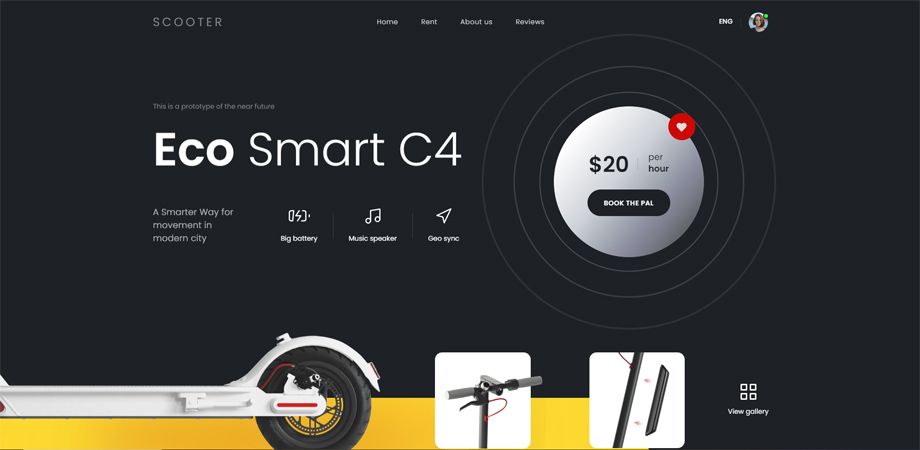
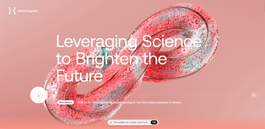
Many businesses found remarkable growth by updating their sites with top-tier animations, that resonated with their audience’s sensibilities. For instance, eScooter witnessed a 37% rise in on-site time after refreshing their animations. Hematogenix’s lead generation increased by 25% post integrating dynamic animation techniques.
What Is Animation In Web Design?
Animations in web design are all about giving your website that “wow” factor, the subtle pop and sizzle that make users stop and pay attention. It’s like the digital version of a magician’s sleight of hand, guiding your visitors from one point to another, making their journey on your website not just informational but also enjoyable.
Web animations, in essence, breathe life into static elements. They can range from a subtle call-to-action (CTA) button gently pulsating to grab attention, to a grand and captivating full-screen display that elevates storytelling to new heights. Whether the goal is to direct a user’s attention or infuse vibrancy into web pages, animations are the secret ingredient that elevates user experience like nothing else. Discover the magic with animations, brought to you by a top website design company in India.
Animations do more than just look cool; they serve a purpose. They can guide users through complicated processes, make interactive sessions more fun, and provide instant feedback, all of which culminate in a robust and rewarding user experience. Benefits of using CSS animation include smoother transitions, faster loading times, and improved website performance.
Searching for a Stellar Website Designer? Look No Further!
Elevate Your Online Business with Alakmalak Technologies! Unlock Exceptional Website Development That Suits Your Budget to Perfection.
Types Of Website Animation
Let’s dive into the six predominant types of website animations, understand their mechanics, and explore the advantages they can offer to your business website.
1. Hero Animation: Hero animations transform the static hero image just below the website header into a dynamic, engaging visual, making the first point of contact with the user more lively and captivating.
2. Loading Animation: Loading animations serve as visual placeholders, keeping users engaged by indicating that a process is underway while they wait for their request to complete.
3. Accent Animation: Accent animations amplify key website elements like buttons or menus, enhancing user engagement and intuitive navigation while strategically guiding attention to vital content for better scannability and visual hierarchy.
4. Interactive Animation: Interactive animations, activated by user actions like hovering, clicking, or scrolling, range from simple color-changing buttons to complex drag-and-drop features, making website navigation efficient and turning the user experience into an engaging, informative journey.
5. Hover Animation: Hover animations respond to cursor movement to signal clickable elements, clarifying website usability while also highlighting key information and boosting overall design aesthetics.
6. Scrolling Animation: Scroll-triggered animations activate as a user navigates vertically through a webpage, enhancing engagement by adding dynamism and interactivity. These animations can take various forms, such as:
- Fade-In Effects: These animations gradually reveal or hide web elements as the user scrolls, enhancing the layout’s visual flow.
- Parallax Effects: Here, different webpage layers move at varying speeds, creating an illusion of depth and three-dimensionality.
- Fixed Elements: Features like menus or call-to-action buttons stay constant on the screen as the user scrolls, ensuring they are always accessible.
- Dynamic Backgrounds: These are animated backdrops that move or change as the user scrolls, adding an extra layer of engagement and visual interest.
[Source: dribble/Tran Mau Tri Tam]
Website Animation Techniques
In web design, animation techniques are the diverse strategies employed by designers to incorporate animated elements into a website. Some of the prevalent approaches are:
1. Progression
The progression method in web design utilizes loading animations to signify the ongoing status of a particular operation on a web page. This can be represented either circularly or linearly:
- Circular indicators illustrate the progress by moving a circle clockwise, which can be determinate (indicating the time required for completion) or indeterminate (implying an unknown waiting period).
- Linear indicators employ a horizontal bar or line that fills or highlights in segments, demonstrating how much of the operation is complete.
2. Skeleton Screens
Skeleton screens serve as a placeholder layout, giving the impression of faster content loading on a webpage. Displayed initially during the loading process, these screens are gradually overlaid with the actual content. By filling in the skeletal framework with real content as it loads, skeleton screens help minimize the perceived wait time, offering users an instant sense of progression and enhancing their overall experience on the site.
3. Visual Feedback
Visual feedback animation offers real-time cues that guide users as they interact with a website, clarifying the site’s responsiveness to their actions. For example, it can illuminate a button when hovered over or indicate successfully filled form fields while flagging errors, thereby facilitating a more intuitive and guided user experience.
4. Attracting Attention
The “Attracting Attention” animation approach leverages motion to captivate users to focus on particular webpage elements. For instance, an entry form might subtly tilt to signify successful completion, or ‘shake’ to indicate an error, capitalizing on our natural tendency to notice movement.
5. Storytelling
The “Storytelling” animation technique in web design employs dynamic visuals to weave a narrative or explain complex concepts. For instance, animated infographics can turn data presentation into an engaging experience, enhancing user comprehension and making the content more visually striking and memorable.
10 Leading Website Animation Examples
When animations are thoughtfully implemented in web design, they contribute to an immersive user experience without overwhelming the page or impacting its loading speed. Here are 10 instances of websites that masterfully balance animation to elevate the user experience.
1. Buddha Brands
Buddha Brands’ consumer-focused website skillfully incorporates subtle animations that emanate a sense of playfulness and joy, enhancing the overall user experience.

[Source: BuddhaBrands]
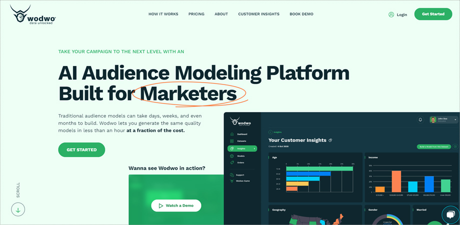
2. Wodwo
Wodwo’s business-to-business website masterfully integrates a range of interactive and scroll-triggered animations, elevating the user experience into something uniquely engaging and delightful.
[Source: Wodwo]
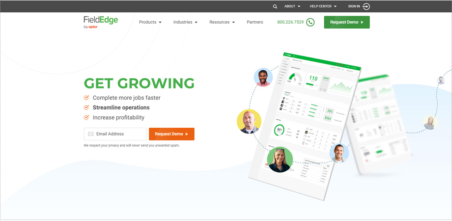
3. Field Edge
Field Edge, a company specializing in heating, ventilation, and air conditioning, utilizes an interactive website design where elements dynamically appear as users scroll down the landing page.
[Source: FieldEdge]
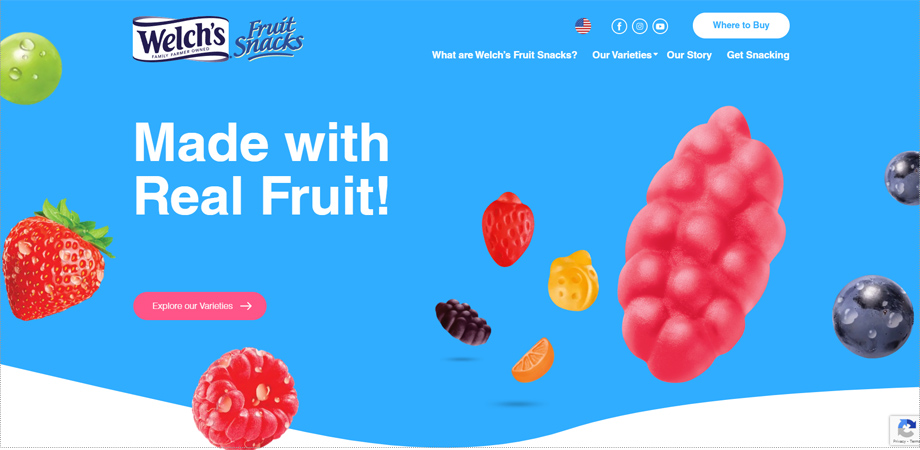
4. Welch’s Fruit Snacks
We employed animations to inform visitors about the various aspects of Welch’s Fruit Snacks, including their texture, health benefits, and portion sizes.
[Source: Welch’s Fruit Snacks]
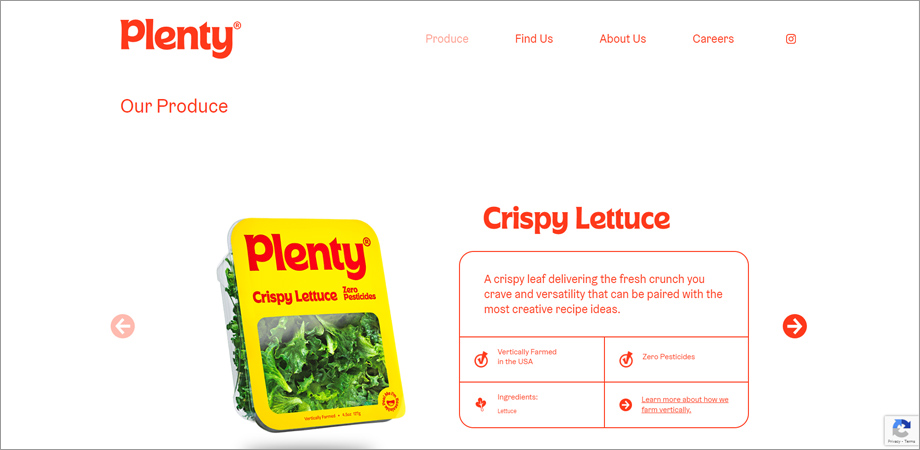
5. Plenty
Working alongside Plenty’s design team, we developed an engaging cursor animation that transforms the arrow into a dot when it hovers over a call-to-action section.
[Source: plenty]
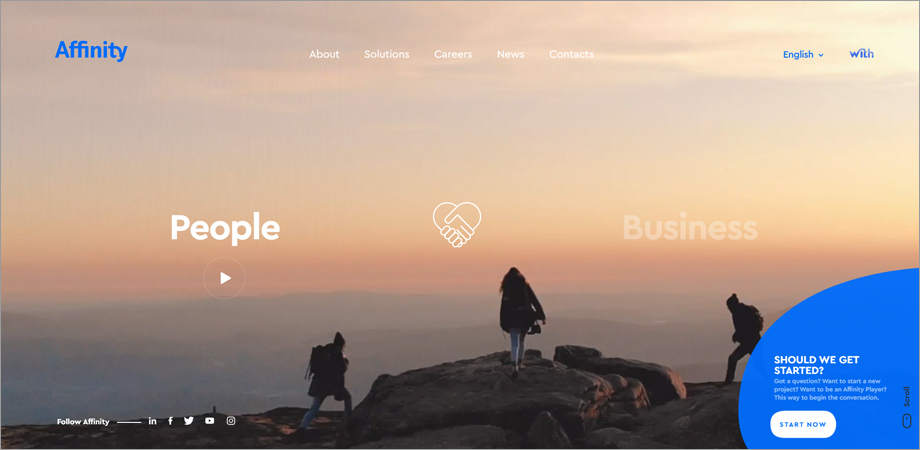
6. Affinity
Affinity, a consultancy focused on technology and information systems, opted for a website design rich in interactive features and eye-catching visuals.
[Source: affinity]
7. Bewagen
Bewagen, a bike-sharing network, employs scroll-activated animations to enhance the user experience on their website.
8. eScooter
eScooter, an electric scooter rental service, utilizes interactive animations activated by scrolling or hovering to create a polished and engaging user experience on their website.
[Source: eScooter]
9. Hematogenix
Hematogenix, a clinical laboratory service, captivates visitors immediately with an animated hero image and adds an extra layer of engagement by incorporating futuristic background music.
[Source: Hematogenix]
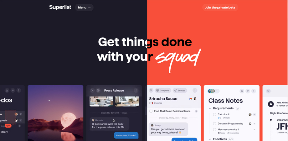
10. Superlist
The moment you land on Superlist’s website, you’re greeted with a dynamic array of animations, ranging from hover-activated to automated features, delivering a one-of-a-kind user experience.
[Source: Superlist]
5 Best Website Animation Tools
Interested in crafting compelling website animations similar to the inspiring examples provided? Explore these five top-notch tools commonly used by top web designers India to produce animations that captivate users.
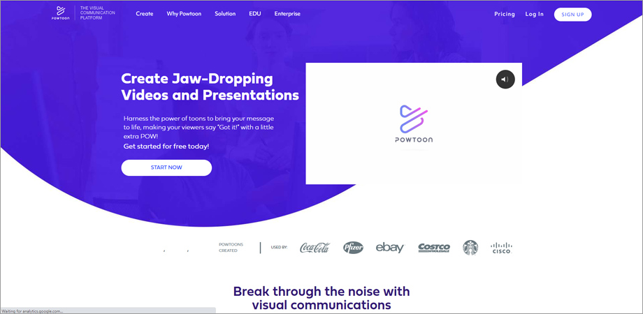
1. Powtoon
Powtoon is a comprehensive visual communication platform with options for free and tiered pricing: Lite ($15/month), Professional ($40/month), and Business ($120/month). It provides users with a diverse set of tools, from creating animated videos to sending video messages, and even offers a custom character-building feature alongside PowerPoint-to-video conversion capabilities.
[Source: Powtoon]
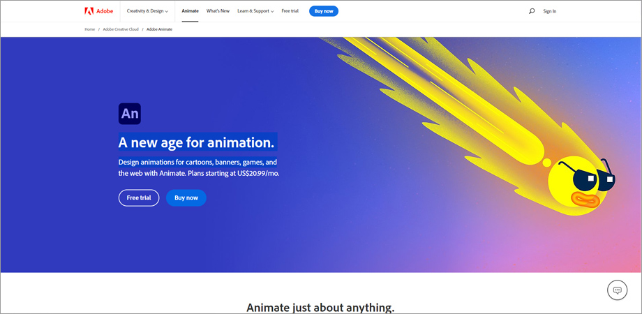
2. Adobe Animate
Adobe Animate is a leading software for crafting interactive animations for websites, as well as doodles and avatars. You can try it out with a free trial or opt for one of its four pricing plans:
- Single App: $20.99/month
- Complete Creative Cloud Suite: $54.99/month
- Educational Pricing (Students and Teachers): $19.99/month
- Business Pricing: $35.99/month per license
Key features of Adobe Animate include:
- Cross-platform publishing capabilities
- Support for frame-by-frame animation
- Creation of interactive web banners
- Envelope deformation tools
[Source: Adobe]
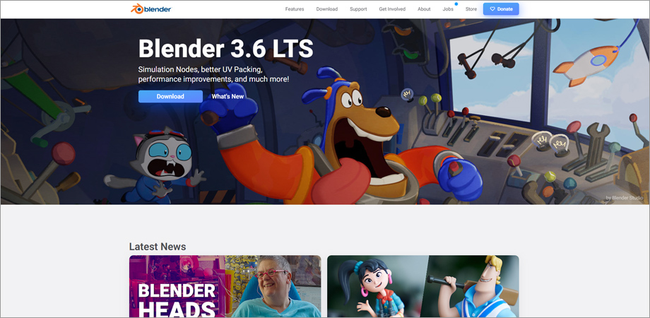
3. Blender
Blender is a robust, open-source 3D creation suite that caters to professionals and hobbyists alike. While it’s entirely free to use, the software offers advanced functionalities that rival those of commercial 3D animation tools. Not only is it capable of producing intricate 3D models, but it also allows for 3D animation, sculpting, and even game creation.
[Source: Blender]
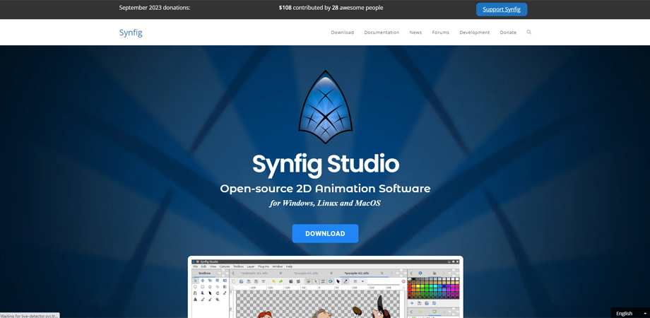
4. Synfig
Synfig is another open-source offering packed with a wide array of animation features. Its core advantage lies in its capacity for 2D animation, offering capabilities similar to traditional hand-drawn methods. Though it has a steeper learning curve compared to some other tools, it’s absolutely free and offers an incredible range of features that make it worth the time investment for serious animators.
[Source: Synfig]
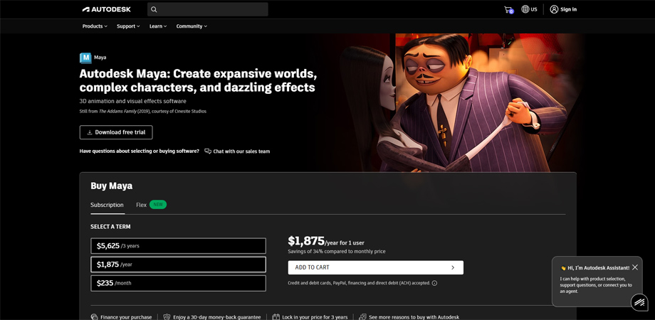
5. Autodesk Maya
Maya stands as a top-tier solution for creating intricate 3D animations and visual effects for websites. It has three subscription options to choose from:
Three-Year Plan: $5,625
One-Year Plan: $1,875
Month-to-Month Plan: $235
Among its standout features are:
Advanced 3D animation toolset
Polygonal modeling capabilities
Built-in Arnold rendering engine
Time and graph editing functions
Comprehensive character rigging tools
[Source: Autodesk]
Conclusion:
Website animations are more than just eye candy; they’re a critical component of effective web design. Companies like Buddha Brands and Wodwo show how well-crafted animations can elevate user experience, while tools like Powtoon and Maya make creating these animations accessible for all skill levels. When done right, animations can guide, engage, and delight users, making them an indispensable tool for any modern website.
Interested in elevating your website with state-of-the-art animations? Contact us today to discover how we can bring the latest trends, techniques, and top examples to your online presence.

 By: Rushik Shah

