 Web
Design
Web
Design Web Development
 Apps
Development
Apps
Development Digital
Marketing
Digital
Marketing CMS
CMS Ecommerce
 Emerging Tech
 By: Rushik Shah
In today’s digital landscape, where mobile devices account for over 50% of all online traffic, optimizing your eCommerce website for a seamless mobile experience has become absolutely crucial. In fact, studies show that 79% of smartphone users have made a purchase online using their mobile device in the past 6 months. If your website isn’t providing a top-notch mobile experience, you’re missing out on a massive opportunity to reach and convert these on-the-go shoppers.
As an eCommerce website development company with over 18 years of experience, we’ve helped numerous brands optimize their online stores for optimal mobile performance. In this blog post, we’ll share our proven tips and strategies for ensuring your eCommerce website is fully optimized for mobile devices, from lightning-fast load times to intuitive navigation and effortless checkout.
Here’s a detailed guide to ensure your eCommerce website offers a seamless and conversion-friendly experience on mobile devices:
8 Tips to Optimize eCommerce Website for Mobile Devices

The following are the 8 important elements for optimizing your e-commerce website for mobile devices:
1. Embrace Responsive Design
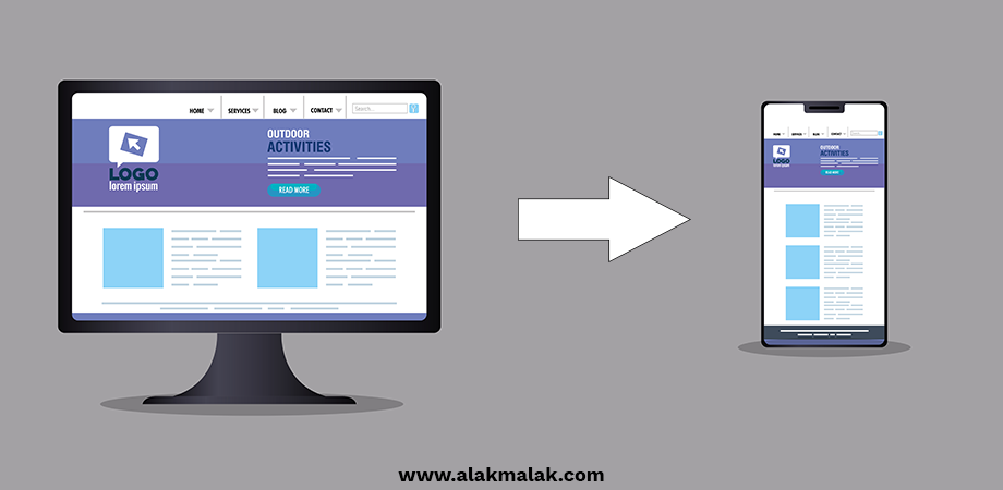
One of the most crucial steps in optimizing an eCommerce website for mobile devices is embracing responsive design. Responsive design ensures that your website dynamically adapts its layout, content, and functionality to provide an optimal viewing and interaction experience across a wide range of devices, from smartphones and tablets to desktops and laptops.
Why responsive web design is important for eCommerce websites?
In today’s mobile-first world, a responsive website is no longer a nice-to-have, but a necessity for any eCommerce business that wants to stay competitive. Studies show that 57% of users won’t recommend a business with a poorly designed mobile site. By embracing responsive website designing, you can ensure your eCommerce store provides a seamless and engaging experience for mobile shoppers, ultimately driving higher engagement, conversion rates, and customer loyalty.
How to Implement Responsive Design
Implementing responsive design involves several key steps:
- Use a mobile-friendly, responsive web design framework: Popular options include Bootstrap, Foundation, and Materialize CSS. These frameworks provide a pre-built grid system, UI components, and responsive styles to ensure your website adapts flawlessly to different screen sizes.
- Optimize images and media: Ensure that all images, videos, and other media on your eCommerce site are properly sized and compressed for fast loading on mobile devices. Consider using responsive image techniques like srcset and sizes to serve the appropriate image file for each screen size.
- Prioritize mobile-friendly navigation: Create a clean, intuitive navigation menu that is easy to use on smaller screens. Consider features like hamburger menus, sticky headers, and dropdown menus to improve the mobile user experience.
- Streamline the checkout process: Optimize the checkout flow for mobile users by reducing the number of form fields, implementing mobile-friendly payment options like Apple Pay or Google Pay, and ensuring a seamless, one-page checkout experience.
2. Prioritize Speed
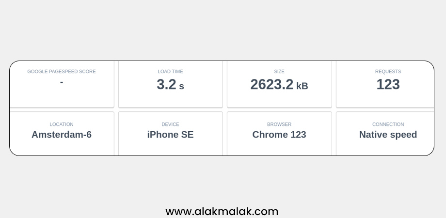
In today’s hyper-competitive eCommerce landscape, lightning-fast website speed is no longer a nice-to-have, but a critical requirement for any business seeking to thrive in the mobile-dominated market. When it comes to optimizing your eCommerce website for mobile devices, prioritizing website speed should be at the top of your list.
Why website loading speed is important for eCommerce websites?
Studies have shown that a one-second delay in page load time can result in a 7% reduction in conversions. Worse yet, 53% of mobile users will abandon a website if it takes more than 3 seconds to load. With attention spans at an all-time low, eCommerce businesses simply can’t afford to have a slow, sluggish website, especially on mobile devices where users expect instant gratification.
How to Implement Speed Optimizations
To ensure your eCommerce website is lightning-fast on mobile devices, consider implementing the following strategies:
- Optimize images and media: Reduce the file size of all images, videos, and other media on your site by compressing and resizing them for the web. Leverage modern image formats like WebP to further decrease load times.
- Minimize HTTP requests: Combine and minify CSS and JavaScript files, and use techniques like lazy loading to only load content when it’s needed.
- Leverage browser caching: Configure your server to set appropriate caching headers so that repeat visitors can load your site’s static assets from their browser cache instead of re-downloading them.
- Implement a content delivery network (CDN): A CDN will serve your site’s static assets (images, CSS, JavaScript) from servers around the world, reducing the distance data has to travel and improving load times for your mobile users.
- Use a fast, mobile-optimized web host: Choose a web hosting provider that specializes in high-performance, scalable hosting for eCommerce websites. Avoid shared hosting plans, which can often lead to slow load times.
3. Simplify Navigation
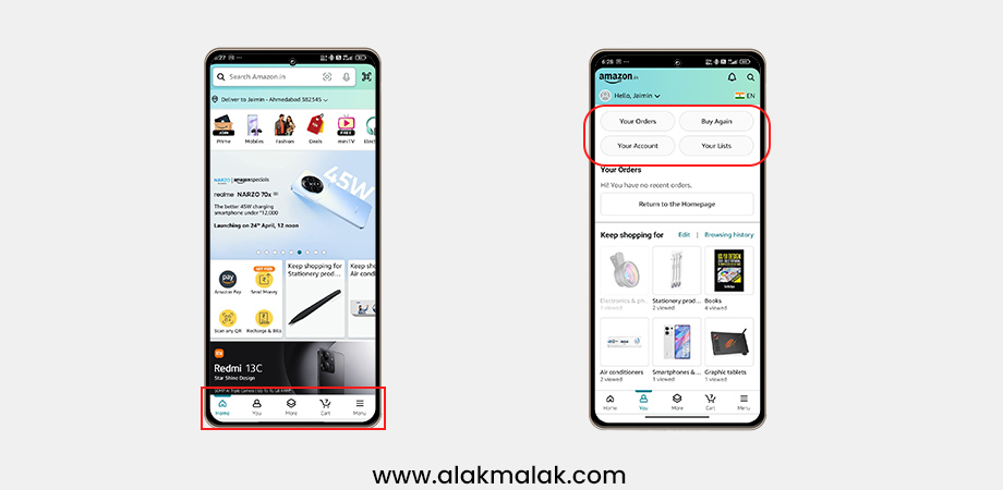
In the world of mobile eCommerce, simplicity reigns supreme. While your desktop website may feature a complex, multi-tiered navigation menu, such an approach can quickly become cumbersome and frustrating for mobile users. To ensure your eCommerce site delivers a seamless and intuitive experience for customers on the go, it’s essential to simplify and streamline your website’s navigation.
Why eCommerce websites should have a simplified navigation?
Studies have shown that 60% of mobile users will abandon a website if they can’t easily find what they’re looking for. Additionally, 42% of mobile users will leave a website if the navigation is unclear or difficult to use. By simplifying your eCommerce site’s navigation, you can minimize user frustration, increase engagement, and drive higher conversion rates on mobile devices.
Implementing Simplified Navigation
Here are some key strategies for simplifying the navigation on your eCommerce website for mobile users:
- Use a mobile-friendly menu design: Opt for a responsive, collapsible “hamburger” menu that neatly consolidates your main navigation links into a compact, easy-to-access interface.
- Limit the number of top-level menu items: Aim for no more than 5-7 primary navigation categories to avoid overwhelming mobile users. Use strategic categorization to group related products and services.
- Prioritize the most important pages: Ensure your mobile menu features direct links to your highest-converting pages, such as your homepage, product categories, shopping cart, and checkout.
- Implement search functionality: Make it easy for mobile users to quickly find what they’re looking for by providing a prominently placed search bar or magnifying glass icon.
- Use clear, intuitive labeling: Ensure your menu items and navigation links use plain, straightforward language that mobile users can instantly understand.
4. Streamline the Checkout Process
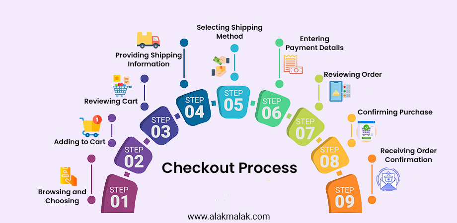
Shopping cart abandonment rates on mobile devices can reach as high as 85.6% (Baymard Institute, 2023). Complex checkout processes are a major contributor.
For eCommerce businesses, the checkout process is the digital equivalent of the final hurdle before a sale is complete. Unfortunately, many mobile-optimized websites fall short when it comes to providing a seamless and frictionless checkout experience for customers on the go. To maximize your conversions and revenue from mobile shoppers, it’s crucial to streamline and simplify the checkout process on your eCommerce website.
Why seamless checkout process is important on eCommerce website?
Studies have shown that the mobile checkout abandonment rate can be as high as 85%, with many users citing a complicated or confusing checkout process as the primary reason for abandoning their purchase. By optimizing the checkout experience for mobile devices, you can significantly reduce cart abandonment and drive more successful transactions. In fact, research indicates that a streamlined mobile checkout can increase conversion rates by up to 35%.
Implementing a Streamlined Checkout
Here are some key strategies for streamlining the checkout process on your eCommerce website for mobile users:
- Minimize form fields: Reduce the number of form fields customers need to fill out, focusing only on the essential information required to complete the transaction.
- Implement mobile-friendly payment options: Provide a range of easy-to-use payment methods, such as Apple Pay, Google Pay, and digital wallets, to allow customers to checkout quickly and securely.
- Optimize the checkout flow: Ensure the checkout process is linear and intuitive, with a clear progress indicator to guide users through each step.
- Eliminate unnecessary distractions: Remove or minimize any non-essential elements, such as ads or cross-sell offers, that could distract or divert mobile users during the checkout process.
- Optimize for one-handed use: Design the checkout interface with thumb-friendly placement of buttons and fields to ensure a smooth, ergonomic experience for customers using their mobile devices with one hand.
5. Prioritize Mobile SEO
Google now uses mobile-first indexing, meaning the mobile version of your site is primarily considered for search ranking (Google, 2020).
In today’s mobile-centric digital landscape, where the majority of online traffic and searches originate from smartphones and tablets, ensuring your eCommerce website is optimized for search engine visibility on mobile devices has become an absolute necessity. Prioritizing mobile SEO should be a critical component of your overall strategy for optimizing your online store for the mobile-first era.
Why mobile SEO important?
With Google’s recent shift to a mobile-first indexing model, where the search engine giant prioritizes the mobile version of a website for ranking and indexing purposes, having a strong mobile SEO strategy has become essential for eCommerce businesses. In fact, studies show that 60% of all searches are now conducted on mobile devices, and 50% of consumers say they won’t engage with a brand if its mobile experience is poor. By focusing on mobile SEO, you can ensure your eCommerce website ranks highly in search results and attracts valuable, ready-to-convert mobile traffic.
Implementing Mobile SEO Strategies
To optimize your eCommerce website for mobile SEO, consider the following strategies:
- Ensure a responsive design: As mentioned earlier, having a mobile-friendly, responsive website is a crucial foundation for effective mobile SEO.
- Optimize for mobile-specific keywords: Research and target keywords that are commonly used by mobile searchers, such as “near me,” “open now,” and “buy online.”
- Improve page speed: Implement the speed optimization techniques discussed earlier to ensure your mobile pages load quickly, as Google prioritizes fast-loading websites in its mobile search rankings.
- Leverage AMP (Accelerated Mobile Pages): Consider implementing AMP, a Google-backed framework that enables the creation of lightweight, mobile-optimized web pages with instant loading times.
- Optimize for local search: Ensure your eCommerce website is properly listed on Google My Business and other local directories, and optimize your site’s content and schema markup for location-based searches.
- Monitor and adapt: Regularly track your mobile SEO performance using tools like Google Search Console, and make data-driven adjustments to your strategy as needed.
6. Ensure an Omnichannel Shopping Experience
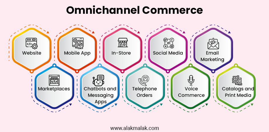
In the modern, multi-device world, customers expect a seamless, integrated shopping experience that allows them to move fluidly between their desktop, mobile, and even in-store interactions with a brand. To optimize your eCommerce website for mobile devices, it’s crucial to adopt an omnichannel approach that provides a consistent, high-quality customer journey across all touchpoints.
Why give omnichannel shopping experience to the users?
Studies show that customers who engage with a brand across multiple channels have a 30% higher lifetime value than those who only use a single channel. Furthermore, 73% of consumers say that they prefer to shop using a mix of online and offline channels. By delivering an omnichannel shopping experience, you can meet your customers’ expectations, build stronger brand loyalty, and drive higher revenue and profitability.
Implementing an Omnichannel Approach
To ensure your eCommerce website provides an omnichannel shopping experience for mobile users, consider the following strategies:
- Integrate your online and offline channels: Seamlessly connect your eCommerce website with your physical retail stores, allowing customers to easily browse, purchase, and return products across both channels.
- Offer consistent branding and messaging: Maintain a cohesive visual identity, tone of voice, and key messaging across your mobile website, social media, email marketing, and other digital channels.
- Provide a unified customer profile: Enable customers to create a single account that allows them to track orders, manage their preferences, and access their purchase history regardless of the device or channel they’re using.
- Optimize for cross-device functionality: Make it easy for customers to add items to their cart on their mobile device and then pick up their purchase on a desktop or in-store.
- Leverage real-time inventory data: Provide accurate, up-to-date information about product availability and delivery options across all your sales channels.
7. Optimize Call-to Action buttons

Mobile users are 3x more likely to tap on large, clear CTAs (Unbounce, 2022).
In the world of mobile eCommerce, where users are often operating with limited screen space and attention spans, the design and placement of your call-to-action (CTA) buttons can have a significant impact on driving conversions. Optimizing these critical elements is a crucial step in ensuring your eCommerce website delivers a seamless and engaging experience for mobile users.
Why it is important to optimize Call-To-Action Buttons on eCommerce website?
Studies have shown that the design and positioning of CTA buttons can influence conversion rates by as much as 527%. Additionally, research indicates that mobile users are 50% more likely to convert on a website if the CTA buttons are easy to find and interact with. By optimizing your eCommerce site’s CTA buttons for mobile devices, you can significantly boost user engagement, encourage more customers to take the desired actions, and ultimately drive higher revenues for your business.
Implementing CTA Button Optimization
To optimize the call-to-action buttons on your eCommerce website for mobile devices, consider the following strategies:
- Use clear, concise language: Craft CTA copy that is simple, direct, and immediately communicates the value proposition to your mobile users.
- Ensure adequate size and spacing: Make your CTA buttons large enough to be easily tapped on a mobile screen, with ample surrounding whitespace to prevent accidental clicks.
- Strategically place CTAs: Position your primary CTA buttons in prominent, above-the-fold locations where mobile users can easily spot and interact with them.
- Leverage contrasting colors: Use high-contrast colors for your CTA buttons to make them stand out and draw the user’s attention.
- Optimize for one-handed use: Design your CTA buttons with thumb-friendly placement and sizing to ensure a comfortable, ergonomic experience for mobile users.
- A/B test and iterate: Continuously experiment with different CTA designs, placements, and messaging to identify the optimal approach for your mobile audience.
Take the First Step Towards a Mobile-Optimized eCommerce Empire
Throughout this comprehensive guide, we’ve explored the seven essential strategies for optimizing your eCommerce website for mobile devices. From embracing responsive design and prioritizing speed to streamlining the checkout process and ensuring an omnichannel shopping experience, each of these elements plays a crucial role in providing your customers with a seamless and engaging mobile experience.
As the landscape of eCommerce continues to evolve, with more and more consumers relying on their smartphones and tablets to make purchases, the importance of mobile optimization cannot be overstated. By implementing these best practices, you’ll not only enhance your customer satisfaction but also drive increased conversions, improve your search engine rankings, and position your eCommerce business for long-term success.
Now that you have a comprehensive understanding of the key strategies for optimizing your eCommerce website for mobile devices, it’s time to take action. Review your current mobile presence, identify areas for improvement, and start incorporating these mobile-friendly features into your online store.
If you’re feeling overwhelmed or uncertain about where to begin, don’t hesitate to reach out to our team of eCommerce website development experts at Alakmalak. We would be more than happy to evaluate your current mobile experience, provide personalized recommendations, and guide you through the process of transforming your eCommerce website into a true mobile powerhouse.
Take the first step towards a fully optimized, mobile-friendly eCommerce presence. Contact us today, and let’s work together to unlock the full potential of your online store.
Mobile devices have become a primary source of online shopping, and eCommerce businesses must adapt to this trend. By optimizing your website for mobile devices, you can enhance your brand’s online presence, increase customer experience, and drive more sales. With the ever-growing competition in the eCommerce industry, optimizing your website for mobile devices has become a necessity to stay ahead of the game and succeed in the online marketplace.
Therefore, it’s essential to regularly review and update your website to ensure that it’s optimized for mobile devices and provides a seamless user experience. Remember, the key to success is to keep your users in mind and prioritize their needs to provide the best online shopping experience possible.
Need assistance optimizing your eCommerce website for mobile devices? Contact us today – we’re here to help and guide you through the process!